
Time Study Template Excel: Build, Use & Master Productivity Tracking in Your Spreadsheet
Master time study template Excel setup step by step. Track tasks, analyze bottlenecks, and boost productivity. 📝 Free practice quizzes included.

A solid time study template excel setup is one of the most powerful tools any professional, student, or operations manager can build inside Microsoft Excel. Whether you are tracking how long a manufacturing process takes, measuring how employees spend their shifts, or simply trying to understand where your own workday disappears, a well-designed time study spreadsheet gives you hard data instead of guesswork. Industrial engineers have relied on time studies since Frederick Winslow Taylor pioneered scientific management in the late 1800s, and the core methodology is just as relevant in modern offices and factories today.
Before diving into construction, it helps to understand what a time study actually measures. At its core, you are recording the elapsed time for each discrete task or activity, repeating the observation across multiple cycles, and then computing averages, standard deviations, and efficiency ratios. Excel is ideal for this work because its grid structure naturally mirrors the observation sheet format used in classic industrial engineering, and its built-in functions let you calculate statistics automatically the moment you enter raw times. You do not need specialized software when a carefully structured workbook can do everything you require.
One of the first decisions you will make is whether to use decimal hours, minutes-and-seconds, or hundredths-of-a-minute — the unit industrial engineers call TMUs (time measurement units). Excel handles all three formats, but you must be consistent throughout the entire template or your averages will be meaningless. Most office-based time studies work best with minutes expressed as decimals, so 1 minute 30 seconds becomes 1.5, which is easy to average and graph without any conversion gymnastics. Manufacturing studies sometimes prefer TMUs because the numbers stay in whole integers and reduce rounding error across hundreds of cycles.
Excel skills like vlookup excel formulas, dropdown validation, and conditional formatting all become useful as your template grows more sophisticated. For instance, you might use a VLOOKUP to pull a standard allowed time from a reference table whenever a task code is entered, instantly comparing observed time against the benchmark. A drop-down list created through Data Validation keeps task names consistent across observers and prevents the kind of spelling variation that makes pivot table summaries unreliable. These intermediate Excel features are not required for a basic template, but they dramatically reduce manual error and speed up analysis.
The institute of creative excellence in workplace productivity consistently points to measurement as the foundation of improvement. You cannot reduce waste, eliminate bottlenecks, or set fair performance standards without first knowing how long each step actually takes. Time studies carried out with a rigorous Excel template produce defensible numbers that survive scrutiny from management, union representatives, and quality auditors alike. The key is building the template correctly from the start so that data entry is fast, analysis is automatic, and the resulting reports are visually clear.
This article walks you through every component of an effective time study template in Excel: from the initial sheet design and data-entry layout, through the formulas that calculate performance ratings and allowances, all the way to charts and summary dashboards that communicate results to stakeholders. Along the way you will find practical tips drawn from real industrial engineering practice, common mistakes to avoid, and guidance on adapting the template for office work, healthcare settings, logistics operations, and self-directed personal productivity tracking. By the end, you will have a complete blueprint ready to build in your own workbook.
Even if you are brand new to Excel, the step-by-step instructions here are written so you can follow along without prior spreadsheet expertise. And if you want to verify your Excel knowledge at any point, the practice quizzes linked throughout this article cover exactly the functions and features used in a professional-grade time study template, giving you confidence that you understand not just what to click but why each formula works the way it does.
Time Study in Excel by the Numbers
Core Components of a Time Study Template in Excel
The primary data-entry area where observers record start time, end time, and elapsed time for each task cycle. Columns are labeled by element number and rows represent individual observation cycles. Color coding separates productive from non-productive time.
A lookup table storing standard allowed times, task codes, and department names. VLOOKUP or XLOOKUP pulls values automatically when an observer enters a task code, eliminating manual searches and ensuring consistency across all observers.
Auto-calculated section displaying mean, standard deviation, coefficient of variation, and performance rating for every observed element. Formulas update instantly as new observations are entered, giving supervisors real-time insight without manual recalculation.
Converts normal time to standard time by applying personal, fatigue, and delay allowances expressed as percentages. Most industrial standards use a 15% total allowance for light office work and up to 25% for physically demanding tasks.
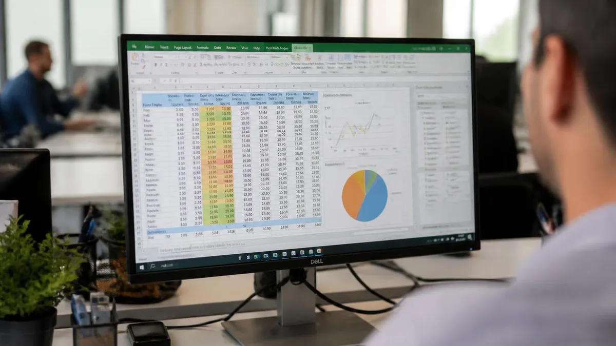
Visual summary including bar charts of element times, control charts showing observation-to-observation variation, and a pie chart breaking total cycle time into productive versus non-productive categories — ready to paste into PowerPoint reports.
Once your sheet structure is in place, the formulas that power a professional time study template in Excel are surprisingly straightforward. The foundation is elapsed time calculation: if your observer records a start time in column B and an end time in column C, the elapsed time in column D is simply =C2-B2 formatted as [mm]:ss to display minutes and seconds correctly.
The bracket around mm is critical — it tells Excel to display total minutes even when the duration exceeds 60 minutes, rather than rolling over to hours. Without the bracket, a 90-minute task would display as 30:00 and your data would be silently wrong.
The AVERAGE function computes mean observed time for each element across all cycles. Place it at the bottom of each element column and reference only the non-empty data rows using AVERAGEIF to skip blank cycles where the element did not occur. For example, =AVERAGEIF(D2:D41,"<>""",D2:D41) calculates the mean of all non-blank elapsed times in the range. If you anticipate outliers — a cycle where someone was interrupted by a phone call, for instance — use TRIMMEAN instead, which drops the top and bottom 5% or 10% of values before averaging, producing a more stable central tendency.
Standard deviation belongs in the row directly below the average. Use =STDEV.S for a sample standard deviation, which is appropriate because your 25 or 30 observations represent a sample of all possible cycles, not the entire population. Divide the standard deviation by the mean and multiply by 100 to get the coefficient of variation as a percentage. Industrial engineering convention says a CV above 20% signals high variability and means you should either collect more observations or investigate what is causing inconsistent cycle times before setting a standard.
Performance rating is the most judgment-intensive number in any time study. The observer rates the worker's pace on a scale where 100% represents normal pace — the speed an average trained worker sustains without overexertion or excessive rest. Ratings below 100 indicate a slower-than-normal pace; above 100 indicates faster. Normal time is calculated as =ObservedTime * (Rating/100). Build a separate input cell for the rating on each observation row, and let the formula reference it automatically. This keeps the rating linked to the specific cycle it describes rather than applying a blanket adjustment to the whole study.
Allowances convert normal time to standard time, the number you actually use for scheduling, costing, and performance measurement. The formula is =NormalTime * (1 + AllowanceRate). Allowances compensate workers for personal needs such as restroom breaks, fatigue that accumulates over a shift, and unavoidable delays like machine setup or waiting for materials. The exact percentages come from your company's industrial engineering standards or from published tables in references such as the Maynard Industrial Engineering Handbook. Enter your allowance rates in a clearly labeled input section at the top of the summary sheet so they are easy to find and audit.
Knowing how to create a drop down list in excel makes task-code entry faster and error-free. Select the task-code column, go to Data, Data Validation, choose List as the validation type, and reference a named range containing your approved task codes. This prevents observers from typing "assembly" in one row and "Assembly" in another, which would cause your pivot table summaries to count them as different tasks and undercount both. Named ranges are defined under Formulas, Name Manager, and a good naming convention such as TaskCodes_Sheet2 makes it obvious where each range lives.
How to merge cells in excel is a question that comes up when formatting the header rows of your observation sheet. Select the cells you want to merge, click Home, Merge and Center, and the selected cells become one. Use merging sparingly in a time study template — never merge cells in data rows because it breaks sorting, filtering, and formula ranges.
Reserve merging exclusively for the top title row and section headers that span multiple columns purely for visual clarity. For the same reason, avoid merging cells in any row that might be included in a pivot table data source.
How to Create a Drop Down List in Excel for Your Time Study Template
For office-based time studies, your drop-down list should include categories such as email correspondence, meeting attendance, document creation, phone calls, data entry, and administrative filing. Navigate to Data, then Data Validation, select List, and type each category separated by a comma directly in the Source field. This approach works well when your category count is under 20 and you want a self-contained workbook that does not depend on a separate reference sheet being present.
Once the drop-down is in place, add a second validation column for sub-categories. Use INDIRECT to make the sub-category list change dynamically based on what was selected in the primary category column. For example, selecting "Meeting" in column A automatically restricts column B to choices like "Scheduled," "Impromptu," or "Video Call." This two-level validation dramatically increases the granularity of your data without requiring observers to type free text, keeping your analysis pivot tables clean and sortable by any combination of category and sub-category.

Time Study Templates in Excel: Advantages and Limitations
- +Zero additional software cost — every organization with Microsoft Office already has Excel available on existing hardware
- +Fully customizable to any industry, task type, or observation methodology without vendor lock-in or subscription fees
- +Formulas update automatically as new observations are entered, eliminating manual recalculation errors that plagued paper-based studies
- +Built-in charting creates professional visual summaries suitable for management presentations without exporting to separate tools
- +Pivot tables allow rapid analysis by department, shift, operator, or date range with just a few clicks on completed datasets
- +Portable and shareable via email or SharePoint with no special software required for recipients to open and review results
- −Manual data entry during live observation is error-prone and slower than purpose-built time study apps with barcode or tablet input
- −No built-in version control — overwriting cells with new data permanently destroys previous observations unless explicit backup protocols are followed
- −Concurrent multi-user editing in shared Excel files can cause data conflicts that silently corrupt observation records
- −Large studies with thousands of cycles and dozens of elements can slow Excel noticeably on older hardware, affecting observer responsiveness
- −No automatic timestamp capture — observers must manually record start and end times, introducing human delay and rounding error into every measurement
- −Replicating the template across multiple studies requires careful copy-paste discipline; formula references break if sheet names change after copying
Time Study Template Excel Build Checklist
- ✓Create a dedicated reference sheet with all task codes, department names, and standard allowed times organized as a named table.
- ✓Build the observation sheet with columns for element number, start time, end time, elapsed time, performance rating, and observer notes.
- ✓Apply [mm]:ss number formatting to all elapsed time cells so durations over 60 minutes display correctly without rolling over.
- ✓Add Data Validation drop-down lists to the task code and department columns referencing named ranges on the reference sheet.
- ✓Freeze the header row using View, Freeze Panes so column labels remain visible as the observation log grows across hundreds of rows.
- ✓Write AVERAGEIF and STDEV.S formulas in the summary section to calculate mean and variability for each element automatically.
- ✓Include a performance rating input column and link Normal Time formulas to multiply observed time by the rating factor.
- ✓Build an allowance input table at the top of the summary sheet and connect it to the Standard Time formula with a clear labeled reference.
- ✓Apply conditional formatting to flag any coefficient of variation above 20% in red as a signal to collect additional observations.
- ✓Create a dashboard chart sheet with a bar chart of element standard times and a control chart showing cycle-to-cycle variation.
How Many Observations Do You Really Need?
Industrial engineering standards require enough observations to achieve ±5% accuracy at 95% confidence. The formula is N = (40 × √(ΣX² − (ΣX)²/n) / ΣX)² where n is your pilot sample size. Build this formula into your Excel template and it will tell you automatically whether you have collected enough cycles or need to continue observing — eliminating the most common time study mistake of stopping too early.
Advanced time study templates in Excel move beyond simple data capture into automation and intelligent analysis. One powerful upgrade is adding a required-observations calculator directly on the summary sheet. After collecting a pilot sample of 10 to 15 cycles, the formula computes whether your data variance requires more observations to achieve statistical validity. Most industrial engineering standards specify 95% confidence with ±5% precision, and the required sample size formula is a straightforward nested Excel calculation that updates automatically every time a new observation row is added to the dataset.
Conditional formatting transforms a plain observation table into a self-auditing document. Set a rule to highlight any elapsed time that falls more than two standard deviations from the mean in orange — these are potential outliers caused by interruptions, machine faults, or observer distraction. A second rule colors any performance rating below 75% or above 125% in yellow, flagging unrealistic pace assessments that need supervisor review before being included in the normal time average. These visual signals catch data quality problems during collection rather than during analysis, when the study may already be weeks in the past.
VLOOKUP excel lookups become especially powerful when your time study workbook references a central standards library. Build the library as a separate workbook with a table mapping operation codes to their engineered standard times, department codes, and applicable allowance categories. In each individual study workbook, use VLOOKUP to pull the published standard time for each element automatically. The comparison between observed normal time and published standard time appears in a highlighted variance column, making it immediately obvious which elements are running faster or slower than the engineered expectation — exactly the information a methods engineer needs to prioritize improvement projects.
Dynamic charts powered by named ranges and the OFFSET function update automatically as new observations are added. Instead of manually extending chart data ranges every time you add a row, define the chart's data source as a dynamic named range that expands to include all non-empty rows. The formula =OFFSET(Sheet1!$D$2,0,0,COUNTA(Sheet1!$D:$D)-1,1) creates a range that grows with your data. Assign this named range as the chart series source and your control chart, run chart, and bar chart all refresh instantly with each new entry, giving observers and supervisors a live view of how the study is progressing.
Inner excellence book principles on focused attention apply directly to time study design. The best templates minimize observer cognitive load by making data entry as automatic as possible. Achieve this by using keyboard shortcuts for common entries, setting up AutoFill for sequential element numbers, and configuring the Enter key to move the cursor right rather than down so observers can fill one complete row — element, time, rating — before moving to the next cycle. These small ergonomic choices compound across hundreds of observations into significantly lower transcription error rates and faster data collection overall.
Protecting the structure of your template is essential when multiple observers will use the same workbook. Use the Review, Protect Sheet feature to lock all formula cells and formatting while leaving only the designated input cells editable. Set a password that is documented in your engineering procedures but not shared with observers, so the formulas and formatting cannot be accidentally overwritten. This protection step takes three minutes to configure but prevents hours of template reconstruction after an observer inadvertently deletes a summary formula or reformats a cell range that breaks downstream calculations.
Excel resorts — the best-practice collection of sheet organization patterns used by professional analysts — consistently recommend grouping workbook sheets into logical zones: input sheets at the left, calculation sheets in the middle, and output sheets including charts and reports at the right.
Apply a consistent color-coding scheme to the sheet tabs: blue for observation data sheets, green for summary and calculation sheets, and orange for output and dashboard sheets. New team members can instantly understand the workbook's information flow without reading any documentation, which reduces onboarding time and prevents the most common mistake of entering data on a summary sheet instead of the correct observation sheet.

Merged cells in observation data rows silently break Excel's SORT, FILTER, AVERAGEIF, and pivot table features — often without displaying any error message. The time study formulas appear to work but produce incorrect results because Excel treats merged cells as containing data only in the upper-left cell of the merged range. Reserve merging for title rows only, and use Center Across Selection formatting instead for any header that needs to span multiple columns within the data area.
The most common mistakes in Excel time study templates are not formula errors — they are structural decisions made during the initial build that create cascading problems once real data is being collected. The single most damaging choice is building the observation area as a plain formatted range rather than as an official Excel Table.
Tables, created with Insert, Table or Ctrl+T, automatically expand as you add rows, extend formulas to new rows instantly, include structured reference notation that makes formulas self-documenting, and filter independently of other sheet regions. Converting your observation range to a Table on day one costs nothing and saves hours of maintenance over the study lifecycle.
Date and time format confusion causes subtle errors that are difficult to diagnose after the fact. Excel stores dates as whole numbers and times as decimal fractions of a day. When you subtract a start time from an end time, the result is a small decimal. Formatted as [mm]:ss it displays correctly, but if the cell was previously formatted as a number or percentage, the display becomes meaningless without affecting the underlying value.
Always verify your time format by pressing Ctrl+1 on any elapsed time cell and confirming the format code reads [mm]:ss or [h]:mm:ss depending on your expected maximum duration. Add a validation rule that flags any elapsed time greater than 60 minutes in a manufacturing context or greater than 8 hours in an office context, since those values almost certainly represent entry errors.
How to freeze a row in excel correctly matters even more in multi-observer studies where different people access the same workbook at different times. If the freeze setting is not saved as part of the workbook, observers who open the file on a new computer may find that headers scroll out of view, leading to data entered in the wrong columns.
Freeze settings are saved with the workbook in .xlsx format, so distribute the template as a pre-configured file rather than relying on observers to apply the freeze themselves. Include a brief setup instruction sheet as the first tab of the workbook explaining any first-time configuration the observer needs to perform.
Performance rating subjectivity is the most frequently criticized aspect of traditional time studies, and your Excel template can address it through anchoring and calibration tools. Build a rating reference panel on the observation sheet itself: a small table listing description phrases for common rating levels such as 75% (noticeably slow, appears unengaged), 100% (steady pace, normal effort), and 125% (brisk and purposeful, difficult to sustain all day). When observers can refer to written behavioral anchors while assigning ratings, inter-rater reliability improves significantly.
Some organizations supplement written anchors with embedded hyperlinks to video clips demonstrating each rating level, which Excel supports through Insert, Link.
After all elements for a cycle are entered, a sum cell should verify that the total of all element elapsed times equals the overall cycle time measured independently by a stopwatch. If the check sum differs by more than five seconds, conditional formatting flags the entire cycle row in red.
This discrepancy almost always means an element was missed, a start or end time was transcribed incorrectly, or the observer lost track of the cycle boundary. Catching it in the field while memory is fresh is far easier than reconstructing what happened days later during analysis.
Invest 20 minutes at the end of template construction to standardize fonts to Calibri 11pt throughout, set column widths to display all data without truncation, apply a consistent header background color from your company palette, and remove all gridlines from the printed output area using Page Layout, Sheet Options. When the report looks professional, readers focus on the data rather than the formatting, which is exactly the impression you want to create when presenting findings to management.
After each time study project is completed, schedule a 30-minute retrospective to document what the template handled well and what caused friction. Create a running change log on the last sheet of the workbook, noting the date, the issue encountered, and the fix applied.
Over time this log becomes a valuable institutional knowledge document that helps future observers avoid repeating the same problems and gives template maintainers a clear history of why each structural decision was made the way it was — the kind of documentation that survives staff turnover and keeps the template genuinely useful for years.
Putting together your final time study report in Excel requires thinking about the audience as much as the data. Engineers want to see the raw observation tables, statistical summaries, and standard time calculations. Supervisors and managers need the dashboard charts and the headline number: what is the standard time for this operation, and is it faster or slower than the previous standard?
Executives want the business impact: if the standard time is reduced by 8%, how many units per shift does that represent, and what is the dollar value? Build separate named print areas for each audience so a single Ctrl+P command with the correct sheet selected generates the right report without requiring manual hiding of rows or columns.
Naming conventions for your files and sheets matter more than most people realize. A workbook named TimeStudy_Final_v3_REAL.xlsx is a warning sign that version control has broken down. Adopt a convention from day one: TimeStudy_[OperationCode]_[YYYYMMDD]_[ObserverInitials].xlsx.
The date in the filename makes the chronological sequence unambiguous, the operation code links the file to the standard being studied, and the observer initials support traceability if questions arise about the data quality. Store all study files in a shared folder organized by operation family so historical studies are findable when a methods engineer needs to compare current performance to a baseline from three years ago.
The final section of your observation sheet should include a notes field for each cycle where the observer records any abnormal events: machine malfunction, material shortage, visitor interruption, or unusual operator behavior. These notes are essential for deciding whether to include or exclude outlier cycles during analysis.
An elapsed time of 4.2 minutes for an operation normally taking 2.5 minutes is either a serious process problem worth investigating or a meaningless data point caused by a dropped part — the note tells you which. Build the notes column as wide enough to read without column expansion but formatted as wrap text so long notes do not overflow into adjacent cells or get truncated.
Excel's TEXTJOIN function, available from Excel 2019 onward, is useful for generating automatic narrative summaries in the report.
Combine TEXTJOIN with IF and TEXT to build a sentence like: "The mean observed time for Element 3 was 1.42 minutes with a standard deviation of 0.08 minutes, representing a coefficient of variation of 5.6%, which is within the acceptable range." This kind of auto-generated prose saves significant report-writing time and ensures the narrative always accurately describes the current data rather than being copied from a previous report and left outdated. The formula is complex but once built it is reusable across all future studies by simply copying the cell.
Build a multi-study comparison sheet that imports summary statistics from individual study files using Get Data, From Workbook connections.
When you have 10 or 15 studies of the same operation conducted over six months, the comparison sheet reveals whether standard time is truly stable or whether seasonal demand, material quality variation, or crew composition creates meaningful differences that a single study would miss entirely. This longitudinal perspective elevates a routine time study program into a genuine continuous improvement intelligence system.
Sharing your completed template with colleagues works best when you package it as a macro-enabled workbook with a simple user interface built on Form Controls. Add a button labeled "Start New Study" that clears the observation data from the previous study, enters today's date and the user's name automatically, and positions the cursor in the first data entry cell ready for observation. A second button labeled "Generate Report" formats and prints the appropriate report pages.
These two buttons reduce the setup time for each new study from 10 minutes to 30 seconds, which matters enormously in busy production environments where engineers are often managing multiple studies simultaneously and any friction in the template workflow translates directly into studies being skipped or completed with fewer observations than the methodology requires.
Ultimately, the value of a time study template in Excel is proportional to the discipline with which it is used. A perfectly designed workbook with complete formulas, professional formatting, and automatic charts produces worthless results if observers rush the data collection, skip cycles when the operation looks routine, or fail to rate performance consistently.
Build your template to be as easy and error-resistant as possible, train every observer on both the Excel mechanics and the underlying industrial engineering principles, and treat each completed study as a calibration opportunity to improve the next one. That combination of good tooling and good practice is what separates meaningful time study programs from spreadsheet exercises that gather dust on a shared drive.
Excel Questions and Answers

Excel to PDF: 5 Ways to Convert Your Spreadsheet

Excel COUNTA Function — Complete Guide (2026)

How to Create Hyperlinks in Excel: The Complete 2026 Guide to Linking Cells, Sheets, Files, and URLs

How to Use SUMIFS in Excel: The Complete Guide to Multi-Criteria Summing

Excel Data Validation: How to Restrict Input, Create Drop-Downs, and Prevent Errors
About the Author

Business Consultant & Professional Certification Advisor
Wharton School, University of PennsylvaniaKatherine Lee earned her MBA from the Wharton School at the University of Pennsylvania and holds CPA, PHR, and PMP certifications. With a background spanning corporate finance, human resources, and project management, she has coached professionals preparing for CPA, CMA, PHR/SPHR, PMP, and financial services licensing exams.