How to Make Graphs in Excel: Step-by-Step Guide for Beginners
Learn how to make graphs in Excel with this clear, step-by-step guide. Build bar, line, and pie charts fast, then format and share them.

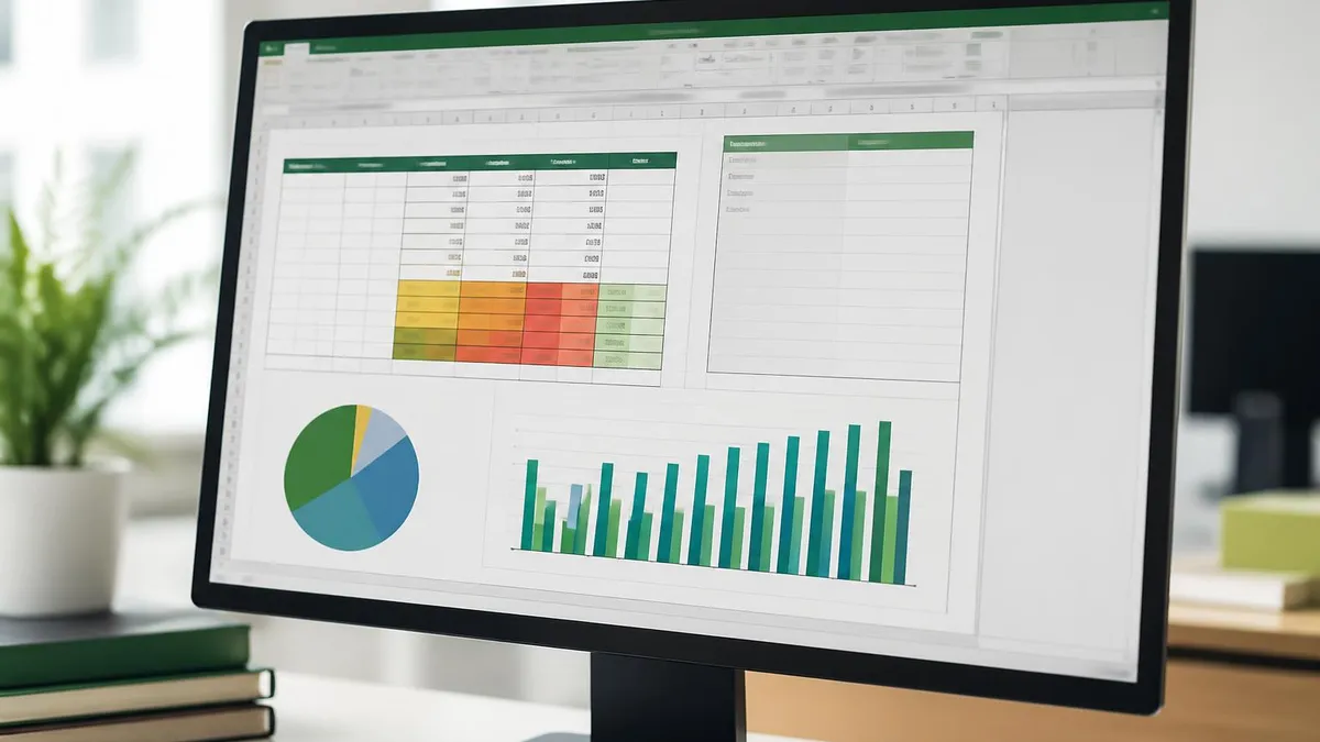
You opened a worksheet packed with numbers and now you need a chart that tells the story. That is what graphs in Excel are for. They turn rows of data into something a reader can scan in seconds. They also help you spot trends you would miss in a wall of digits.
The basic process has not changed in years. Pick a range, click Insert, choose a chart type, and Excel does the rest. The harder part is choosing the right chart and getting it to look clean.
A pie chart can flatten meaningful differences. A line chart can mislead if the axis starts above zero. Even the default colors can make a graph look busy. This guide walks through every step in plain language.
You will see how to select your data, choose the right chart, and format the final result for a report or a slide deck. You do not need any add-ins. The built-in tools in Excel for Windows, Mac, and the web all cover the same ground.
You will also see how to recover when something goes wrong. Maybe your axis labels disappear. Maybe a category got read as a number. Maybe a stacked bar chart suddenly flipped its series. Each of these has a fix, and most take less than a minute once you know where to look.
Most readers land on this guide with one specific need: a chart they can finish in the next ten minutes. That use case drives the structure here. The early sections cover the fastest path, including keyboard shortcuts that produce a chart in under a second. The middle sections cover chart-type selection in depth.
The later sections cover sharing, exporting, and the small accessibility wins that separate amateur charts from professional ones. Skim or read in order. Either approach works.
Excel Charting at a Glance
Before you click Insert, take a minute on the data itself. Excel reads the top row as labels for each series and the leftmost column as labels for each category. If your headers are missing or your numbers are stored as text, the chart will look strange.
Fix the source first. Highlight the column, check the Number group on the Home tab, and convert text-numbers to real numbers using a Paste Special multiply by 1 trick. The small green triangle in the corner of the cell also offers a quick conversion.
Keep your range tight. Select only the cells you want plotted. If you leave blank rows in the middle of the selection, Excel may add empty gaps to the chart.
If you include a total row, it will dwarf every other bar and squash the chart. Either delete totals from the selection or hold Ctrl and click to skip rows. A clean, contiguous block of numbers with one header row and one label column is the easiest input Excel can read.
Select the data range, including headers. Press Alt + F1 on Windows or Fn + Option + F1 on Mac. Excel drops a default column chart onto the same sheet. Done. To put it on its own sheet, press F11 instead.
This is the fastest way to sanity-check your data before you spend time formatting. If the auto-chart looks wrong, the data needs cleanup, not the chart.
Once you have the data sorted, the menu path is the same on every modern version. Go to the Insert tab on the ribbon. In the Charts group you will see icons for column, bar, line, pie, area, scatter, and a small dropdown for more.
Hover over each icon and Excel shows a live preview of how your selected data would look. This preview saves a huge amount of trial and error.
If you cannot tell which chart type is right, click the Recommended Charts button. Excel scans your data and suggests three or four options ranked by fit. Pick the one that reads cleanest and click OK.
The chart drops onto your worksheet as a floating object. You can drag it anywhere, resize it from the corners, or right-click and choose Move Chart to send it to its own dedicated sheet.
A separate sheet is useful when the chart is the final deliverable, because it stays large and easy to read no matter what zoom level you use on the data sheet.
Worth knowing: every chart in Excel is technically an embedded OLE object. That means it has its own internal data table, separate from your worksheet cells, even though it normally pulls from them. If you ever need to send a chart without the underlying data, copy the chart, paste it into a blank workbook, and right-click to choose Select Data.
You can then break the link to the original file. The chart will keep its current values frozen, like a snapshot. Handy when you need to share a chart with someone who should not see the raw numbers.
The Most Useful Excel Chart Types
Vertical bars. Best for comparing values across a small number of categories. The default chart for a reason, and the safest pick when you are not sure what to use.
Horizontal bars. Use this when category names are long or when you have many categories to stack on one screen. Easier to read than a column chart with rotated labels.
Connected points over time. The right choice for monthly sales, daily temperatures, or any continuous trend that has a real time axis.
Parts of a whole. Use only with 2 to 5 slices and clear percentage differences. Avoid for serious analysis because slices are hard to compare by eye.
Two numeric variables plotted as dots. Great for correlation work: height vs. weight, ad spend vs. revenue, or any pair of measurements.
Mixes columns and lines on one chart with a secondary axis. Perfect for sales bars plus a growth-rate line, or volume bars plus a price line.
The single most common mistake is picking the wrong chart type. A pie chart with eight slices is harder to read than a simple bar chart with the same numbers.
A line chart with categorical data, like product names on the x-axis, suggests a continuous trend that does not exist. Match the chart to the question the reader is going to ask.
If the question is which category is largest, use bars. If the question is how something changed over time, use a line. If the question is how two variables relate, use a scatter plot.
When you are stuck, take the lazy and effective route: insert a column chart first. Column charts work for almost any dataset, even if they are not always optimal.
They give you a quick, honest view of your data without misleading the reader. From there you can experiment by clicking Change Chart Type on the Chart Design tab to see the same numbers drawn as bars, lines, or area charts.

Step-by-Step by Chart Type
Select your data with one header row and one label column. On the Insert tab, click the column chart icon (vertical bars) for column or the bar chart icon (horizontal bars) for bar.
Choose the 2-D version unless you have a specific reason to use 3-D. Click the chart, then use the Chart Design tab to add a title, switch row/column if the axes are reversed, or apply a preset style.
To sort the bars largest to smallest, sort the source data on the worksheet itself. The chart will follow.
After the chart appears, formatting is where most people spend the bulk of their time. The right panel that opens when you click a chart element is your control center.
Click the axis, the bars, or the title, and the panel updates to show every option for that specific element. You can change colors, fonts, gridlines, number formats, and rotation angles.
Two shortcuts save time. First, the green plus icon next to a selected chart toggles all the major elements: title, legend, data labels, gridlines, error bars, and trendlines.
Tick or untick to add or remove instantly. Second, the paintbrush icon next to the plus offers preset styles and color palettes. Cycling through these is often faster than designing from scratch.
For business reports, keep formatting minimal. Remove the chart border, lighten the gridlines, use one or two colors instead of a rainbow, and make the title descriptive.
Instead of "Sales", try "Q3 Sales Doubled From Q2". A chart title that states the conclusion saves your reader five seconds. The legend can usually be deleted when there is only one series.
One often-missed setting is the gap width on column and bar charts. The default gap is wide enough that bars look skinny, especially with many categories. Right-click any bar, choose Format Data Series, and slide the Gap Width down to about 50 percent.
The bars get chunkier, the chart feels more solid, and small differences become easier to spot. For stacked charts, also check the Overlap slider. Set it to 100 if you want a clean stack, or to a negative value if you want a clustered look with gaps between series.
If your y-axis starts at 90 instead of 0, small differences look huge. This is sometimes useful for showing tight variation, but it can mislead readers. Right-click the axis, choose Format Axis, and check the Minimum value under Bounds. Set it to 0 for honest comparisons.
Only change it when you have a clear reason and label it visibly so the reader knows the scale is not standard.
Data labels can make or break a chart. Without them, the reader squints at the axis to estimate values. With too many, the chart turns into a wall of numbers.
The sweet spot is usually labels on the most important series only, or labels on just the highest and lowest points. To add labels, click the green plus icon, hover Data Labels, click the right arrow, and choose a position.
Outside end works for column charts, center works for stacked bars, above works for line charts. To label only specific points, click the data series once to select all points, click again to select just one, then right-click and choose Add Data Label.
Number formatting on labels matters more than people expect. A label that reads 1234567 is harder to scan than 1.2M.
Right-click any data label, choose Format Data Labels, expand Number, and pick a custom format like #,##0,K for thousands or #,##0,,M for millions. The same format codes work on axis labels.
One more labeling trick: callouts. In modern Excel, when you add data labels, look for the Callout option in the position menu. It places each label inside a little bubble with a leader line pointing to the data point. This is especially useful for line charts where the labels would otherwise overlap.
The callouts auto-position to avoid collisions, and the leader lines make it obvious which label belongs to which point. Use sparingly — they add visual weight and can clutter a chart with many points.

Pre-Publish Chart Checklist
- ✓Chart type matches the question being asked
- ✓Title states the conclusion, not just the metric
- ✓Axes start at 0 unless there is a clear reason otherwise
- ✓Only one or two colors are used unless series demand more
- ✓Data labels are added where exact values matter
- ✓Gridlines are light gray or removed entirely
- ✓Legend is removed if there is only one series
- ✓Numbers are formatted with thousands separators or K/M suffixes
- ✓Source note is added below the chart if data is external
- ✓Chart is readable when printed in black and white
One feature that saves enormous time on recurring reports is the chart template. Once you have formatted a chart exactly the way you want it, right-click the chart and choose Save as Template.
Give it a name and Excel stores it in your user folder. Next time you need the same look, select your data, go to Insert, click any chart icon, choose All Charts, and you will see a Templates folder near the top of the list.
One click and your new data is dressed in the same fonts, colors, and layout as last month's report. Huge time saver for weekly or monthly reporting.
The same idea applies to chart styles within a single workbook. If you have a deck with twelve charts and the boss asks you to change the color palette, you do not have to edit each one.
Select one chart, copy it, select the next chart, and use Paste Special as Formats Only. Each chart inherits the styling without losing its own data.
For a workbook-wide change, edit the underlying theme on the Page Layout tab. Every chart in the file will redraw to match.
If you need to apply a chart template to charts that already exist, you can. Right-click the chart, choose Change Chart Type, click the Templates folder on the left, and pick your saved template. The chart adopts the template's look while keeping its own data.
This is much faster than rebuilding charts from scratch. It also keeps formatting consistent across a long document with many charts. Define one template, apply it everywhere, and any future tweaks happen in one place.
Excel Charts Pros and Cons
- +Built into software you already own and know
- +Data and chart live in the same file, easy to share
- +Fast for one-off analysis and ad-hoc reporting
- +Full control over every visual element
- +Templates and themes speed up recurring reports
- −Hard to scale beyond a few thousand rows of data
- −Limited interactivity compared to Power BI or Tableau
- −Manual refresh unless you build proper data connections
- −Charts can break when source ranges shift
- −Collaboration is clunky compared to web-native tools
Sharing the chart is the last step and the one that most often goes sideways. If you copy a chart from Excel and paste it into Word or PowerPoint, you have several paste options.
The default behavior in modern Office is to paste a live link. The chart in your document will update when the Excel file changes, which sounds great until you email the document and the recipient does not have your file.
To avoid surprises, use Paste Special and choose Picture for a static image or Microsoft Excel Chart Object for an embedded copy that travels with the document.
For external reports, exporting the chart as a PNG is the safest bet. Right-click the chart, choose Save as Picture, and pick PNG for clean edges or JPG for smaller files.
When the chart is going on a web page or into a presentation that will be projected, double the font size. What looks fine on your monitor at arm's length becomes unreadable at the back of a conference room.
Excel makes this easy. Click the chart, then on the Home tab bump the default font from 10 to 14 or 16 points. The chart elements scale together so the proportions stay right.
Excel Questions and Answers
Practice is the only thing that turns the menu of options into muscle memory. Open any small dataset you have at hand, even a list of your monthly expenses, and try inserting each chart type in turn.
Pay attention to which one tells the story best with the least effort from the reader. You will start to recognize that a column chart is almost always the safest default, that line charts demand a real time axis, and that pie charts deserve a high bar before you reach for them.
For more structured practice on Excel features used in business and certification exams, take a few free practice tests. They cover formulas, formatting, pivot tables, and yes, charts.
Working through realistic questions surfaces gaps you would not notice in your own daily files. After a couple of sessions you will move through the chart-building process without thinking, which is exactly when Excel stops being a chore and starts being useful.
Keep this guide handy the next time you need to build a chart under pressure. The keyboard shortcuts alone, Alt+F1 for an instant chart and F11 for a chart sheet, will save you minutes on every report.
The formatting rules, especially keeping the y-axis honest and writing a conclusion-based title, will save you from the kind of small mistakes that get reports kicked back. Master those two layers and you are ahead of most people who use Excel every day.
One last tip worth remembering: when something goes wrong with a chart, the right-click menu is your first stop. Right-click anywhere on the chart — the plot area, a data series, an axis, a label — and the context menu shows exactly the actions relevant to that element.
Format options, data selection, axis settings, and chart type changes are all one right-click away. Most Excel users navigate charts entirely through ribbon tabs and miss how much faster the context menu is. Train yourself to right-click first.
About the Author
Attorney & Bar Exam Preparation Specialist
Yale Law SchoolJames R. Hargrove is a practicing attorney and legal educator with a Juris Doctor from Yale Law School and an LLM in Constitutional Law. With over a decade of experience coaching bar exam candidates across multiple jurisdictions, he specializes in MBE strategy, state-specific essay preparation, and multistate performance test techniques.