How to Add Axis Labels in Excel (Every Version, Step by Step)
Learn how to add axis labels in Excel in 6 seconds. Step-by-step for 2016, 2019, 2026, 365, Mac & Online. Includes formatting tips and FAQs.

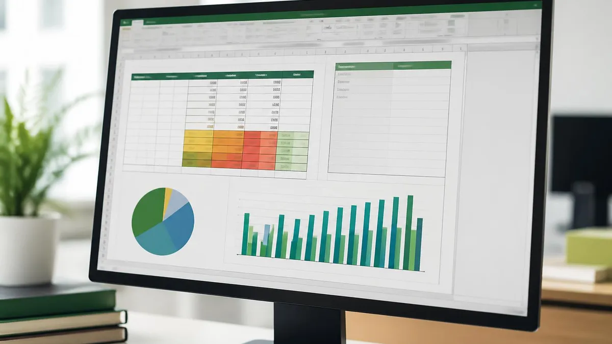
Charts without axis labels are like maps without legends. You can guess what the lines mean, but you shouldn't have to. Adding axis labels in Excel takes about six seconds once you know where to look, and the payoff is huge — your charts suddenly communicate something instead of just decorating a spreadsheet.
This walkthrough covers every version of Excel from 2016 through Microsoft 365, plus Excel for Mac and Excel Online. Whether you're prepping a board deck, a school project, or a quick analysis for your boss, the steps below will get clean, professional labels onto your X and Y axes — and keep them there when you change chart types or update data.
We'll also handle the edge cases that trip people up: secondary axes, rotated text, dynamic labels that pull from cells, and the dreaded missing Chart Elements button. By the end you'll know not just how to add axis labels but why certain choices read better than others for the people viewing your chart.
Why Axis Labels Matter
Before clicking anything, take a second to think about what your axes actually represent. The X axis is almost always your categories — months, products, regions, names. The Y axis is your values — sales, counts, percentages, scores. Strong labels include a unit of measurement: Revenue (USD), Temperature (°F), Response Time (ms). Without units, viewers have to guess, and guessing causes mistakes.
Also worth noting: a chart title and an axis label do different jobs. The title tells the story ("Q3 Revenue by Region"), while the axis label nails down what's being measured ("Revenue (millions USD)"). Don't repeat the title in the axis label — it's wasted real estate.
Quick path for most users
Click your chart, then click the green plus icon (Chart Elements) that appears to the right. Tick the Axis Titles checkbox. Two label boxes appear — type into them. Done. This three-click workflow takes about six seconds once it's in your muscle memory, and it works across every chart type Excel supports — column, bar, line, area, scatter, and combination charts. Hold this method as your default and reach for the longer ribbon route only when the icon isn't available.
That green plus icon is hands-down the fastest route. But it only shows up in Excel 2013 and later for Windows, and Excel 2016 and later for Mac. If you're on an older version, or if the icon is missing because you've customized your ribbon, the long way through the Chart Design tab works in every release.
Below we'll walk through all three methods, then handle every version-specific quirk you might run into. The methods produce identical results — pick whichever feels most natural in your workflow.
Three Ways to Add Axis Labels
Click chart, click green +, tick Axis Titles. Works in Excel 2013+ Windows and 2016+ Mac. Fastest method.
Click chart, go to Chart Design tab, click Add Chart Element, choose Axis Titles. Universal across versions.
Right-click the axis itself, pick Add Axis Title. Less common but useful when the ribbon is hidden.
Click chart, open Chart menu in toolbar, select Axis Titles. Slightly limited but reliable for browser work.
Method 1 wins on speed for daily use. You don't have to scroll through ribbons or hunt for submenus — three clicks and you're typing. The downside? The green plus icon disappears if you click outside the chart, so you need to keep the chart selected.
Method 2 lives in the Chart Design tab (it shows up only when a chart is selected). Click Add Chart Element → Axis Titles → Primary Horizontal or Primary Vertical. You can also add labels to secondary axes from this same menu, which is handy when you're plotting two metrics on different scales.
Method 3 is a power-user favorite. Right-clicking directly on the axis line opens a context menu where Add Axis Title sits near the top. It's the quickest path if you're already hovering over the axis trying to format something else.
Steps by Excel Version

Once a label box exists, editing the text is just like editing any cell — click into it, type, press Enter or click away. You can also link the label to a cell so it updates dynamically. Click the label, click into the formula bar, type =Sheet1!$B$1 (or whatever cell holds your text), press Enter. Now changing the cell changes the label everywhere it appears.
Rotation matters too. Long horizontal axis labels often overlap. Right-click the label, choose Format Axis Title, then under Text Options → Text Box → set the custom angle. Most people rotate the Y axis label 90 degrees so it reads bottom-to-top, which is the convention in published charts.
When Excel adds an axis title, it inserts placeholder text like 'Axis Title'. Click once to select the box, then click again (or press F2) to edit. Pasting while the box is selected — not in edit mode — can replace the entire chart element instead of just the text. If you accidentally do this, hit Ctrl+Z immediately to undo and try again. The visual cue you're looking for is the flashing cursor inside the label box — that means you're safely in edit mode.
That placeholder issue catches people who copy text from elsewhere and paste straight in. Always enter edit mode first (double-click the placeholder or hit F2 after selecting). You'll see a flashing cursor — that's the safe state for pasting. Once you're in edit mode, Ctrl+V works exactly like in any cell. You can also paste with formatting stripped using Ctrl+Shift+V, which prevents weird font carryover from web pages or other documents.
Another classic snag: the label appears but it's tiny and unreadable. By default Excel uses a 10pt font, which looks fine on screen but disappears in printed reports or projected slides. Click the label, then bump the font to 12pt or 14pt from the Home tab. For presentation charts, 16pt is not too much. The rule of thumb is that axis labels should be readable from the back of the room when projected — if you'd squint, your audience will too.
Color matters as well. The default black works most of the time, but if your chart sits on a dark background, switch to white or a light gray. Keep the axis label color consistent with the axis tick labels — mismatched colors look unintentional. If you're matching corporate branding, grab the hex code from your style guide and apply it via Home → Font Color → More Colors → Custom. Excel remembers recently used colors in a small palette below the standard swatches, so you only do this lookup once per session.
Bold or non-bold? For most charts, keep axis labels in regular weight. Bold them only when the chart is going onto a busy slide with competing visual elements. Italic is almost never appropriate — it can suggest an annotation or a footnote rather than a definitive label. Stick to plain weight, sensible size, and a color that complements the rest of the chart, and your labels will quietly do their job without drawing attention.
Axis Label Checklist
- ✓Click the chart so it's selected (the ribbon shows Chart Design tab)
- ✓Click the green + icon or go to Chart Design → Add Chart Element
- ✓Choose Axis Titles, then pick Primary Horizontal or Primary Vertical
- ✓Click into the placeholder text box and type your label
- ✓Include a unit of measurement: (USD), (%), (ms), (count)
- ✓Set font size to at least 12pt for readability
- ✓Rotate the Y axis label 90 degrees if it's long
- ✓Optional: link the label to a cell with =Sheet1!$B$1
- ✓Preview the chart at full size before finalizing
Adding labels is half the battle — keeping them readable is the other half. Below is a quick comparison of common label choices so you can pick what works for your audience. Most reports look better with short, unit-bearing labels rather than verbose sentences, but there are cases where a longer label genuinely helps.

Label Style Pros and Cons
- +Short labels with units (e.g. 'Revenue (USD)') read instantly
- +Linking labels to cells keeps charts dynamic
- +Rotated Y axis labels save horizontal space
- +Consistent font sizes across charts look professional
- +Color matched to brand strengthens reports
- −Long descriptive labels crowd the plot area
- −Hardcoded labels go stale when data updates
- −Default 10pt font is too small for projection
- −Black labels disappear on dark chart backgrounds
- −Missing units force viewers to guess the scale
One more pro-tip worth mentioning: when you copy a chart to PowerPoint or Word, axis labels travel with it. They behave like part of the chart, not separate text boxes. That means editing the source cell in Excel will update the embedded chart in your slide deck — provided you pasted as a linked object, not a static image. For most reports this dynamic link is exactly what you want, because it eliminates the dreaded "the chart in the deck is out of date" problem that plagues every monthly business review.
If you're building a dashboard with many charts, consider standardizing your axis label style. Pick one font size, one color, one rotation convention, and stick to it across every chart. The eye picks up the pattern and reads the whole dashboard faster. Inconsistency feels sloppy even when each individual chart is perfectly labeled — your viewer's brain spends precious cycles re-orienting instead of absorbing the data. Set a style guide on day one, even if it's just a sticky note on your monitor: 12pt Calibri, dark gray, units in parentheses.
If you're using Excel for academic or technical work, axis labels need units in a specific format. Engineering convention is Quantity / unit, like Time / s or Mass / kg. Other fields prefer parentheses: Time (s). Check your style guide before defending your dissertation — the wrong format can earn you genuine annoyance from a thesis committee. Same goes for financial reporting: most US firms expect (USD millions) spelled out rather than just ($M), even though the latter is shorter. Know your audience.
A subtler point: axis labels are accessibility features. Screen readers announce them when a chart is encountered, which helps visually impaired users understand the data. Charts without labels become invisible to assistive technology. If your reports go to a wide audience — internal company-wide emails, public PDFs, government submissions — clear labels aren't just polish, they're compliance with accessibility standards. WCAG 2.1 guidelines explicitly call for meaningful labels on data visualizations.
Before finalizing any chart, paste it into the destination — Word, PowerPoint, PDF, or printout — and check the labels at full size. What looks crisp in Excel can shrink unreadably small once embedded. A 30-second preview saves a 30-minute fire drill later.
Worth pausing on a question we get a lot: should you label the axis itself or rely on the chart title? The answer comes down to redundancy versus clarity. A chart titled "Monthly Revenue 2026" with a Y axis labeled "USD" tells you two things in two glances. A chart titled "2026 Monthly Revenue (USD)" with no Y axis label forces you to keep referring back to the title. Most readers prefer the first arrangement — separate, complementary pieces of information rather than one overloaded title. Split the labor between title and axis label and your chart breathes more easily.
What about charts with multiple Y axes? Combination charts — bar plus line, for example — often need different units on the left and right. Label both. The left axis gets a Primary Vertical label, the right gets a Secondary Vertical label, and each carries its own units. Without those labels, the reader has no way to know which series belongs to which scale, and the chart effectively becomes unreadable.
Pie charts deserve a quick mention because they're the one chart type where axis labels don't apply — there are no axes. Instead, label the slices themselves with data labels: right-click any slice, choose Add Data Labels, then customize what shows (category name, value, percentage). The principle is the same as axis labels: tell the reader what they're looking at without forcing them to consult a separate legend.
Axis Label Workflow
Step 1: Select the chart
Step 2: Open Chart Elements
Step 3: Edit each label
Step 4: Format for readability
Step 5: Preview at final size
If you're collaborating on a shared workbook, axis labels can become a source of subtle conflicts. Two people editing the same chart at the same time may overwrite each other's labels without realizing it. Excel 365's co-authoring flags this, but earlier versions silently take the last edit. The safe practice is to assign chart ownership: one person per chart, and changes happen through that owner. It feels bureaucratic, but it prevents the awkward moment when your carefully formatted axis label gets replaced with someone's typo during a Friday afternoon push to finalize the deck.
One final touch: consider the export medium. A chart that lives in Excel forever has different label requirements than one destined for a PDF report, a printed handout, or a slide projected in a conference room. PDFs and prints can absorb finer detail; projected slides need bigger, bolder labels. If you know the destination ahead of time, build the chart to suit it.
If you don't, default to projected-slide readability — labels that work on a screen behind you will also work everywhere else. The reverse rarely holds true, so when in doubt, err on the side of bigger and bolder. Nobody has ever complained that a chart was too easy to read from across the room.
Excel Questions and Answers
If you walked through every step above, you now have three reliable methods for adding axis labels and a clear sense of which one to reach for. The green plus icon stays the fastest for daily use, the Chart Design ribbon is the universal fallback, and right-clicking the axis directly is the power-user shortcut. Pick one, get it into muscle memory, and your charts will start looking noticeably more polished by tomorrow.
The deeper takeaway is small but real: axis labels are tiny pieces of UX. They don't draw attention to themselves — they just quietly remove ambiguity. Charts with good labels get understood; charts without them get questioned. Every minute you spend writing a clean label saves five minutes of someone asking what the numbers mean. That ratio compounds across reports, presentations, and shared dashboards. Over a year of office work, the time saved is genuinely measurable.
One last thing worth practicing: build a few sample charts with deliberately bad labels, then fix them. Try a missing-unit label, a too-small font, a horizontal Y axis label that overlaps the values. Seeing the problem and the fix side by side teaches the habit faster than any tutorial. After ten minutes of practice you'll spot label problems in other people's charts instantly — and your own work will start looking like the polished decks you've been admiring on LinkedIn.
For anyone preparing for Excel certification or workplace assessments, mastering chart formatting is one of the highest-value skills you can build. Hiring managers don't ask candidates to write complex VBA on day one. They ask for clean, readable reports — and axis labels are a tiny but visible signal that someone knows what they're doing. Spend an afternoon making twenty charts with strong labels and the muscle memory will carry you for years.
If you're teaching someone else Excel, walk them through axis labels early — before pivot tables, before VLOOKUP, before macros. Charts are visible and motivating. A learner who can produce a polished chart on day one stays engaged for week two. Skip the labels and they'll wonder why their charts look amateur compared to the slides their boss sends around. The labels are the difference between a chart that says "I'm new at this" and a chart that says "I know what I'm doing."
Choose to be in the second camp. Ten minutes of practice today saves you from a thousand awkward moments later. The bar for clean axis labeling is genuinely low — most spreadsheets in the wild fail it. Clearing that bar puts your work in a noticeably better tier without any extra effort beyond what you've just learned. That's a rare and easy win in any office workflow.
About the Author
Attorney & Bar Exam Preparation Specialist
Yale Law SchoolJames R. Hargrove is a practicing attorney and legal educator with a Juris Doctor from Yale Law School and an LLM in Constitutional Law. With over a decade of experience coaching bar exam candidates across multiple jurisdictions, he specializes in MBE strategy, state-specific essay preparation, and multistate performance test techniques.