Excel Gantt Chart Templates — Complete Guide (2026 July)
Excel Gantt chart templates explained — free downloads, stacked-bar method, conditional formatting build, and Excel vs MS Project comparison. ✍🏼

Excel Gantt chart templates save hours. You'll learn five free templates worth downloading, two build-from-scratch methods (stacked-bar and conditional formatting), and the honest answer on when Excel beats Microsoft Project — and when it doesn't. No fluff. Just the workflow project managers actually use.
Excel Gantt Chart Templates: The Real Project Manager's Guide
Project managers waste hours rebuilding the same chart. They shouldn't. A solid excel templates library covers 80% of project scheduling needs, and Gantt charts sit at the top of that list. The right template — downloaded once, customized in five minutes — replaces a week of formatting work. That's not an exaggeration. Try building a 30-task Gantt from a blank sheet and time yourself.
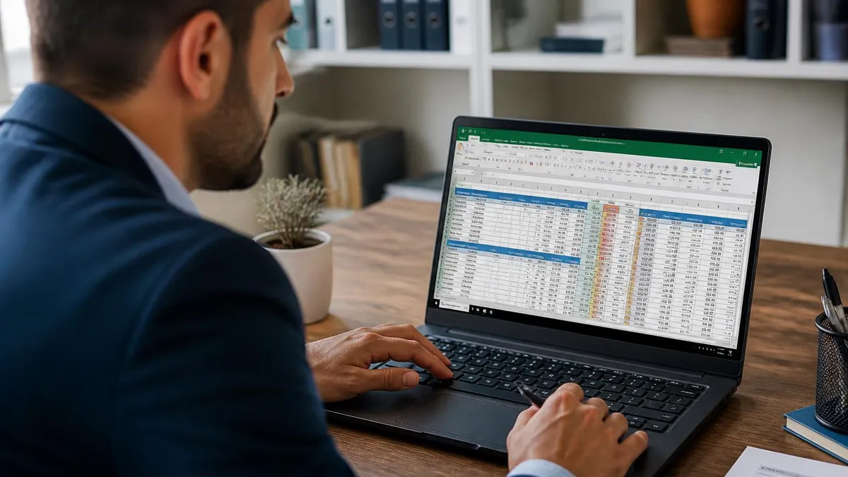
Here's the thing: most people open Excel, search the template gallery, pick the first Gantt chart they see, and immediately fight it. Dates don't align. Bars float wrong. Conditional formatting breaks when they add a row. That's because Gantt templates aren't all built the same. Some use stacked bar charts. Others use conditional formatting on a date grid. A few use VBA macros (avoid those unless you genuinely need them).
This guide walks through both major methods, lists five free downloads worth your time, and compares Excel Gantt charts to dedicated software like Microsoft Project. By the end, you'll know which approach fits your project — a two-week sprint, a six-month construction job, or a year-long product launch. We'll also cover the build-from-scratch process for both methods, because no template ever quite matches what you actually need.
Worth knowing: Excel handles projects up to about 50 tasks comfortably. Past that, performance drags and the visual gets cramped. For anything larger, you're better off in Project, Smartsheet, or Asana. But under 50 tasks? Excel wins on portability, cost (free if you already own it), and learning curve. That covers the vast majority of business projects — marketing campaigns, product launches, internal initiatives, and most construction work under six months.
One more thing before we dive in. If your project involves financial tracking alongside scheduling, you'll want to pair your Gantt with a budget sheet. The excel budget template pattern works great as a companion tab in the same workbook — link your task dates to budget milestones with simple cell references. Two tabs. One workbook. Schedule and money in the same view.
Quick reality check before we start: there's no "best" Gantt template. There's only the template that matches your specific project. Daily granularity or weekly? Static print version or live dashboard? Five tasks or fifty? Those answers point you to different templates and different build methods. Skim the next section to spot the type that fits.
Five Excel Gantt Chart Template Types
Two to four weeks. 10-15 tasks max. Daily granularity. Best for agile sprints, small launches, marketing campaigns.
Multi-month projects with dependencies, milestones, and resource columns. Heavier formatting. Often includes critical path highlighting.
Three to twelve months. Phase-based grouping with collapsible task lists. Color-coded by team or workstream.
Uses Excel's native bar chart with start date + duration. Cleanest visual. Easiest to share as a static image or PDF.
Date grid with cells that fill based on task start and end dates. Updates dynamically. Great for resource-heavy schedules.
Free Excel Gantt Chart Templates Worth Downloading
You don't need to pay for a Gantt template. Microsoft, Vertex42, Smartsheet, and a handful of community creators offer solid free versions. The trick is picking one that matches how you actually work — not the one with the slickest screenshots. Polish doesn't equal function. Some of the ugliest templates have the cleanest formulas underneath.
1. Microsoft's Built-In Gantt Template
Open Excel. File → New → search "Gantt." Microsoft includes a default project planner that uses conditional formatting on a weekly grid. It's basic but it works. Strengths: zero setup, integrates with your Microsoft 365 account, syncs through OneDrive. Weakness: weekly granularity only. If you need daily-level detail, you'll have to rebuild the date row. Worth opening just to see the formula pattern Microsoft uses — it's a reasonable starting point you can fork.
2. Vertex42 Project Schedule
Vertex42's template uses a stacked bar chart approach. It's been around for over a decade and remains one of the most downloaded Excel files on the internet. The chart auto-updates when you change task dates. Dependencies aren't visual (no arrows between bars) but you can fake them with a "depends on" column. Vertex42 also includes a printable version sized for letter paper, which matters more than people admit when you're presenting to clients who still print everything.
3. Smartsheet Free Excel Download
Smartsheet offers an Excel version of their Gantt template as a lead magnet. It's well-built — better than most free options. Conditional formatting is clean, and they include sample data so you can see how the formulas work before deleting it. Just expect marketing emails afterward. The template itself is yours forever though, regardless of whether you ever sign up for the paid product.
4. Office Timeline Gantt Template
Office Timeline (a PowerPoint plugin company) has a free Excel version. It's PowerPoint-export-friendly, so if you regularly present Gantts to executives, this template saves the conversion step. The visual style leans more toward roadmap than detailed schedule — fewer rows, bigger bars, less text. Good for executive summary views, less good for active project tracking.
5. Community-Built Templates on Reddit and Spreadsheets Forums
The r/excel subreddit and the MrExcel forum have user-submitted Gantt templates that are often better than commercial options. They handle edge cases (vacation days, partial-week tasks, multi-resource bars) that polished templates skip. Search either community for "Gantt" and sort by upvotes. The top three results consistently outperform paid templates.
Quick filter tip: before downloading any template, open it and check the named ranges (Formulas → Name Manager). If it has fewer than 5 named ranges, it's probably a static design with no formula logic. Those break the moment you add a row. Templates built on named ranges scale up. Templates built on hardcoded cell references don't.
Excel Gantt by the Numbers
How to Build a Gantt Chart in Excel From Scratch
Templates are great. But sometimes you need a custom Gantt — odd date ranges, unusual milestone styling, a chart that fits exactly inside one printed page. Here's the cleanest from-scratch method using the stacked-bar approach. Five minutes if you've done it before. Fifteen the first time. Worth doing once even if you plan to use templates forever — understanding the underlying mechanic makes you better at fixing templates when they break.
Open a blank workbook. Create five columns: Task Name, Start Date, Duration (in days), End Date, and a calculated "Days Complete" column for progress tracking. The End Date column should be a simple formula: =B2+C2. That keeps everything driven by start and duration — change one, the rest updates. Avoid hardcoding end dates. Hardcoding dates is the single biggest reason Gantt charts fall out of sync with reality.
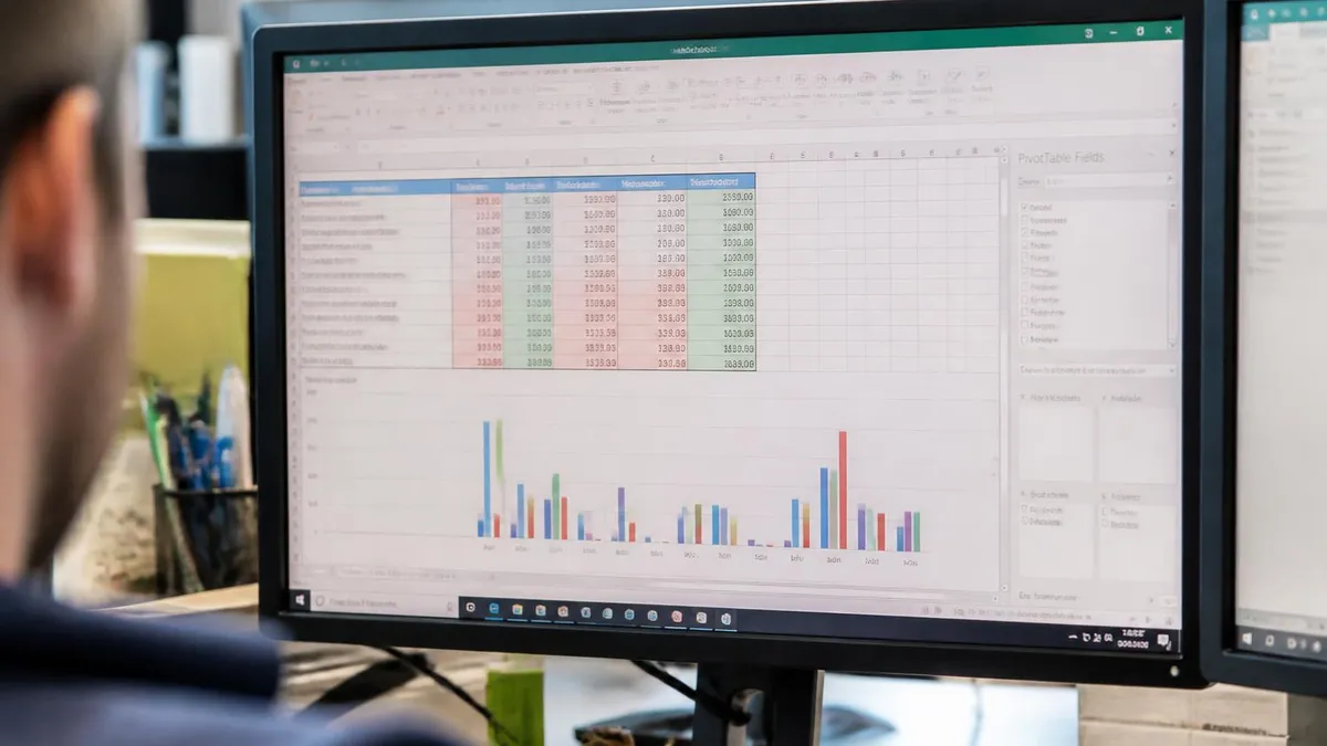
Next, insert a stacked bar chart. Highlight the task names and start dates. Insert → Chart → Bar → Stacked Bar. You'll get a chart with task names on the Y-axis and dates on the X-axis. The bars all start at zero, which looks wrong. That's the next fix. The bars are stretching from January 1900 (Excel's date origin) to your task end dates, which is why everything looks compressed against the right edge.
Add a second data series for Duration. Right-click the chart → Select Data → Add. Series name: "Duration." Series values: your Duration column. Now you have two bars per task: one for Start Date (which you'll hide) and one for Duration (your actual Gantt bar). The Duration bar stacks on top of the Start Date bar — which is exactly what you want, because the Start Date bar is about to become invisible.
Hide the Start Date series. Click any blue bar → Format Data Series → Fill: No Fill, Border: No Line. Suddenly your chart looks like a real Gantt. Reverse the task order so the first task appears at the top — right-click Y-axis → Format Axis → check "Categories in reverse order." That's the standard direction Gantt charts read. Top-to-bottom in time order. Anything else confuses readers, even technically-trained ones.
One last polish: link the X-axis to your actual project dates. Right-click X-axis → Format Axis → Minimum: paste your earliest start date (as a number — Excel stores dates as serial numbers, so 45000 is around May 2023). Set Maximum to your latest end date. The chart now spans only the project range, not 1900 to 2099. Format the axis labels as dates while you're there — Format Axis → Number → Date → pick your preferred format (DD/MM or MM/DD depending on region).
Build Steps in Order
Step 1
Step 2
Step 3
Step 4
Step 5
Step 6
Step 7
Step 8
Conditional Formatting Gantt: The Formula-Driven Method
The stacked-bar method gives you a real chart. The conditional formatting method gives you a grid that fills in as dates pass. Both are valid. Conditional formatting wins when you want everything in one view — task list, dates, and visual schedule — without flipping between a sheet and a chart object. It also prints better, because the schedule is just cells, not an embedded chart object that resizes weirdly across page breaks.
Set up a header row across the top with sequential dates. Day 1, Day 2, Day 3... or week 1, week 2... whatever your granularity. Below that, your task list with Start Date and End Date columns. The grid to the right of those columns is where the magic happens. Pick your column width carefully — narrow columns (around 3 units) let you fit more dates on screen, but text becomes unreadable in the header row. Wider columns (8-10 units) read well but limit how far the schedule extends.
Select the empty grid cells (the area to the right of End Date that spans all your date columns). Home → Conditional Formatting → New Rule → "Use a formula to determine which cells to format." Enter this formula: =AND(F$1>=$D2,F$1<=$E2) — where F$1 is the first date header and $D2 / $E2 are your Start and End Date columns. The dollar signs lock the right references. Get the dollar signs wrong and the formatting either won't apply or will apply to every cell uniformly.
Pick a fill color (light blue works) and click OK. Cells in the grid that fall between each task's start and end date now fill automatically. Add a row, the formatting extends. Change a date, the bar shifts. No chart needed. This is the moment most people realize how much faster Excel is than they thought — the entire schedule rebuilds itself in real-time as you edit dates.
For progress tracking, layer a second conditional formatting rule with a darker color and a % Complete reference. The formula gets longer but the principle is the same: compare the column date against task start, end, and completion percentage. Conditional formatting layers stack — the most specific rule wins. Order matters. Put the "completed portion" rule above the "task duration" rule in the Manage Rules dialog, otherwise both colors blend instead of stacking cleanly.
This method handles up to about 200 tasks before Excel feels sluggish, which is double what the chart method allows. Trade-off: it doesn't export to PowerPoint cleanly. If your audience needs slides, stack-bar wins. If your audience uses the workbook directly, conditional formatting wins. Either way, this stays inside microsoft excel — no add-ins, no plugins, no licenses beyond what you already own. Same workbook, same formulas, same shortcuts you already use.
Stacked-Bar vs Conditional Formatting Comparison
Best for presentations, executive reviews, and one-page schedule prints. The chart is a separate object you can copy into PowerPoint or Word. Looks polished out of the box.
Strengths: exports cleanly, professional look, handles up to ~50 tasks, easy to color-code by team. Weaknesses: chart drifts when you add rows in the source data, requires manual axis adjustment for date ranges, dependencies aren't visual.
Excel Gantt vs Microsoft Project: When to Switch
Bottom line: under 50 tasks, Excel wins. Over 100 tasks, Microsoft Project wins. Between 50 and 100, it depends on what features you actually use. Most project managers underestimate how often they're in the 20-40 task range. That's the sweet spot where Excel stays simple and Project feels like overkill.
Microsoft Project handles dependencies natively. You draw an arrow from Task A to Task B, and if A slips, B slips automatically. Excel can't do this without VBA. If your project has more than a handful of dependent tasks, you're rebuilding the schedule manually every time something changes. That's where Excel falls apart. The pain isn't building the chart once — it's maintaining it weekly as reality shifts.
Resource leveling is another big gap. Project automatically detects when you've assigned one person to two overlapping tasks and warns you. Excel doesn't. You'll spot the conflict only when the person tells you they can't do both at once. For projects with 5+ named resources, this matters. For a solo or two-person project, it doesn't.
Cost? Microsoft Project Online runs around $10-$55 per user per month depending on the tier. Excel comes bundled with Microsoft 365 you probably already have. For a one-off project, Excel saves real money. For ongoing program management, Project pays for itself in week one. The math flips fast once you're running multiple concurrent projects.
Learning curve favors Excel by a huge margin. If you already know excel formulas, building a Gantt is an afternoon. Microsoft Project has its own logic, its own ribbon, and its own way of thinking about tasks and resources. Three days to feel comfortable, three weeks to feel fluent. Most teams who buy Project never actually master it. They use 20% of the features and pay for 100%.
One sneaky alternative: pair Excel for the schedule with a separate tool for dependencies. Some teams use Excel for the visual Gantt (because everyone can open it) and Asana or Trello for the dependency tracking and notifications. That hybrid setup works well for distributed teams where not everyone has a Project license. The Gantt becomes the executive-facing artifact; the work tracker is operational. Both stay in sync because the Gantt is a snapshot, updated weekly, of what the work tracker already shows.

Excel Gantt vs Microsoft Project
- +Free if you own Microsoft 365 — no extra license
- +Anyone can open it — no software install required
- +Easy to customize colors, columns, and layout
- +Exports cleanly to PowerPoint and PDF
- +Familiar interface — minimal learning curve
- +Great for projects under 50 tasks
- +Works offline, online, on Mac, on iPad
- −Native dependency arrows between tasks
- −Automatic resource conflict detection
- −Built-in critical path calculation
- −Handles 1000+ tasks without performance issues
- −Baseline vs actual comparison reports
- −Better suited for ongoing program management
- −Costs $10-$55 per user monthly
Download Tips and Best Practices for Free Templates
Free Gantt templates have a quality range. Some are excellent — clean formulas, smart conditional formatting, sensible defaults. Others are dressed-up trash that breaks the moment you customize them. Here's how to vet a template before you commit your project data to it. Five minutes of inspection saves hours of debugging.
First, open the file and unhide all sheets. Right-click any tab → Unhide. Bad templates hide working sheets to make the front look clean. If you see hidden tabs full of calculations, that's actually fine — that's how good templates separate display from logic. If you see hidden tabs full of marketing content or instructions, the template is bloated. Delete those bloat sheets before you start customizing. They slow down save times and add visual noise.
Check the cells under your date headers. Are they formulas referencing your task start and end dates? Good. Are they hardcoded fills with no formula? Bad — you'll be re-coloring cells by hand every time something changes. Click into a filled cell and look at the formula bar. If it shows a value (like the date), the cell is hardcoded. If it shows a formula starting with =, the cell is dynamic. You want dynamic.
Look at the Name Manager (Formulas → Name Manager). Solid templates have 5-15 named ranges with clear names like TaskList, StartDates, ProjectStart. Templates with zero named ranges or names like RangeA, X1, tempo are usually held together with duct tape. Named ranges signal that someone built the template with maintenance in mind — not just appearance.
Test the template before importing your real data. Add a row. Delete a row. Change a date. Does everything update? Or does the formatting break? Run these three tests in five minutes — they'll save you hours of debugging later. Bonus test: try copying the entire workbook to a different folder and opening it. Some templates have absolute file-path references that break when moved.
Finally, save a clean copy before you start. Save As → "ProjectName-Gantt-MASTER.xlsx." If you make a mess of the formulas later (and you might), you can re-download the structure from your master without rebuilding from the original template. This habit alone saves about an hour per project on average. Same principle works for any excel spreadsheet you plan to customize heavily — keep an untouched master before you start editing. Future-you will thank present-you for the discipline.
Pre-Project Gantt Setup Checklist
- ✓Define project start and end dates before opening Excel
- ✓List all major tasks — aim for 20-40 for a typical project
- ✓Identify task durations in days, not hours
- ✓Flag dependencies explicitly (Task B can't start until Task A ends)
- ✓Pick stacked-bar method for presentations or conditional formatting for tracking
- ✓Save a clean MASTER copy before customizing
- ✓Test add-row, delete-row, change-date before importing real data
- ✓Add a % Complete column even if you don't track it yet
- ✓Color-code by team or workstream, not by priority
- ✓Set X-axis min and max to your actual project range
- ✓Save final version as .xltx template for next project
Excel Project Tools Cost Comparison
Microsoft Excel Practice Test Questions
Prepare for the Microsoft Excel exam with our free practice test modules. Each quiz covers key topics to help you pass on your first try.
Microsoft Excel Excel Basic and Advance
Microsoft Excel Exam Questions covering Excel Basic and Advance. Master Microsoft Excel Test concepts for certification prep.
Microsoft Excel Excel Formulas
Free Microsoft Excel Practice Test featuring Excel Formulas. Improve your Microsoft Excel Exam score with mock test prep.
Microsoft Excel Excel Functions
Microsoft Excel Mock Exam on Excel Functions. Microsoft Excel Study Guide questions to pass on your first try.
Microsoft Excel Excel MCQ
Microsoft Excel Test Prep for Excel MCQ. Practice Microsoft Excel Quiz questions and boost your score.
Microsoft Excel Excel
Microsoft Excel Questions and Answers on Excel. Free Microsoft Excel practice for exam readiness.
Microsoft Excel Excel Trivia
Microsoft Excel Mock Test covering Excel Trivia. Online Microsoft Excel Test practice with instant feedback.
Microsoft Excel Advanced Data Analysis Tools
Free Microsoft Excel Quiz on Advanced Data Analysis Tools. Microsoft Excel Exam prep questions with detailed explanations.
Microsoft Excel Advanced Formula and Macro...
Microsoft Excel Practice Questions for Advanced Formula and Macro Creation. Build confidence for your Microsoft Excel certification exam.
Microsoft Excel Advanced Formulas and Macros
Microsoft Excel Test Online for Advanced Formulas and Macros. Free practice with instant results and feedback.
Microsoft Excel Basic and Advance Question...
Microsoft Excel Study Material on Basic and Advance Questions and Answers. Prepare effectively with real exam-style questions.
Microsoft Excel Creating and Managing Charts
Free Microsoft Excel Test covering Creating and Managing Charts. Practice and track your Microsoft Excel exam readiness.
Microsoft Excel Data Visualization with Ch...
Microsoft Excel Exam Questions covering Data Visualization with Charts. Master Microsoft Excel Test concepts for certification prep.
Microsoft Excel Formulas and Functions
Free Microsoft Excel Practice Test featuring Formulas and Functions. Improve your Microsoft Excel Exam score with mock test prep.
Microsoft Excel Formulas and Functions App...
Microsoft Excel Mock Exam on Formulas and Functions Application. Microsoft Excel Study Guide questions to pass on your first try.
Microsoft Excel Formulas Questions and Ans...
Microsoft Excel Test Prep for Formulas Questions and Answers. Practice Microsoft Excel Quiz questions and boost your score.
Microsoft Excel Functions Questions and An...
Microsoft Excel Questions and Answers on Functions Questions and Answers. Free Microsoft Excel practice for exam readiness.
Microsoft Excel Managing Data Cells and Ra...
Microsoft Excel Mock Test covering Managing Data Cells and Ranges. Online Microsoft Excel Test practice with instant feedback.
Microsoft Excel Managing Tables and Data
Free Microsoft Excel Quiz on Managing Tables and Data. Microsoft Excel Exam prep questions with detailed explanations.
Microsoft Excel Managing Tables and Table ...
Microsoft Excel Practice Questions for Managing Tables and Table Data. Build confidence for your Microsoft Excel certification exam.
Microsoft Excel Managing Worksheets and Wo...
Microsoft Excel Test Online for Managing Worksheets and Workbooks. Free practice with instant results and feedback.
Microsoft Excel MCQ Questions and Answers
Microsoft Excel Study Material on MCQ Questions and Answers. Prepare effectively with real exam-style questions.
Microsoft Excel Questions and Answers
Free Microsoft Excel Test covering Questions and Answers. Practice and track your Microsoft Excel exam readiness.
Excel Questions and Answers
Related Excel Guides


About the Author

Business Consultant & Professional Certification Advisor
Wharton School, University of PennsylvaniaKatherine Lee earned her MBA from the Wharton School at the University of Pennsylvania and holds CPA, PHR, and PMP certifications. With a background spanning corporate finance, human resources, and project management, she has coached professionals preparing for CPA, CMA, PHR/SPHR, PMP, and financial services licensing exams.