
Best Ways to Create Custom Pivot Charts in Excel: Layouts, Combo Charts, Slicers, and Refresh-Proof Styling
Best ways to create custom pivot charts in Excel: build the table first, pick the chart type, add combo axes, slicers and timelines, keep styling on refresh ✅

A pivot chart is the fastest way to turn a pivot table into something a manager will actually read, but the default chart Excel produces is rarely the one you want. It picks a clustered column layout, stacks every field it can find, and leaves the gray field buttons on the canvas. The best ways to create custom pivot charts in Excel start from that default and reshape it deliberately: the right chart type per measure, a clean layout, slicers for interaction, and formatting that survives a refresh.
This guide walks through the process in the order you will actually follow at work. It begins with building the pivot table that the chart will read, because a chart can only be as good as the fields behind it. It then covers chart type selection, combination charts with secondary axes, slicers and timelines, conditional styling, and the refresh-proof formatting tricks that keep your work intact when next month's data lands.
Everything here works in Microsoft 365, Excel 2021, and Excel 2019 on Windows. Excel for Mac supports pivot charts since 2019 but hides a few options behind different menus, and those differences are noted where they matter. If you are new to pivot tables themselves, our guide to Excel pivot tables is the right place to start before you chart anything.
By the end you will be able to build a pivot chart that answers one question clearly, add controls that let a reader answer follow-up questions without touching the table, and save the result as a template you can reuse on the next dataset in minutes.
Pivot Charts by the Numbers

Build the Pivot Table the Chart Will Read
Every pivot chart is bound to a pivot table, and the field layout of that table dictates what the chart can show. Rows become the horizontal axis, Columns become the legend series, and Values become the plotted numbers. Before you insert a chart, arrange the table so the axis field has a sensible number of categories, ideally under fifteen, and the legend field has no more than five or six series. A chart with forty product lines in the legend is unreadable no matter how you style it.
Put the measure you care about most in Values first, because Excel plots the first value field on the primary axis. If you plan a combination chart, add the second measure now as well. Rename the value fields in the table, for example from Sum of Revenue to Revenue, since those names appear in the chart legend and axis titles exactly as written and are painful to fix later.
Sort the table before charting. Right-click a row label, choose Sort, and order by the value you are plotting. Bars sorted from largest to smallest read instantly; bars in alphabetical order force the reader to hunt for the biggest one. Sorting in the table carries into the chart and, unlike manual reordering, it holds after refresh.
Finally, group dates. Right-click any date in the Rows area and choose Group to roll daily records into months or quarters. A chart of 365 daily points is noise; the same data grouped by month is a trend you can act on. Grouping also creates the hierarchy that the timeline control uses later.
Choosing the Right Pivot Chart Type
Select any cell in the pivot table and press Alt+F1 to insert a default chart on the same sheet, or F11 to place it on its own chart sheet. Then open Change Chart Type on the Design tab and pick with intent. Clustered columns compare categories at one point in time. Lines show change over time and need a date field on the axis. Stacked columns show composition, and 100 percent stacked columns show share, which is the right choice when totals vary wildly between periods.
Pivot charts cannot be scatter, bubble, stock, treemap, sunburst, histogram, or waterfall charts. If you need one of those, build a regular chart from the pivot table's range using GETPIVOTDATA, or copy the values to a static range. Pie charts are allowed but rarely wise; a bar chart sorted by value does the same job with fewer misreadings.
Match the type to the question. Which region sold most last quarter is a sorted bar chart. How did sales move through the year is a line chart with months on the axis. What share of revenue came from each channel is a 100 percent stacked column. Deciding the question first and the chart second is the single habit that separates useful dashboards from decorative ones.
The same discipline applies to the number of series. Two lines on a chart are a comparison; eight lines are spaghetti. If the legend field has many members, filter the pivot to the top five with a Value Filter, or add a slicer so the reader chooses which series to show.
Custom Layouts: Combination Charts, Secondary Axes, and Field Buttons
A combination chart plots one measure as columns and another as a line, which is how you show revenue against margin percent or units against average price in one picture. Open Change Chart Type, choose Combo at the bottom of the list, and assign a chart type to each series. Tick Secondary Axis for the series whose scale is different, otherwise the percentage line hugs the floor beneath the revenue columns.
Keep combos to two measures. A third measure on the same chart forces a reader to track two axes and a legend at once, and the insight disappears. If you need three, build two charts that share a slicer.
Slicers and Timelines: Custom Interaction Without Formulas
Slicers are the feature that turns a pivot chart from a static picture into a small application. With the chart selected, choose Insert Slicer on the Analyze tab and tick the fields a reader should be able to filter, such as Region or Product Line. Each slicer appears as a panel of buttons; clicking one filters the pivot table and the chart together, and Ctrl-click selects several. Readers who would never open a filter dropdown will happily click a button.
A timeline is a slicer built for dates. Insert Timeline creates a horizontal bar that lets the reader drag across years, quarters, months, or days, and it only works if the field is a true date, which is another reason to fix text dates before you start. Pair a timeline with a line chart and the reader can zoom into any period without asking you for a new version.
One slicer can drive many charts. Right-click the slicer, choose Report Connections, and tick every pivot table built from the same source. That is how a single Region slicer at the top of a dashboard filters the revenue chart, the units chart, and the margin table at once. The pivot tables must share a source or a data model connection for this to work.
Slicers also solve the too-many-series problem. Instead of plotting every product, plot the top five and add a Product slicer so the reader can pull any other product into view. The chart stays readable and nothing is hidden from the person who needs it.
Four Custom Pivot Chart Recipes
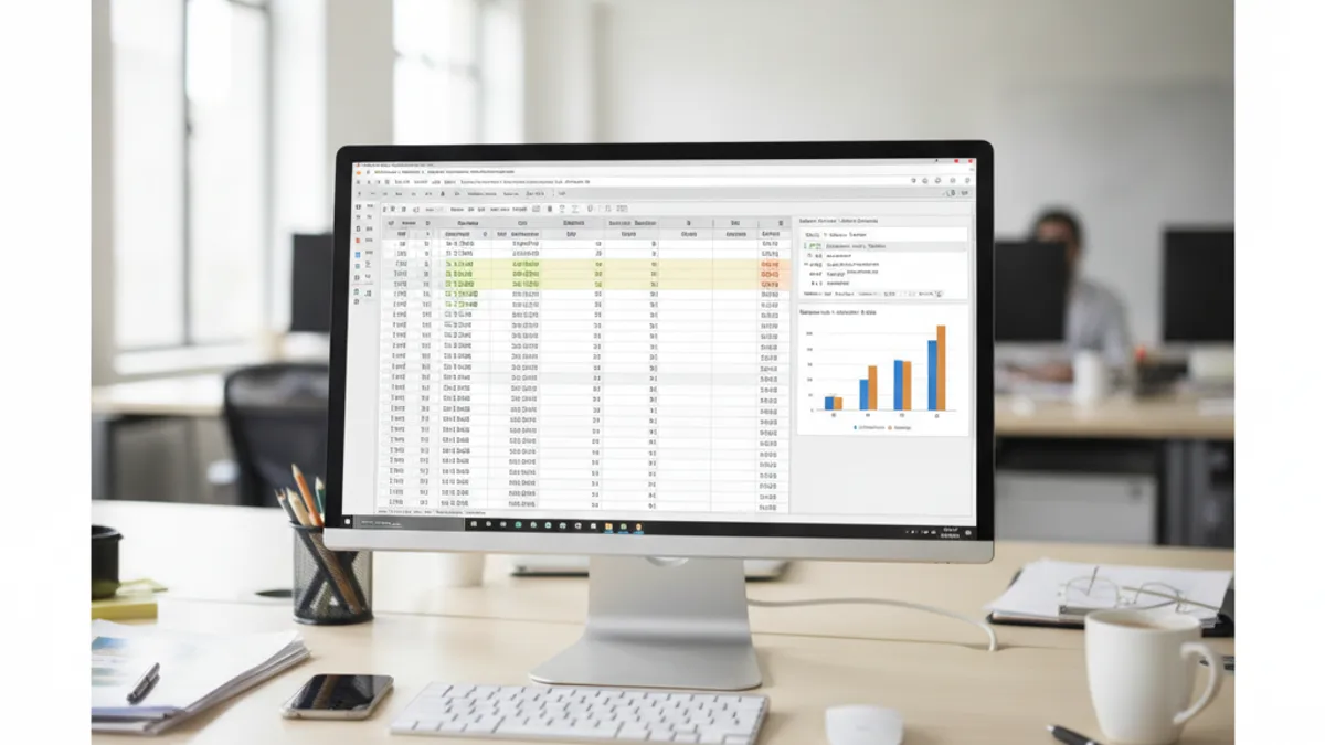
Revenue as clustered columns on the primary axis, Margin percent as a line on the secondary axis, months on the horizontal axis, and a Region slicer connected to both.
Apply a Value Filter for the top ten customers, sort descending, switch to a horizontal bar chart, and add data labels so the ranking reads without an axis.
A 100 percent stacked column by quarter with Channel as the legend field shows mix shift over time far better than several pie charts.
A line chart by month with a Timeline control lets readers scrub any date range; set fixed axis bounds so the scale stays stable while they explore.
Styling That Survives a Refresh
Pivot charts lose custom formatting on refresh more often than regular charts, and the fix is to format the right object. Formatting applied to the chart area, plot area, axes, and chart style persists. Formatting applied to individual data points, such as coloring one bar red, is often reset when the pivot recalculates. To preserve formatting on refresh, right-click the chart, open PivotChart Options, and confirm that Preserve cell formatting on update is ticked in the linked pivot table's options as well.
For a color that carries meaning, use a series rather than a point. Add a calculated field or a helper column in the source that flags rows above target, put it in the Columns area, and the flagged values become their own series with their own color. That color now survives every refresh because it belongs to a field, not to a hand-picked bar.
Set number formats in the pivot table, not in the chart. Right-click a value field, choose Value Field Settings, then Number Format, and pick currency or percent. Data labels and axis labels inherit that format automatically and stay consistent when the table changes shape. The same logic applies to the field names you fixed earlier: rename in the table, and the chart follows.
Once a chart looks right, save it as a template. Right-click the chart, choose Save as Template, and Excel writes a .crtx file. On the next dataset, insert a chart and pick Templates in the Change Chart Type dialog. The colors, fonts, axis settings, and layout land in one click, which is the closest thing to a house style Excel offers.
Pivot Charts vs Regular Charts
- +Filtering, sorting, and grouping in the table update the chart instantly
- +Slicers and timelines give readers interaction without formulas
- +One slicer can drive several charts through Report Connections
- +Date grouping turns daily noise into monthly or quarterly trends
- +Templates make consistent styling a one-click step
- +Refresh pulls new data through table and chart together
- −Scatter, bubble, treemap, and waterfall types are unavailable
- −Per-point formatting can reset on refresh
- −Field buttons clutter the canvas until hidden
- −Axis scales jump between refreshes unless bounds are fixed
- −Charts are bound to one pivot table's layout
- −Mac versions hide some options in different menus
Advanced Techniques and Dashboard Assembly
Calculated fields extend what a pivot chart can plot. On the Analyze tab, choose Fields, Items and Sets, then Calculated Field, and define Margin as Profit divided by Revenue. The new field behaves like any other measure: drop it in Values and it becomes a series. For anything more complex, such as a distinct count or a year-over-year change, add the source to the Data Model when you create the pivot and write the measure in DAX instead.
Show Values As is the underused menu that produces the most insightful charts. Right-click a value, choose Show Values As, and pick Percent of Column Total, Difference From a previous period, or Running Total. A running total line chart of bookings against a flat target line tells a sales team exactly where they stand without a single formula on the sheet.
For dashboards, place each pivot table on a hidden data sheet and each chart on a single presentation sheet, aligned to a grid. Connect every chart to the same two or three slicers, hide field buttons, fix axis bounds, and apply your saved template. Lock the presentation sheet so readers cannot drag charts, and leave the data sheet unprotected so a refresh still works.
Automate the refresh rather than the chart. Data, Refresh All updates every pivot and chart in the workbook. If the source is a table loaded through Power Query, our Power Query show how to set the query to refresh on open, which means the dashboard is current the moment it is opened.

Custom Pivot Chart Checklist
- ✓Arrange the pivot table first: axis field in Rows, legend field in Columns, measures in Values
- ✓Rename value fields (Revenue, not Sum of Revenue) before charting
- ✓Sort by value and group dates by month or quarter
- ✓Press Alt+F1 for an in-sheet chart or F11 for a chart sheet
- ✓Choose the type by the question: bar to compare, line for time, 100% stack for share
- ✓Use Combo with a secondary axis only when units differ
- ✓Fix axis minimum and maximum so scales stay stable on refresh
- ✓Hide field buttons and add slicers or a timeline instead
- ✓Connect one slicer to every chart with Report Connections
- ✓Set number formats in Value Field Settings, then save the chart as a template
Common Mistakes and How to Avoid Them
The first mistake is charting a pivot table that still has Grand Totals switched on. The total becomes a giant bar that flattens every real category. Turn totals off on the Design tab under Grand Totals before you insert the chart, or filter them out of the chart's axis field afterwards.
The second is a legend field with too many members, which produces a rainbow of thin stripes nobody can read. Apply a Top 10 Value Filter, or move that field to a slicer. The third is relying on per-point colors that vanish on refresh; if a color means something, make it a series through a flag field.
The fourth mistake is manual axis labels. Typing over an axis title breaks the link to the field, so after a refresh the chart says Region while showing Product. Let titles inherit from field names, and change the names in the table. Where labels are long, adjust the plot area instead; our guide on change column width in Excel covers the same instinct for tables, which is to give data room rather than shrink the text.
Finally, do not build a chart on a range that will grow without converting it to an Excel Table first. A pivot built on a Table picks up new rows on refresh; a pivot built on a fixed range silently ignores them, and the chart reports last month's story as if it were this month's.
Format fields, not points
Where Pivot Chart Skills Are Tested
Pivot charts appear in Microsoft Office Specialist Expert exams, in data analyst screening tasks, and in the practical portion of many job interviews, where a candidate receives a raw export and thirty minutes to produce a one-page summary. Examiners look for the same habits described here: a sensible table layout, a chart type that fits the question, slicers instead of manual filters, and formatting that is not going to break.
The skills transfer directly to Power BI, whose visuals are pivot charts with a different coat of paint, and to reporting in Google Sheets. They also make Excel VBA automation simpler, because a macro that refreshes a well-built pivot and chart needs two lines, while one that rebuilds a static chart needs fifty.
If you keep an Excel cheat sheet for interviews, add the three shortcuts from this guide, Alt+F1, F11, and Alt, J, T for the Analyze tab, plus the rule about fixed axis bounds. They are the details that make a chart look finished under time pressure.
Version Notes and Further Practice
Slicers arrived in Excel 2010, timelines in Excel 2013, and Combo charts through the Change Chart Type dialog in Excel 2013. Excel for Mac gained pivot charts and slicers in 2019, but timelines and the Data Model still lag; if your team is mixed, keep dashboards to slicers and calculated fields. The web version of Excel can display and filter pivot charts but cannot create them.
Practice on a real export rather than sample data. Take a sales or expense file with at least a year of dates, build one chart for each of the three questions, comparison, trend, and share, and connect all three to one slicer. Then refresh with an extra month of rows and see what breaks. Everything that breaks points to a rule in the checklist above.
The free Excel practice tests below include chart and pivot questions in the same format as certification and screening exams, and every answer explains the reasoning so you learn the why as well as the click.
Next Steps
Build the table first, chart second, and decorate last. Decide the question, choose the chart type that answers it, add a slicer so readers can ask the follow-up themselves, and fix the axis bounds so the picture does not change shape every month.
Save your best chart as a template today. The next dashboard will take a fraction of the time, and every chart in the workbook will look like it belongs to the same report.
Then keep practicing with the free Excel questions on this site. They cover pivot tables, charts, and the formulas behind them in the same style as certification exams, with an explanation for every answer.
EXCEL Questions and Answers
About the Author

Business Consultant & Professional Certification Advisor
Wharton School, University of PennsylvaniaKatherine Lee earned her MBA from the Wharton School at the University of Pennsylvania and holds CPA, PHR, and PMP certifications. With a background spanning corporate finance, human resources, and project management, she has coached professionals preparing for CPA, CMA, PHR/SPHR, PMP, and financial services licensing exams.