How to Draw a Graph in Excel: Complete Step-by-Step Guide to Charts, Plots, and Visualizations in 2026 July
Learn how to draw a graph in Excel with step-by-step instructions for bar, line, pie, scatter, and combo charts. Format, customize, and export like a pro. ✍🏼

Learning how to draw a graph in Excel is one of the highest-leverage skills you can develop as an analyst, student, or business professional. A well-built chart turns a wall of numbers into an instant story, helping decision-makers see trends, outliers, and proportions in seconds. Excel ships with more than fifteen native chart types, ranging from familiar bar and line charts to advanced waterfall, funnel, treemap, and sunburst visualizations that you can deploy without a single line of code or external add-in.
This guide walks you through every step of the process, starting with how to structure your raw data in rows and columns, then moving on to inserting your first chart, formatting axes, adding data labels, and exporting the final image for reports or presentations. Whether you are visualizing quarterly revenue, survey results, scientific measurements, or website analytics, the workflow is essentially the same: clean data in, chart out, polish, and publish.
Excel 2026 introduced several enhancements that make charting faster than ever, including AI-powered chart recommendations, smart data type detection, and improved dynamic array support so that charts automatically expand when new rows arrive. Combined with classic features like PivotCharts, slicers, and sparklines, you have a complete visualization toolkit inside a single application that most workplaces already license, eliminating the need for separate BI tools for everyday reporting tasks.
Before you draw anything, it is worth understanding that the quality of your chart depends almost entirely on the quality of your underlying data. Messy headers, merged cells, blank rows, and inconsistent date formats are the leading causes of broken charts. We will cover the data preparation checklist in detail, including how to use named ranges and Excel Tables so that your visualization stays synchronized with your source whenever values change or new records arrive in the worksheet.
You will also learn the difference between chart types that look superficially similar but communicate very different things. A clustered column chart compares categories side by side, while a stacked column shows part-to-whole relationships within each category. A line chart implies continuity over time, whereas a scatter plot reveals correlation between two independent variables. Choosing the right chart for the right message is the single most important decision in data visualization.
By the end of this tutorial, you will be able to build polished, presentation-ready graphs in under two minutes, customize every visual element from gridlines to trendlines, and troubleshoot the most common rendering issues. We will also cover keyboard shortcuts, accessibility considerations such as colorblind-safe palettes, and how to embed live charts into PowerPoint and Word documents so they update automatically when your source workbook changes overnight.
If you want to test your broader Excel knowledge as you go, our Excel Functions List reference pairs perfectly with this guide because most real-world charts pull from formulas like SUMIFS, AVERAGEIFS, and INDEX/MATCH before they ever reach the chart canvas. Mastering both formulas and visualization together is what separates intermediate users from advanced practitioners in any data-heavy role across finance, marketing, operations, and academic research environments today.
Excel Charting by the Numbers

How to Draw a Graph in Excel: Quick Workflow
Prepare Your Data
Select the Range
Insert the Chart
Customize the Design
Save and Share
The fastest way to draw a graph in Excel is to click any cell inside your data range and press Alt+F1, which inserts a default clustered column chart on the same worksheet in roughly half a second. Pressing F11 instead places that chart on a new dedicated sheet, which is useful when you want a full-screen visualization for presentations. These two shortcuts are the foundation of efficient charting and should be memorized by anyone who builds reports more than once a week in any professional setting.
For more deliberate chart selection, navigate to the Insert tab on the ribbon and locate the Charts group in the middle. The Recommended Charts button uses Excel's built-in heuristics to suggest the three to five chart types most appropriate for your data shape, which is genuinely helpful when you are unsure whether to use a column, bar, or line chart. Beside it sits the full gallery, organized by category: column, line, pie, bar, area, scatter, map, stock, surface, radar, treemap, sunburst, histogram, box and whisker, waterfall, funnel, and combo.
Once your chart appears, three small icons float to its right side: a green plus for adding elements like titles and labels, a paintbrush for switching styles and color palettes, and a funnel for filtering which series and categories are visible. These contextual controls are the fastest way to refine your visualization without diving into the formatting panel. Click the plus icon and you can toggle axis titles, data labels, legend position, trendlines, error bars, and gridlines individually for surgical adjustments.
To change the underlying data shown in the chart, right-click anywhere inside it and choose Select Data. The Select Data Source dialog lets you add, edit, or remove series, switch rows and columns with one click, and define the horizontal category labels. This is also where you handle hidden and empty cells, choosing whether blanks display as zeros, gaps, or interpolated lines. Mastering this dialog unlocks combo charts where you assign different chart types to different series.
Resizing and repositioning the chart is intuitive but worth practicing. Hold the Alt key while dragging to snap the chart edges to cell boundaries, which produces visually clean layouts on dashboards. Hold Ctrl+Shift while dragging the corner handle to resize proportionally from the center. To move a chart between worksheets, right-click and choose Move Chart, then pick either a new sheet name or an existing tab as the destination location for your visualization.
If your data lives in an Excel Table, your chart automatically expands when new rows are added below the last record, which is one of the most underrated features in Excel. To convert any range, select it and press Ctrl+T, confirm the header checkbox, and click OK. From that moment forward, any chart sourced from the table will dynamically include new entries without manual range updates, saving hours of maintenance over a reporting cycle of weeks or months.
For deeper analytical workflows, consider building your underlying calculations with the Excel Data Analysis Toolpak before charting, especially when you need regression outputs, moving averages, or descriptive statistics visualized. The Toolpak generates clean output tables that chart beautifully and pair naturally with scatter plots and histograms, which are the workhorse visualizations of statistical reporting in academic, financial, and scientific contexts across virtually every quantitative discipline you will encounter.

Microsoft Excel Practice Test Questions
Prepare for the Microsoft Excel exam with our free practice test modules. Each quiz covers key topics to help you pass on your first try.
Microsoft Excel Excel Basic and Advance
Microsoft Excel Exam Questions covering Excel Basic and Advance. Master Microsoft Excel Test concepts for certification prep.
Microsoft Excel Excel Formulas
Free Microsoft Excel Practice Test featuring Excel Formulas. Improve your Microsoft Excel Exam score with mock test prep.
Microsoft Excel Excel Functions
Microsoft Excel Mock Exam on Excel Functions. Microsoft Excel Study Guide questions to pass on your first try.
Microsoft Excel Excel MCQ
Microsoft Excel Test Prep for Excel MCQ. Practice Microsoft Excel Quiz questions and boost your score.
Microsoft Excel Excel
Microsoft Excel Questions and Answers on Excel. Free Microsoft Excel practice for exam readiness.
Microsoft Excel Excel Trivia
Microsoft Excel Mock Test covering Excel Trivia. Online Microsoft Excel Test practice with instant feedback.
Microsoft Excel Advanced Data Analysis Tools
Free Microsoft Excel Quiz on Advanced Data Analysis Tools. Microsoft Excel Exam prep questions with detailed explanations.
Microsoft Excel Advanced Formula and Macro...
Microsoft Excel Practice Questions for Advanced Formula and Macro Creation. Build confidence for your Microsoft Excel certification exam.
Microsoft Excel Advanced Formulas and Macros
Microsoft Excel Test Online for Advanced Formulas and Macros. Free practice with instant results and feedback.
Microsoft Excel Basic and Advance Question...
Microsoft Excel Study Material on Basic and Advance Questions and Answers. Prepare effectively with real exam-style questions.
Microsoft Excel Creating and Managing Charts
Free Microsoft Excel Test covering Creating and Managing Charts. Practice and track your Microsoft Excel exam readiness.
Microsoft Excel Data Visualization with Ch...
Microsoft Excel Exam Questions covering Data Visualization with Charts. Master Microsoft Excel Test concepts for certification prep.
Microsoft Excel Formulas and Functions
Free Microsoft Excel Practice Test featuring Formulas and Functions. Improve your Microsoft Excel Exam score with mock test prep.
Microsoft Excel Formulas and Functions App...
Microsoft Excel Mock Exam on Formulas and Functions Application. Microsoft Excel Study Guide questions to pass on your first try.
Microsoft Excel Formulas Questions and Ans...
Microsoft Excel Test Prep for Formulas Questions and Answers. Practice Microsoft Excel Quiz questions and boost your score.
Microsoft Excel Functions Questions and An...
Microsoft Excel Questions and Answers on Functions Questions and Answers. Free Microsoft Excel practice for exam readiness.
Microsoft Excel Managing Data Cells and Ra...
Microsoft Excel Mock Test covering Managing Data Cells and Ranges. Online Microsoft Excel Test practice with instant feedback.
Microsoft Excel Managing Tables and Data
Free Microsoft Excel Quiz on Managing Tables and Data. Microsoft Excel Exam prep questions with detailed explanations.
Microsoft Excel Managing Tables and Table ...
Microsoft Excel Practice Questions for Managing Tables and Table Data. Build confidence for your Microsoft Excel certification exam.
Microsoft Excel Managing Worksheets and Wo...
Microsoft Excel Test Online for Managing Worksheets and Workbooks. Free practice with instant results and feedback.
Microsoft Excel MCQ Questions and Answers
Microsoft Excel Study Material on MCQ Questions and Answers. Prepare effectively with real exam-style questions.
Microsoft Excel Questions and Answers
Free Microsoft Excel Test covering Questions and Answers. Practice and track your Microsoft Excel exam readiness.
Drawing Common Graphs (Bar, Line, Pie) — From VLOOKUP Excel Outputs to Visuals
Bar and column charts compare values across discrete categories such as products, regions, months, or survey responses. Column charts run vertically and work best when you have eight or fewer categories with short labels, while horizontal bar charts handle longer category names without label rotation or truncation issues. To draw one, select your data including headers, go to Insert, click the column chart icon, and choose either clustered, stacked, or 100% stacked depending on whether you want to compare totals or proportions.
For maximum impact, sort your data from largest to smallest before charting, remove unnecessary gridlines, and apply data labels directly on the bars instead of forcing readers to estimate from the axis. Use a single accent color to highlight the most important category and gray for the rest, which is a classic technique used in McKinsey-style consulting decks. Avoid 3D effects because they distort visual perception of length and undermine the chart's credibility in serious analytical contexts.
Drawing Graphs in Excel vs Dedicated BI Tools
- +Already installed on nearly every business computer, eliminating licensing and onboarding friction
- +Direct integration with the data source means no ETL pipeline needed for ad-hoc analysis
- +Charts copy and paste cleanly into PowerPoint, Word, Outlook, and Teams with linked updates
- +Familiar interface that 1.1 billion users worldwide already know how to operate
- +Native support for PivotCharts that let users slice data interactively without writing queries
- +Free templates and chart galleries available across the entire Microsoft ecosystem and community
- +Works offline with no cloud dependency, important for sensitive financial or healthcare data
- −Struggles with datasets above one million rows, where tools like Power BI or Tableau handle billions
- −Limited collaborative editing compared to web-native platforms like Looker Studio or Google Sheets
- −Custom visualizations require workarounds since you cannot install third-party chart libraries
- −Color palettes feel dated by default and require manual customization for modern designs
- −Dashboards built in Excel are harder to publish to the web than purpose-built BI applications
- −Version control is weak unless paired with SharePoint, OneDrive, or a Git-based workflow
Pre-Chart Data Preparation Checklist
- ✓Place a single, clearly labeled header row at the top of your data range
- ✓Remove any merged cells inside the source range because they break chart series detection
- ✓Eliminate blank rows and columns that would create gaps or misalignment in the rendered chart
- ✓Ensure all numeric columns are formatted as numbers, not text, by checking the cell format dialog
- ✓Standardize date formats using the DATEVALUE function if your dates were imported as strings
- ✓Sort categorical data in a meaningful order such as largest to smallest or chronological
- ✓Convert the range to an Excel Table with Ctrl+T so charts auto-expand with new records
- ✓Name your table descriptively, such as Sales2026 or SurveyResponses, for easier reference
- ✓Remove duplicate records using the Remove Duplicates button on the Data tab before charting
- ✓Verify totals using SUM or SUBTOTAL formulas to confirm your data matches expected values
- ✓Document any data cleaning steps in a separate worksheet so the chart is fully reproducible
- ✓Save a backup copy of the raw source before any transformation in case you need to start over
The 30-Second Chart Rule
If a viewer cannot understand your chart's main message within thirty seconds, the chart has failed. Strip out anything that does not contribute to that message: redundant legends, decorative gridlines, 3D effects, and clutter. The best Excel charts look almost embarrassingly simple, with a clear title that states the conclusion and a single visual element that proves it.
Formatting is where amateur charts become professional ones. The moment your chart appears, click on it once to activate the Chart Design and Format tabs in the ribbon. Chart Design controls the high-level appearance through preset styles and color schemes, while Format gives you pixel-level control over individual elements like the plot area, axes, gridlines, data labels, and legend. The keyboard shortcut Ctrl+1 with any element selected opens the detailed Format pane on the right side of the screen for granular adjustments.
Start every customization by editing the chart title because a vague or missing title is the single most common mistake in business charting. Replace the default Chart Title placeholder with a sentence that states the conclusion, not the topic. Instead of Quarterly Sales, write Q4 Sales Exceeded Target by 18 Percent, Driven by Enterprise Renewals. This style, called action titles, transforms charts from passive displays into persuasive arguments and is standard practice in management consulting deliverables across the industry.
Axis formatting follows a hierarchy of importance. Set the value axis to start at zero whenever possible for bar and column charts, because truncated axes exaggerate differences and mislead readers. For line charts where small variations matter, you can use a non-zero baseline as long as you clearly indicate the broken axis convention. Format axis numbers with appropriate precision: show whole numbers for large values, one decimal place for percentages, and currency symbols where relevant for monetary figures throughout your analysis.
Data labels deserve special attention because they bridge the gap between visual and textual communication. Right-click any series, choose Add Data Labels, then format them to show value, percentage, category name, or any combination. For combo charts mixing bars and lines, place bar labels above the bars and line labels above the markers to avoid visual collisions. Adjusting the font size to between nine and eleven points typically produces the cleanest result on standard letter-size printouts.
Color selection is more strategic than decorative. Use a single accent color for the most important data series and shades of gray for context series, a technique that draws the eye exactly where you want it. For colorblind accessibility, avoid red-green combinations and use patterns or shape variation alongside color encoding. Excel's built-in color schemes under Chart Design include several colorblind-friendly palettes, and you can save custom palettes as theme files for organizational consistency across reports.
Legends should appear only when necessary. If your chart has a single data series, delete the legend entirely because it adds visual noise without information. For multi-series charts, position the legend at the top or bottom rather than the right side, which forces a narrower plot area. Match legend label colors and order to the series order in the chart to reduce cognitive load. Direct-labeling lines at their right endpoints often beats a separate legend entirely for clarity.
Finally, save your finished chart as a reusable template by right-clicking and choosing Save as Template. The .crtx file gets stored in your user templates folder and appears under the Templates category in the Insert Chart dialog. This is invaluable for teams that produce recurring reports because everyone can apply the same approved corporate style with one click, ensuring consistent branding and reducing time spent on cosmetic adjustments across hundreds of charts every quarter.
Three formatting choices instantly mark a chart as unprofessional: 3D effects on flat data, rainbow color palettes that signal nothing, and truncated value axes that exaggerate small differences. Always preview your chart in grayscale before publishing because many readers print reports in black and white, and color-only encoding becomes invisible. Test charts on a second monitor to catch contrast issues that your primary display might mask.
Dynamic charts take Excel visualization to the next level by allowing the chart to react to user input, formula outputs, or new data automatically. The simplest form of dynamic charting starts with Excel Tables, which we already covered, but you can go further with named ranges defined by the OFFSET or INDEX functions. These dynamic named ranges expand and contract based on conditions like the last non-blank cell, letting your chart show only the most recent twelve months or only rows matching a filter criterion.
Interactive dashboards combine charts with form controls such as drop-down lists, option buttons, and scroll bars from the Developer tab. A common pattern is to build a drop-down where the user picks a region or product, then use INDEX/MATCH formulas to pull the relevant data into a hidden helper range that feeds the chart. The result feels almost like a custom application despite being pure Excel, and it loads instantly because everything runs in memory on the local machine without server round-trips.
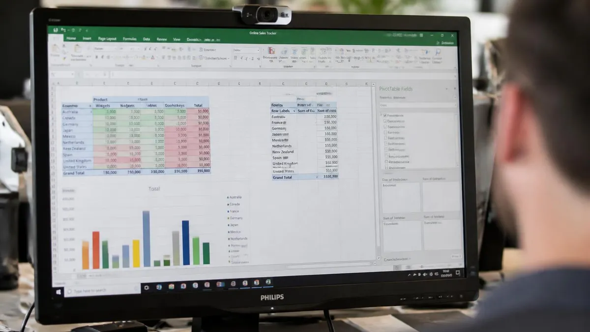
PivotCharts deserve their own discussion because they combine pivoting power with chart visualization in one connected object. Insert a PivotChart from the Insert tab and Excel creates both a PivotTable and a linked chart simultaneously. As you drag fields between rows, columns, values, and filters, the chart updates in real time. Add slicers and timelines for clickable filter buttons that let stakeholders explore the data themselves during meetings, which is far more engaging than static handouts in any boardroom presentation environment.
Sparklines are tiny in-cell charts introduced in Excel 2010 that show trends without taking up dashboard real estate. Select an empty cell next to a row of numbers, go to Insert and choose Sparkline, then pick line, column, or win/loss. Sparklines work brilliantly in summary tables where each row shows a metric with a small trend visualization beside the latest value, giving stakeholders both the current number and recent history in a single glance across hundreds of rows.
For statistical work, scatter plots with trendlines reveal correlations that bar and line charts cannot show. Plot two numeric variables against each other, then right-click the series and add a linear trendline with R-squared displayed. The R-squared value tells you how much of the variance in Y is explained by X, with values above 0.7 indicating strong correlation in most business contexts. Pair scatter plots with the techniques in our Standard Deviation Formula in Excel guide for rigorous variance analysis.
Waterfall charts, introduced natively in Excel 2016 and refined in later versions, are perfect for showing how an initial value rises and falls through a sequence of positive and negative contributions to a final total. Common use cases include profit bridges from revenue to net income, cash flow walks across reporting periods, and headcount changes from hires and attrition. Select your data with a starting value, intermediate changes, and ending total, then insert a waterfall chart and mark the totals using the right-click context menu.
Combo charts let you mix chart types on a single canvas, typically showing one series as columns and another as a line with a secondary axis. The classic use case is plotting revenue as bars and growth percentage as a line, where the two metrics use different scales but share the same time axis. Right-click your chart, choose Change Chart Type, select Combo at the bottom, then assign each series to either column or line and toggle the Secondary Axis checkbox as needed for clean dual-scale visualizations.
With the fundamentals in place, the next step is building a personal practice routine that turns these techniques into instinct. Set aside thirty minutes a week to recreate a chart you saw in a financial report, news article, or industry whitepaper. Reverse-engineering published visualizations forces you to think about both the data structure and the formatting choices, and it surfaces gaps in your knowledge that random tutorials would never reveal. Keep a personal swipe file of charts you admire, organized by chart type and use case.
When you encounter rendering bugs or unexpected chart behavior, the first troubleshooting step is almost always inspecting the source data. Hidden rows, filtered tables, text values masquerading as numbers, and inconsistent date formats account for roughly ninety percent of chart problems. Use the Go To Special dialog under Find and Select to highlight blanks, formulas, or constants, and clean up any anomalies before re-running the chart. This habit alone will save you hours over the course of a year of regular reporting.
Performance optimization matters once your workbooks grow beyond a few thousand rows. Charts referencing volatile formulas like OFFSET or INDIRECT recalculate every time anything changes in the workbook, which slows everything down dramatically. Replace volatile references with INDEX-based dynamic ranges or, better still, Excel Tables that handle the resizing natively without volatility. Disable automatic calculation during heavy editing sessions by going to Formulas, Calculation Options, and choosing Manual, then pressing F9 when you need a refresh.
Accessibility is increasingly a compliance requirement, not a nice-to-have. Add alt text to every chart by right-clicking and choosing Edit Alt Text, then write a one-sentence description that conveys the chart's main message. Screen readers will announce this text to visually impaired users, and search engines index it when workbooks are published online. Pair alt text with high-contrast color choices and minimum font sizes of ten points to ensure your charts work for the widest possible audience across devices.
Collaboration workflows in modern Excel center on OneDrive and SharePoint, where multiple users can edit the same workbook simultaneously. Charts behave well in co-authoring sessions, but always communicate with collaborators before restructuring source data because chart series can break when columns are inserted or deleted. Use comments and threaded conversations attached to the chart object to document design decisions, and turn on version history so you can roll back if a teammate accidentally overwrites a carefully formatted visualization.
Exporting charts for use outside Excel offers several paths depending on the destination. For PowerPoint, copy the chart and paste with the Link option so changes flow through automatically. For Word reports, paste as a picture to lock the visual state and avoid accidental edits. For web publishing, save as PNG at 150 DPI for retina-quality display. For print, save as PDF through File, Export to preserve vector quality at any zoom level for high-resolution professional printing requirements.
Finally, document your charting standards in a one-page style guide for your team or organization. Cover topics like preferred chart types per scenario, brand colors with hex codes, font choices, title conventions, and accessibility requirements. This single document, refreshed annually, transforms an inconsistent collection of personal styles into a coherent visual language that strengthens your brand and reduces the time spent debating cosmetic choices in every new report cycle across every department.
Excel Questions and Answers

Excel Functions List: The Complete Reference Guide to Every Formula You Need in 2026

Excel Finance Functions Guide With PMT, NPV, IRR and Loan Models

Standard Deviation Formula in Excel: STDEV.P vs STDEV.S Guide

Excel Data Analysis Toolpak: Complete Guide to the Analysis ToolPak Add-In

Freeze Panes in Excel: Complete Guide to Locking Rows and Columns
About the Author

Business Consultant & Professional Certification Advisor
Wharton School, University of PennsylvaniaKatherine Lee earned her MBA from the Wharton School at the University of Pennsylvania and holds CPA, PHR, and PMP certifications. With a background spanning corporate finance, human resources, and project management, she has coached professionals preparing for CPA, CMA, PHR/SPHR, PMP, and financial services licensing exams.