
How to Create a Stacked Bar Chart in Excel: The Complete Step-by-Step Guide
Learn how to create a stacked bar chart in Excel step-by-step. 📝 Master data visualization, formatting, and chart customization for any dataset.

Learning how to create a stacked bar chart in Excel is one of the most practical data visualization skills you can develop, whether you are analyzing sales figures, comparing project timelines, or breaking down budget allocations across departments. A stacked bar chart lets you see both the total magnitude of a category and the proportional contribution of each sub-component at a glance, making it far more informative than a simple bar chart for multi-variable datasets. This guide walks you through every step from raw data to a polished, presentation-ready chart.
Excel offers two primary stacked bar chart variations: the standard stacked bar chart, which shows absolute values, and the 100% stacked bar chart, which normalizes all bars to the same height and displays relative percentages instead. Knowing when to use each type is just as important as knowing how to build them. If your audience needs to compare totals alongside composition, the standard version wins. If the focus is purely on proportional breakdown — say, market share across regions — the 100% variant communicates that story more clearly without the distraction of varying bar heights.
Before you insert a single chart, your data must be structured correctly. Excel reads stacked bar chart data in a tabular format where rows represent categories (often time periods, product lines, or geographic regions) and columns represent the data series that will become individual stacked segments. Missing values, merged cells, or inconsistent headers are the most common reasons charts render incorrectly, so cleaning your dataset first will save you significant troubleshooting time later in the process.
One of the reasons stacked bar charts are so widely used in business reporting is their versatility across industries. Finance teams use them to show revenue broken down by product category over quarterly periods. HR departments use them to visualize headcount changes across multiple teams. Marketing analysts rely on them to display channel attribution splits month over month. No matter your field, if you have data with a categorical breakdown over time or across groups, a stacked bar chart is almost certainly the right choice for a first-pass visualization.
Many users who are comfortable with basic Excel functions — such as vlookup excel formulas for combining data from multiple tables, or knowing how to freeze a row in excel so headers stay visible while scrolling — find that chart creation feels like an entirely separate skill set. In reality, charting follows the same logical patterns as the rest of Excel: structure your data correctly, select the right tool, and then refine the output using the formatting options that Excel surfaces in its ribbon menus and right-click context panels.
This article covers the complete workflow: organizing source data, inserting the chart, switching rows and columns when Excel guesses your orientation wrong, adding data labels, customizing colors and axes, and finally exporting your chart for use in PowerPoint, Word, or PDF reports. We also address common pitfalls like overlapping labels, mismatched legend entries, and charts that lose their formatting when the underlying data range is updated. You can also explore how to create a stacked bar chart in excel alongside financial modeling techniques for even richer reporting.
By the end of this guide, you will be able to build a professional stacked bar chart from scratch in under five minutes, troubleshoot the most common rendering issues, and apply consistent branding through Excel's chart template feature so your visualizations always match your organization's style guidelines. Whether you are preparing a board-level presentation or a quick internal dashboard, the techniques here will become a reliable part of your Excel toolkit.
Excel Stacked Bar Charts by the Numbers
How to Create a Stacked Bar Chart in Excel: Step-by-Step
Organize Your Source Data
Select the Entire Data Range
Insert the Stacked Bar Chart
Verify and Adjust Data Orientation
Add Data Labels and Axis Titles
Apply Formatting and Save as Template
Once your stacked bar chart is inserted, the real work of making it presentation-ready begins. Excel's default chart styling is functional but rarely matches the aesthetic standards of professional reports or executive dashboards. The first formatting priority is color consistency. By default, Excel assigns colors from your active Office theme, which may clash with your company's brand palette. To override these, click any colored segment in the chart, then right-click and choose 'Format Data Series'. Under the Fill options, select 'Solid fill' and enter your exact hex color code in the color picker dialog.
Axis formatting is frequently overlooked but critically important for readability. The horizontal axis on a stacked bar chart shows the measurement scale, and Excel often generates unhelpful tick marks or overly granular number intervals. Right-click the axis, select 'Format Axis', and manually set the minimum, maximum, and major unit values to round numbers that match your dataset's range. For example, if your highest total bar reaches 4,750, set the maximum to 5,000 and the major unit to 1,000 for clean, easy-to-read gridlines.
Data labels deserve special attention on stacked charts because each bar contains multiple segments, and labels can quickly become overcrowded. A common best practice is to display labels only on segments that represent five percent or more of the total bar height. Unfortunately, Excel does not have a built-in threshold filter for labels, so you will need to manually delete labels on small segments after enabling data labels globally. Alternatively, use a helper column in your source data to replace small values with empty strings, which prevents labels from rendering on those segments altogether.
The legend is another element worth repositioning. By default, Excel places the legend to the right of the chart, which reduces the available horizontal space for the bars themselves. Moving the legend to the top or bottom of the chart — by right-clicking it and selecting 'Format Legend', then choosing a position — gives the bars more room and generally improves the chart's overall proportions. For charts with only two or three series, you may consider deleting the legend entirely and instead labeling the end of each stacked bar directly using text boxes for a cleaner look.
Gridlines are another formatting choice with significant visual impact. Heavy or frequent gridlines make a chart feel cluttered; removing major gridlines entirely on stacked bar charts often improves clarity because the bar segments themselves communicate the data. To remove gridlines, click once on any gridline in the chart, press Delete, and Excel removes the entire gridline set. If you want subtle reference lines without visual noise, reduce the gridline color to a light gray (e.g., #DDDDDD) through the Format Gridlines panel.
Chart titles should be specific and informative, not generic. Replace Excel's default 'Chart Title' placeholder by clicking directly on it and typing your actual title — something like 'Q1–Q4 Revenue by Product Line (USD Thousands)' tells the reader exactly what they are looking at without needing to consult surrounding text. Include the unit of measurement in the title or axis label to eliminate any ambiguity about whether figures represent thousands, millions, or raw units.
Finally, consider the chart's size and aspect ratio before embedding it in a report. Stacked bar charts with many categories (ten or more rows) need more vertical space than Excel's default chart dimensions provide, causing bars to become too thin to read comfortably. Drag the chart's resize handles to increase its height, aiming for a bar height of at least 20 pixels per category. When exporting for presentations, save the chart as an image at 150 DPI minimum to prevent blurriness on high-resolution screens or projectors.
Microsoft Excel Practice Test Questions
Prepare for the Microsoft Excel exam with our free practice test modules. Each quiz covers key topics to help you pass on your first try.
Microsoft Excel Excel Basic and Advance
Microsoft Excel Exam Questions covering Excel Basic and Advance. Master Microsoft Excel Test concepts for certification prep.
Microsoft Excel Excel Formulas
Free Microsoft Excel Practice Test featuring Excel Formulas. Improve your Microsoft Excel Exam score with mock test prep.
Microsoft Excel Excel Functions
Microsoft Excel Mock Exam on Excel Functions. Microsoft Excel Study Guide questions to pass on your first try.
Microsoft Excel Excel MCQ
Microsoft Excel Test Prep for Excel MCQ. Practice Microsoft Excel Quiz questions and boost your score.
Microsoft Excel Excel
Microsoft Excel Questions and Answers on Excel. Free Microsoft Excel practice for exam readiness.
Microsoft Excel Excel Trivia
Microsoft Excel Mock Test covering Excel Trivia. Online Microsoft Excel Test practice with instant feedback.
Microsoft Excel Advanced Data Analysis Tools
Free Microsoft Excel Quiz on Advanced Data Analysis Tools. Microsoft Excel Exam prep questions with detailed explanations.
Microsoft Excel Advanced Formula and Macro...
Microsoft Excel Practice Questions for Advanced Formula and Macro Creation. Build confidence for your Microsoft Excel certification exam.
Microsoft Excel Advanced Formulas and Macros
Microsoft Excel Test Online for Advanced Formulas and Macros. Free practice with instant results and feedback.
Microsoft Excel Basic and Advance Question...
Microsoft Excel Study Material on Basic and Advance Questions and Answers. Prepare effectively with real exam-style questions.
Microsoft Excel Creating and Managing Charts
Free Microsoft Excel Test covering Creating and Managing Charts. Practice and track your Microsoft Excel exam readiness.
Microsoft Excel Data Visualization with Ch...
Microsoft Excel Exam Questions covering Data Visualization with Charts. Master Microsoft Excel Test concepts for certification prep.
Microsoft Excel Formulas and Functions
Free Microsoft Excel Practice Test featuring Formulas and Functions. Improve your Microsoft Excel Exam score with mock test prep.
Microsoft Excel Formulas and Functions App...
Microsoft Excel Mock Exam on Formulas and Functions Application. Microsoft Excel Study Guide questions to pass on your first try.
Microsoft Excel Formulas Questions and Ans...
Microsoft Excel Test Prep for Formulas Questions and Answers. Practice Microsoft Excel Quiz questions and boost your score.
Microsoft Excel Functions Questions and An...
Microsoft Excel Questions and Answers on Functions Questions and Answers. Free Microsoft Excel practice for exam readiness.
Microsoft Excel Managing Data Cells and Ra...
Microsoft Excel Mock Test covering Managing Data Cells and Ranges. Online Microsoft Excel Test practice with instant feedback.
Microsoft Excel Managing Tables and Data
Free Microsoft Excel Quiz on Managing Tables and Data. Microsoft Excel Exam prep questions with detailed explanations.
Microsoft Excel Managing Tables and Table ...
Microsoft Excel Practice Questions for Managing Tables and Table Data. Build confidence for your Microsoft Excel certification exam.
Microsoft Excel Managing Worksheets and Wo...
Microsoft Excel Test Online for Managing Worksheets and Workbooks. Free practice with instant results and feedback.
Microsoft Excel MCQ Questions and Answers
Microsoft Excel Study Material on MCQ Questions and Answers. Prepare effectively with real exam-style questions.
Microsoft Excel Questions and Answers
Free Microsoft Excel Test covering Questions and Answers. Practice and track your Microsoft Excel exam readiness.
Stacked Bar vs. Other Excel Chart Types
A stacked bar chart excels when you need to show both the total size of a category and how individual sub-components contribute to that total. For instance, if you are tracking monthly sales broken down by product line, a stacked bar instantly reveals which months had the highest overall revenue while also showing which products drove that revenue. The horizontal bar orientation makes it particularly effective for comparing many categories where long text labels would overlap on a vertical column chart.
The main limitation of the stacked bar chart is that comparing non-bottom segments across bars is cognitively difficult because each segment starts at a different baseline. For example, comparing the middle segment across five bars requires estimating both the start and end points of each segment rather than reading from a common zero baseline. When precise cross-category comparison of individual segments is the primary goal, a grouped (clustered) bar chart or a separate line chart per series typically communicates more clearly than a stacked format.
Stacked Bar Charts: Benefits and Limitations
- +Shows both total magnitude and component breakdown in a single visual
- +Horizontal orientation handles long category label text without rotation
- +Immediately reveals which categories dominate total values
- +Easy to build in Excel without add-ins or advanced knowledge
- +100% variant clearly communicates proportional shifts over time
- +Supports up to 255 data series in a single chart object
- −Comparing non-baseline segments across bars is cognitively difficult
- −Too many series (more than 5-6) creates visually noisy, hard-to-read stacks
- −Does not show negative values accurately in standard stacked format
- −Data labels overlap and become illegible on narrow or short segments
- −100% variant hides absolute values, requiring supplementary data tables
- −Default Excel colors rarely match brand guidelines without manual adjustment
Pre-Chart Data Preparation Checklist
- ✓Confirm row 1 contains unique, descriptive column headers for every data series.
- ✓Remove all blank rows and blank columns within the data range before selecting.
- ✓Unmerge any merged cells in the data area — merged cells break chart data reads.
- ✓Verify all numeric cells are formatted as numbers, not text stored as numbers.
- ✓Check that category labels in column A are consistent (no typos or duplicate entries).
- ✓Replace any #N/A or #REF! errors with 0 or use IFERROR to suppress them before charting.
- ✓Sort categories in the order you want them displayed (Excel plots top-to-bottom, mirroring your row order).
- ✓Confirm units are consistent across all series (e.g., do not mix thousands and millions in one chart).
- ✓Remove any subtotal or grand total rows from the selection — they inflate the chart scale dramatically.
- ✓Save a backup copy of the workbook before inserting the chart to preserve the clean data state.
Always Check Chart Orientation Before Formatting
Excel frequently guesses wrong about whether your rows or columns represent data series, especially when your table has more columns than rows. Before spending any time on formatting, right-click the chart, select 'Select Data', and click 'Switch Row/Column' to instantly toggle the orientation. A single click fixes what would otherwise take minutes of troubleshooting to diagnose as a data structure problem.
Even experienced Excel users encounter frustrating issues when building stacked bar charts, and most problems trace back to a handful of predictable root causes. Understanding these common mistakes in advance helps you avoid them entirely rather than diagnosing them after the chart is already embedded in a report and formatting has been applied. The single most common issue is incorrect data selection — specifically, accidentally including a total column alongside the component columns, which causes Excel to add a massive extra segment to every bar that dwarfs the others.
A related mistake involves non-contiguous data ranges. If your category labels are in column A, your first two series are in columns B and C, but column D is a helper column you want to exclude, selecting A:C and then Ctrl-clicking E:F creates a non-contiguous range that Excel handles inconsistently across versions. The safest approach is to rearrange your columns so the chart data is a single contiguous block, with any helper or calculation columns placed outside that range — either to the far right of the dataset or on a separate sheet tab.
Date-formatted cells in category labels cause another common rendering problem. When your category column contains dates (e.g., January 2024, February 2024), Excel may interpret them as a time-scale axis and insert gaps for missing dates rather than treating each row as a discrete category. To force Excel to treat dates as text categories, right-click the horizontal axis, select 'Format Axis', change the Axis type from 'Automatically select based on data' to 'Text axis', and Excel will stop inserting phantom gaps between your labeled periods.
Color blindness accessibility is a frequently overlooked consideration in chart design. Approximately 8% of men and 0.5% of women have some form of color vision deficiency, which means the default red-green color pairings Excel often assigns are invisible as distinct segments to a meaningful portion of your audience. Using pattern fills in addition to color — accessible through Format Data Series → Fill → Pattern Fill — adds a secondary visual differentiator that works even in grayscale printouts. Alternatively, choose a colorblind-safe palette such as the blue-orange-teal combination recommended by the ColorBrewer visualization tool.
Chart performance can degrade noticeably when your source data contains more than 10,000 rows or when you have linked charts across multiple workbooks. For large datasets, consider aggregating your source data using a PivotTable before charting — pivot the raw data to produce the summary table your chart needs, then build the stacked bar chart from the PivotTable output rather than the raw data. This reduces the chart's data dependency to dozens of cells rather than thousands, making scrolling and recalculation significantly faster.
Version compatibility is another practical concern when sharing workbooks. Charts created in Excel 365 with newer gradient fills or chart styles may not render identically in Excel 2016 or older versions, and some chart animation settings are lost entirely. If your workbook will be opened by colleagues using older Excel versions, test the file in Compatibility Mode (File → Info → Check Compatibility) before distributing to identify any rendering issues that require adjustment.
Finally, when a chart loses its data connection after a workbook is moved or renamed, the broken reference error manifests as a chart with empty axes and no bars. To repair this, right-click the chart, choose 'Select Data', and update each series range reference to point to the correct new file path or sheet name. Excel's Name Manager (Formulas tab → Name Manager) can also help identify named ranges that power chart data series, making it easier to trace and fix broken links in complex workbooks with many inter-sheet dependencies.
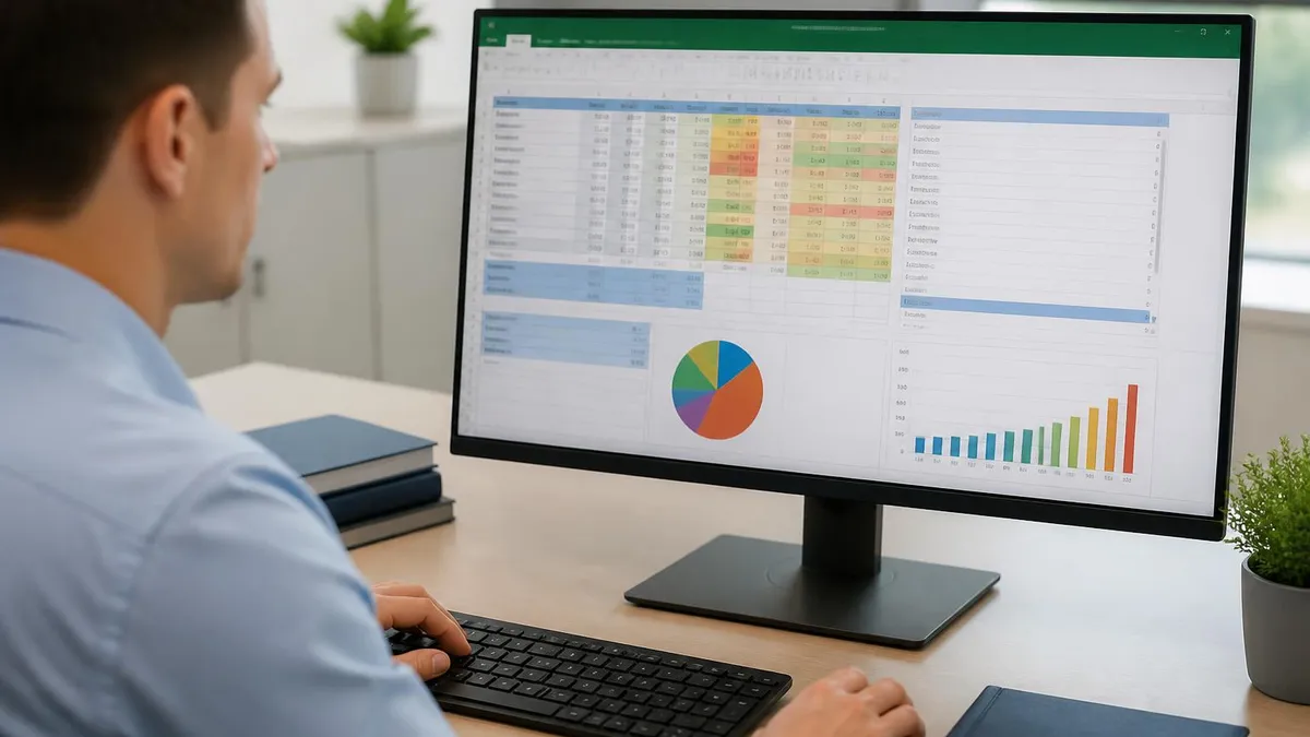
If your source table includes a 'Total' or 'Grand Total' column alongside the component columns, selecting the entire table will cause Excel to render that total as an additional stacked segment — producing bars that appear to be double the correct height. Always exclude total columns from your chart data selection, or move them outside the charted range before inserting the chart object.
Advanced users can push stacked bar charts well beyond the basics using a combination of Excel features that most tutorials never cover. One of the most powerful techniques is creating a dynamic stacked bar chart that automatically updates its data range as new rows are added to the source table. The key is to convert your source data to an Excel Table (Ctrl+T) before inserting the chart. Excel Tables automatically expand their boundaries when new rows are appended, and charts linked to Table ranges inherit this dynamic expansion without any manual range updates required.
Secondary axes unlock a related advanced technique: the combo stacked bar and line chart. By adding a line series on a secondary axis — for example, plotting a target or benchmark line across your stacked bars — you create a hybrid chart that shows both the composition breakdown and a reference threshold in one view.
To add this, right-click any data series in the chart, choose 'Change Series Chart Type', and set the target series to Line while checking the Secondary Axis box. This is particularly useful for budget-versus-actual reporting where you want to show category breakdowns alongside a total budget line.
Sorting your source data strategically before charting makes a significant visual difference. Excel plots stacked bar categories in the reverse order of your data rows — the top row in your table appears as the bottom bar in the chart. If you want your most important category at the top of the chart (which draws the eye first), place it at the bottom of your source table. Alternatively, sort in descending order by total value so the largest bars appear at the top, making the chart immediately show which categories dominate without requiring the reader to scan the full list.
Named ranges provide another layer of dynamism and clarity. Instead of referencing ranges like =$B$2:$B$14 in your chart's series definitions, you can create named ranges (Formulas → Define Name) such as 'ProductA_Sales' and reference those names in the chart data dialog. This makes the chart's data connections self-documenting — anyone who opens the workbook and checks the chart's data source can immediately understand what each series represents without decoding cryptic cell addresses.
For users who regularly build the same chart type, Excel's chart template feature is a major time saver. After formatting a chart exactly as desired — colors, fonts, axis settings, legend position, data label format — right-click the chart border and select 'Save as Template'. Excel saves the template as a .crtx file in the Charts subfolder of your AppData directory. Future charts can apply this template by choosing 'All Charts → Templates' in the chart insertion dialog, applying all saved formatting in a single click rather than reapplying it manually each time.
Keyboard shortcuts speed up the chart creation workflow considerably once you know them. Alt+F1 inserts a default chart on the active worksheet from the current selection in a single keystroke — useful for quick exploratory charts during data analysis. F11 inserts the same chart on a new dedicated chart sheet rather than embedded in the worksheet. Pressing Tab while a chart is selected cycles through its individual elements (plot area, legend, axes, data series), allowing you to select and format specific elements without precise mouse clicks.
Integration with Power Query extends stacked bar charts to handle data sources that Excel cannot read natively. If your chart data lives in a SQL database, a SharePoint list, or a web-based CSV, you can use Power Query (Data → Get Data) to pull that data into Excel and shape it into the table format your chart requires. The chart then refreshes automatically each time you click 'Refresh All', pulling the latest data from the source system without any manual copy-paste steps. This transforms a static chart into a live reporting dashboard that stays current with minimal maintenance effort.
Practical mastery of stacked bar charts comes from building them repeatedly across different types of datasets and applying deliberate refinement after each attempt. The best way to accelerate this learning curve is to study charts from published reports, business publications, and data journalism outlets that use Excel or similar tools. When you see a stacked bar chart that communicates especially clearly, reverse-engineer what makes it work: the color palette, the number of series, the label placement, the chart title specificity, and the axis range choices. These observations become your personal library of design patterns to draw from.
Understanding the relationship between stacked bar charts and other Excel skills deepens your overall data analysis capability. For example, knowing how to create a drop down list in excel enables you to build interactive dashboards where a dropdown selection filters the source data that powers a dynamic stacked chart, creating a self-service reporting tool that non-technical stakeholders can navigate without your assistance. The combination of data validation dropdowns, OFFSET or INDEX formulas for dynamic ranges, and a well-structured stacked bar chart produces genuinely powerful business intelligence tools.
Practice with real datasets rather than invented sample data whenever possible. Public sources like government statistical agencies, the World Bank Open Data portal, and company annual reports published in CSV format provide rich, realistic datasets that mirror the messy reality of workplace data. Working with real data exposes you to the irregular structures, missing values, and formatting inconsistencies that sample datasets never include — and building the habit of cleaning and structuring real data before charting is what separates proficient Excel users from truly expert ones.
The process of building charts also reinforces your understanding of the underlying data in ways that formula work alone does not. When you plot a stacked bar chart and one segment looks unexpectedly large or small, your instinct to investigate that anomaly sharpens your data analysis reflexes. Many valuable business insights have originated from chart anomalies that prompted deeper investigation — a sudden shift in product mix visible in a stacked chart that turned out to reflect a supply chain disruption, or an unexpected category dominance that revealed a previously unnoticed customer segment.
As you build confidence with standard stacked bar charts, consider exploring Excel's newer chart types introduced in recent versions. The Treemap and Sunburst charts solve some of the same multi-level breakdown problems that stacked bar charts address but use hierarchical area encoding rather than bar length, which can be more space-efficient for deeply nested category structures.
The Waterfall chart is particularly useful for financial reporting where you want to show how individual positive and negative components accumulate to a final total — a visualization need that stacked bar charts can approximate but never handle as elegantly as the dedicated waterfall format.
Regular practice through structured quizzes and exercises is the most efficient way to move from understanding concepts to building genuine fluency. Many Excel certification exams, including the Microsoft Office Specialist (MOS) certification, include chart creation and formatting questions that test exactly the skills covered in this guide. Practicing with realistic exam-style questions before attempting a certification ensures that you can execute these steps accurately and quickly under time pressure, rather than only being able to do so when following a step-by-step tutorial at your own pace.
The investment you make in learning Excel charting skills compounds over time because visualizations are one of the most visible outputs of data work. A well-crafted stacked bar chart in a weekly report earns credibility and attention in a way that raw numbers in a spreadsheet rarely do. Whether your goal is career advancement, certification success, or simply making your daily work more impactful, developing a reliable, repeatable process for building professional-quality stacked bar charts is one of the highest-return Excel skills you can cultivate.
Excel Questions and Answers

Excel Finance Functions Guide With PMT, NPV, IRR and Loan Models

Excel Merge Tables: The Complete 2026 Guide to Combining Data Across Worksheets

Lock Formulas in Excel: The Complete 2026 Guide to Protecting Cells, Sheets, and Workbook Calculations

Excel Data Analysis Toolpak: Complete Guide to the Analysis ToolPak Add-In

Mail Merge Labels from Excel: The Complete 2026 Guide to Printing Address Labels with Word and Excel
About the Author

Business Consultant & Professional Certification Advisor
Wharton School, University of PennsylvaniaKatherine Lee earned her MBA from the Wharton School at the University of Pennsylvania and holds CPA, PHR, and PMP certifications. With a background spanning corporate finance, human resources, and project management, she has coached professionals preparing for CPA, CMA, PHR/SPHR, PMP, and financial services licensing exams.