How to Make an XY Graph in Excel: The Complete 2026 Guide to Creating Scatter Plots and Visualizing Data Relationships
Learn how to make an XY graph in Excel with step-by-step scatter plot instructions, trendline tips, and chart customization for data visualization in 2026.

Whether you are charting hotel occupancy trends for properties like Excellence Playa Mujeres or plotting laboratory measurements for a research paper, knowing how to make an XY graph in Excel is a foundational data visualization skill that every spreadsheet user should master. An XY graph, also called a scatter plot, displays the relationship between two numerical variables by plotting data points on a horizontal X-axis and a vertical Y-axis, making patterns and correlations immediately visible to anyone reviewing the chart.
Excel remains the world's most widely used spreadsheet application, with more than 750 million users relying on its charting capabilities to communicate data effectively. XY graphs are particularly powerful because they reveal trends, outliers, and correlations that raw numbers simply cannot convey on their own. Whether you are a student analyzing experimental results, a business analyst comparing marketing spend against revenue, or a scientist examining temperature fluctuations over time, scatter plots offer clarity that data tables alone lack.
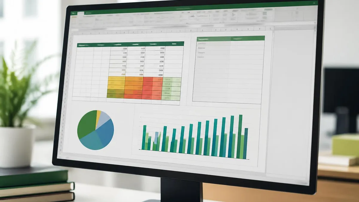
The process of creating an XY graph in Excel follows a straightforward sequence that begins with organizing your data in two columns, selecting the appropriate cell range, and inserting a scatter chart from the Insert tab on the ribbon. However, the real value comes from understanding how to customize your chart with meaningful titles, axis labels, trendlines, and formatting options that make your visualization look professional and easy to interpret for any audience reviewing your work.
Many Excel users benefit from combining their graphing skills with other essential spreadsheet functions to build more powerful workflows. For example, learning how to create a drop down list in Excel can help you build interactive dashboards where users select data ranges to plot dynamically. Similarly, understanding how to merge cells in Excel improves the layout of reports that accompany your charts, while knowing how to freeze a row in Excel keeps header information visible as you scroll through large datasets.
The vlookup Excel function plays an important supporting role when preparing data for XY graphs, because you often need to pull values from reference tables before plotting them on a scatter chart. By mastering both data preparation functions and visualization tools, you build a complete analytical workflow that transforms raw spreadsheet entries into compelling visual narratives that drive better decision-making across your entire organization and stakeholder network.
This comprehensive guide walks you through every step of creating XY graphs in Excel, from initial data setup through advanced customization techniques including trendlines, multiple series, and error bars. You will learn how to format axis scales, handle multiple data series on a single chart, and apply best practices that ensure your charts communicate clearly. By the end, you will have the skills to produce publication-quality scatter plots for any analytical purpose.
Excel's charting engine has evolved significantly over recent versions, and the 2026 edition offers enhanced formatting controls, dynamic data ranges powered by LAMBDA functions, and improved accessibility features that make your charts usable by everyone. Whether you use Microsoft 365, Excel 2021, or an earlier desktop version, the core steps for creating XY graphs remain consistent across all platforms, so this guide applies regardless of your specific software version or operating system.
XY Graphs in Excel by the Numbers
How to Create an XY Scatter Plot in Excel Step by Step
Organize Your Data in Two Columns
Select the Complete Data Range
Insert a Scatter Chart from the Ribbon
Add Chart Elements and Labels
Apply a Trendline and Display the Equation
Format, Review, and Export Your Chart
Once you have inserted your basic XY graph, the next critical step is customizing it so that your audience can interpret the data without confusion or misunderstanding. Excel provides a comprehensive set of chart formatting tools accessible through the Chart Design and Format tabs that appear whenever you click on your chart object. These tools let you modify every visual element, from the color and size of individual data points to the scale and numbering format of both axes on your scatter plot.
Start by adding a descriptive chart title that clearly communicates what the data represents to anyone viewing it. A title like Monthly Revenue vs Marketing Spend 2025-2026 is far more useful than the default Chart Title placeholder because it tells the reader exactly what variables are being compared. Click the default chart title text to edit it directly, and use the Home tab formatting options to adjust font size, weight, and color to match your organization's branding guidelines and report templates.
Axis labels are equally important for chart readability and professional presentation quality. Right-click either axis and select Format Axis to access options for minimum and maximum values, major and minor tick intervals, number formatting, and logarithmic scaling. If your X-axis values represent dates, switch the axis type to Date Axis for proper chronological spacing. For scientific data with very large or very small values, consider using scientific notation to keep axis labels compact and readable.
Data point formatting gives you granular control over how each observation appears on your scatter plot visualization. Select any data series and use the Format Data Series pane to change marker shapes from the default circles to triangles, squares, or diamonds. You can adjust marker size from the default five points up to seventy-two points for emphasis, and apply solid fills, gradient fills, or picture fills to make specific data points stand out visually from the rest of the series.
Adding a trendline transforms your XY graph from a simple data display into a genuine analytical tool that reveals underlying mathematical patterns in your dataset. Right-click any data series and choose Add Trendline to access linear, exponential, logarithmic, polynomial, power, and moving average options. Each trendline type suits different data relationships, and Excel can display the equation and R-squared value directly on the chart so you can evaluate the strength and reliability of the correlation.
Color selection matters more than most users realize when designing effective scatter plots for broad audiences including print distribution. Use contrasting colors for different data series to ensure they remain distinguishable, especially when your chart might be printed in grayscale. Excel's built-in color themes provide pre-coordinated palettes, but you can also define custom colors using RGB or hexadecimal values. Accessibility guidelines recommend avoiding red-green combinations, which approximately eight percent of men cannot differentiate due to color vision deficiency.
Gridlines and chart backgrounds should support rather than compete with your data for visual attention on the page. Light gray gridlines on a white background provide spatial orientation without unnecessary visual clutter. Remove gridlines entirely when your chart contains many overlapping data points, and consider using a subtle gradient background only if your chart will be viewed on screen rather than printed. Every formatting decision should prioritize clarity of the data relationship over decorative appeal.
How to Freeze a Row in Excel and Other Essential Graphing Skills
Proper data preparation is the foundation of every effective XY graph in Excel. Arrange your independent variable in the left column and your dependent variable in the right column, ensuring both columns have clear header labels. Remove any blank rows or cells containing text values within your numeric range, as these cause Excel to misinterpret data types and produce charting errors that distort your visual output significantly.
Use the vlookup Excel function to consolidate data from multiple worksheets before charting your scatter plot. When combining datasets, verify that units of measurement are consistent across all entries and that date formats match throughout the range. Running a quick sort on your X-axis values helps identify duplicate entries and outliers that might skew your scatter plot. Clean data produces accurate and trustworthy visualizations every single time you create charts.

Should You Use XY Graphs or Other Chart Types in Excel?
- +Reveals correlations between two numerical variables instantly through visual positioning
- +Supports six trendline types including linear, exponential, logarithmic, and polynomial regression
- +Handles thousands of data points without significant performance issues or rendering delays
- +Allows independent axis scaling so variables with different units display correctly together
- +Easily compares multiple data series on a single chart with distinct markers and colors
- +Works with both continuous measurement data and discrete numeric observations effectively
- −Not suitable for categorical data like product names, departments, or geographic regions
- −Overlapping data points obscure patterns in large datasets without transparency adjustments
- −Requires both variables to be strictly numeric which limits applicability for mixed data
- −Default trendlines can mislead viewers when the actual data relationship is nonlinear
- −Standard formatting often needs significant manual adjustment to look professional and polished
- −Labeling individual data points requires workarounds since Excel lacks native point labeling
XY Graph Creation Checklist for Excel Users
- ✓Verify both data columns contain only numeric values with no blank cells or text entries
- ✓Place the independent variable in the left column and dependent variable on the right
- ✓Include clear descriptive headers in the first row of each data column for automatic labeling
- ✓Select the complete data range including headers before inserting the chart from the ribbon
- ✓Choose Scatter from the Insert tab rather than Line to ensure proper XY coordinate plotting
- ✓Add a descriptive chart title that identifies both variables and the time period being compared
- ✓Label both axes with variable names and include units of measurement in parentheses
- ✓Apply a trendline and display the equation with R-squared value directly on the chart
- ✓Use contrasting colors for multiple data series and avoid red-green combinations for accessibility
- ✓Test your chart at the final display size to confirm all labels and legends remain fully legible
Trendlines Reveal What Raw Data Cannot Show
Adding a trendline to your XY graph dramatically increases its analytical value by showing the mathematical relationship between variables. Linear trendlines work for proportional relationships, while polynomial trendlines capture curved patterns. Always check the R-squared value — a score above 0.7 indicates a strong fit, while anything below 0.5 suggests the trendline type may not match your data's actual distribution pattern.
Troubleshooting common XY graph problems in Excel requires understanding how the charting engine interprets your data and formatting settings behind the scenes. One of the most frequent issues users encounter is the chart displaying a straight diagonal line or a single clustered point instead of the expected scatter pattern. This typically happens when the data selection includes only one column or when Excel incorrectly interprets your two-column range as a single series with the first column serving as category labels rather than numeric X-values.
To resolve this problem, delete the incorrect chart and carefully reselect your data by clicking the first cell of your X-column, then holding Shift while clicking the last populated cell of your Y-column. Ensure both columns are formatted as Number, Currency, or Scientific data types rather than Text or General. If your data was imported from a CSV file or external database, text formatting is especially common and requires manual conversion using the Paste Special Values technique or the VALUE function applied individually to each affected cell.
Another common issue involves axis scaling that compresses your data points into a small cluster in one corner, making the chart appear nearly empty across most of its area. This occurs when Excel automatically sets axis ranges based on the full numeric spectrum including outliers or zero values positioned far from your main data cluster. Fix this by right-clicking each axis, selecting Format Axis, and manually setting the minimum and maximum bounds to frame your data tightly with approximately ten percent padding on each side.
Data series that refuse to display the correct trendline type often confuse intermediate Excel users who are still learning chart customization techniques. Excel defaults to a linear trendline, but many real-world relationships follow exponential, logarithmic, or polynomial curves. If your linear trendline shows a low R-squared value below 0.7, experiment with other types by right-clicking the existing trendline and selecting Format Trendline. Compare R-squared values across types to identify which mathematical model best describes your data relationship.
Overlapping data points present a significant visualization challenge in scatter plots containing large datasets with hundreds or thousands of observations. When many points cluster together in a small region, individual observations become invisible and meaningful patterns are completely obscured. Excel offers several practical solutions including reducing marker size to three or four points, increasing chart dimensions to spread points across more pixels, or applying semi-transparent marker fills with fifty percent opacity so overlapping regions appear progressively darker than isolated points.
Multiple data series plotted on a single XY graph require careful visual management to maintain clarity and prevent confusion between series. Each series should have a distinct marker shape, color, and size combination that remains identifiable even when series overlap in dense chart regions. Use the legend to label each series with descriptive names rather than default labels like Series1 and Series2, and position the legend inside the chart area in a corner where data points are naturally sparse to avoid covering observations.
Print formatting deserves careful attention before sharing your XY graph in formal reports, academic papers, or business presentations to stakeholders. Colors that look visually distinct on screen may become nearly indistinguishable when printed in grayscale by a standard office printer. Test your chart by temporarily switching to a grayscale color scheme, and use different marker shapes in addition to color differences for accessibility. Set print quality to high resolution and verify that axis labels, the chart title, and all legend text remain readable at the final printed size.

While the core steps for creating XY graphs remain consistent across all Excel versions, some advanced features like dynamic array-powered charts and LAMBDA-based data ranges require Microsoft 365 or Excel 2021. Users running Excel 2016 or earlier should verify that trendline equation display, custom number formatting, and secondary axis options are fully available in their specific version before following the advanced techniques described in this guide.
Real-world applications of XY graphs in Excel span virtually every professional field and academic discipline, making this one of the most universally valuable chart types you can learn to create. In finance, analysts plot stock prices against trading volume to identify unusual market activity and potential insider trading patterns, while portfolio managers chart risk metrics versus expected return across investment options to optimize asset allocation strategies for clients and institutional stakeholders.
Scientific researchers rely heavily on scatter plots to visualize experimental results and determine whether their hypotheses are supported by observed data from controlled experiments. A biologist might chart organism growth rates against nutrient concentrations to identify optimal feeding conditions, while a physicist plots velocity against time to calculate acceleration. The ability to add trendlines and display regression equations directly on the chart makes Excel a practical tool for preliminary data analysis before moving to specialized statistical software packages.
Marketing and sales teams use XY graphs to uncover relationships between spending and outcomes that inform critical budget allocation decisions across departments. Plotting advertising expenditure on the X-axis against lead generation or conversion rates on the Y-axis reveals diminishing returns thresholds where additional spending produces minimal improvement. These insights help managers set optimal budget levels and reallocate resources from underperforming channels to those showing stronger correlations between investment inputs and measurable business results.
Human resources departments apply scatter plots to analyze compensation equity across their workforce by charting employee salaries against years of experience, education level, or annual performance ratings. Outliers in these charts identify individuals who may be significantly underpaid or overpaid relative to peers with similar qualifications, supporting data-driven conversations about pay adjustments and helping organizations maintain fair compensation practices that comply with equal pay regulations and internal equity policies.
Engineering and manufacturing teams chart quality metrics against production variables to identify optimal operating conditions for equipment and processes. An XY graph plotting defect rates against machine operating temperature might reveal that product quality deteriorates sharply above a specific threshold, enabling process engineers to set control limits that prevent costly production failures. These quality charts form the foundation of Six Sigma methodology and statistical process control practices used across global manufacturing operations.
Educational institutions use scatter plots to examine relationships between student outcomes and various input factors affecting academic performance in measurable ways. Charting weekly study hours against final exam scores helps academic advisors identify struggling students who invest significant time but achieve below-average results, suggesting they may benefit from tutoring or alternative learning strategies. School administrators plot class sizes against standardized test performance to support staffing decisions and resource allocation based on empirical evidence.
Environmental scientists create XY graphs to track pollution levels against population density, chart global temperature changes measured over decades, or plot endangered species population counts against remaining habitat area. These visualizations communicate complex environmental relationships to policymakers and public audiences who may not have scientific training, making scatter plots an essential tool for evidence-based environmental advocacy and regulatory compliance reporting across government agencies and nonprofit organizations.
Mastering advanced XY graph techniques elevates your Excel visualizations from basic charts into professional analytical tools that impress stakeholders and communicate insights with precision and authority. One powerful technique involves adding error bars to your scatter plot, which display the uncertainty or variability associated with each data point. Access error bars through the Chart Elements menu and choose between standard error, percentage-based, or custom values calculated from your dataset to show confidence intervals visually alongside your plotted observations.
Dynamic named ranges transform static XY graphs into automatically updating visualizations that incorporate new data rows as they become available without requiring manual chart adjustments. Create a named range using the OFFSET and COUNTA functions that dynamically expands to include all populated cells in your data columns, then reference this named range as your chart data source. Each time you add new rows of data to the bottom of your table, the chart updates without manual intervention, saving significant time and reducing the risk of presenting outdated information.
Secondary axes allow you to plot data series with dramatically different numerical scales on the same XY graph without distorting or compressing either dataset into unreadable proportions. Right-click the secondary data series, select Format Data Series, and choose the Secondary Axis option to create an independent Y-axis on the right side of your chart. This technique is invaluable when comparing variables measured in entirely different units, such as revenue in dollars alongside customer satisfaction scores on a one-to-ten scale.
Conditional formatting of data points based on a third variable adds an extra analytical dimension to your two-dimensional scatter plot visualization. While Excel does not natively support automatic color-coded scatter points by value, you can achieve this effect by splitting your data into defined ranges and plotting each range as a separate data series with distinct colors. For example, color-code data points green for above target, yellow for at-target performance, and red for below-target metrics to create an intuitive visual hierarchy.
Combining XY graphs with other chart types creates powerful composite visualizations that communicate multiple layers of information on a single Excel chart canvas. Add a bar chart overlay to show reference benchmarks alongside your scatter data, or include histogram-style columns along each axis to display the statistical distribution of your X and Y variables simultaneously. These combination charts require selecting different chart types for each data series through the Change Chart Type dialog by selecting the Combo option.
Automation through Excel macros and VBA programming can streamline repetitive charting tasks and ensure consistent formatting standards across all visualizations in your workbook or template library. Record a macro while formatting one chart exactly as desired with your preferred colors, fonts, and layout, then replay it on new charts to apply identical styling instantly. For organizations producing regular reports, VBA procedures can generate charts from updated data, export them as image files, and embed them into PowerPoint presentations automatically.
Finally, consider exporting your finished XY graphs in the optimal file format for each distribution channel and intended audience you serve. Use PNG format at 300 DPI for print publications and academic journals, SVG format for scalable web graphics that maintain crispness at any browser zoom level, and EMF vector format for embedding in other Microsoft Office documents without quality loss. The Save As Picture option from the right-click context menu provides full control over resolution, dimensions, and file format settings for professional output requirements.
Excel Questions and Answers
About the Author
Business Consultant & Professional Certification Advisor
Wharton School, University of PennsylvaniaKatherine Lee earned her MBA from the Wharton School at the University of Pennsylvania and holds CPA, PHR, and PMP certifications. With a background spanning corporate finance, human resources, and project management, she has coached professionals preparing for CPA, CMA, PHR/SPHR, PMP, and financial services licensing exams.