Digital Painting 2026 July
Boost your Digital Painting exam score with practice questions and detailed answer explanations. Track progress with instant feedback. 🎯
Digital Painting Questions and Answers
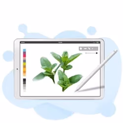
- Select Your Software
- Become familiar with the interface
- Play around with the brushes and colors
- Create an Outline
- Include Color
- What to avoid doing. The temptation when painting hair is to start by painting each hair with a small brush. This not only takes a ton of time, but it frequently comes off as hollow and unconvincing. Additionally, it makes modifying the light source challenging.
- Consider hair as a 3D object instead. Imagine hair as a single, complete, three-dimensional shape rather than a collection of millions of individual strands.
- Start by blocking out the hair’s basic contours, highlights, and shadows. Block out the areas with high values (highlights) and low values using a reasonably large, soft brush (shadows).
- Start by adding a little definition with a smaller brush. Reduce your brush size once the basic shapes are in place to add some fundamental details and definitions.
- In certain locations, use the Smudge Tool to make these lines fuzzier. Use the smudge tool on a new layer to blend and blur the lines you just drew in a few specific locations while making sure to preserve some details.
- Start adding details and individual hair strands with a small brush. To add more details, use an even smaller brush.
- Continue performing steps 5 and 6 until you are happy with the result. Once more, blend a few of these new details using the smudge tool. Then, until you are satisfied with the outcome, keep adding fine details and individual hair strands using a smaller and smaller brush.
- Add base colors first It’s as simple as that to put your base colors in separate layers underneath the sketch or lineart layers.
- Use an airbrush to apply blush and delicate shading. This step will be considerably simpler if a clipping mask is applied over the base layer. Additionally, be sure to match the color to the skin tone.
- Use a darker color or blending mode to block in the shadows. Study how other artists apply shadows, pay attention to how light affects the skin, and practice a lot.
- Combine it
- Add light by blocking in a lighter color. Make sure to shade the chest correctly: The light should be on top and the shadow inside. If you draw in the opposite direction, it will appear flat. Therefore, be sure to do that properly.
- Integrate the light. Don’t blend at random when you’re doing it! You should use the appropriate brush size in addition to blending with strokes that mimic the muscle structure.
- Include Highlights. This step involves placing those delicious highlights on an “Add(Glow)” layer with an opacity of 51. Additionally, you can add some light effects, color dodge, and environmental effects, such as the shadow cast by a tree or light that is dispersed, etc.
- Sketch the outline of the water on one layer. When shaping by filling with the base color, you can quickly and effectively achieve your desired result by turning on the “Border Effect” in the Layer Property.
- Use the “Lock Transparent Pixels” option to lock that layer, then draw some arbitrary outer edges on it.
- Draw more lines until you are happy with how your water is shaped.
- Next, make some areas transparent by erasing them with the “Soft Eraser” at a low opacity.
- Add the light reflections by making a new layer with the Blending Mode Add (Glow). Use the built-in glitter brushes in the “Decoration” subtotal for a better finishing effect.
- Use a large brush to blend colors.
- Use a straightforward brush to paint some grass horizontally. Similar to how we would depict leaves on a shrub. The grass blades can be painted by selecting the same color from the blended area using the color picker.
- Add a few untamed plants.
- Use a pressure-sensitive drawing tablet.
- Become familiar with the fundamental tools.
- Try to limit the number of brushes, pencils, etc.
- Employ layers.
- Avoid becoming overly reliant on ctrl +.
- Warm up with simple exercises.
- Draw a lot of sketches.
- Polish your favorite ones.
- Every few days, pick up one new tool.
- List and evaluate shortcuts.
- Make your workspace unique.
- Understand export and document options.
- Launch Photoshop and select your female reference. By selecting Image> Adjustments > Hue & Saturation and lowering the Saturation to -100, you can convert the Image to black and white. To make the process of referencing much simpler, place the two windows close to one another.
- Let’s now include some guides. Two kinds can be useful. The first is a grid with equal sections like blueprint lines, and the second is to make guidelines that focus on the key shapes in your reference image.
- Use a large Round Brush to begin sketching the basic shapes from your reference (B). Right now, don’t stress about the specifics or having a clear sketch.
- Now, let’s talk about the key features. Put tiny dots to indicate the start and end of each feature using the guidelines. After placing the dots, draw the nose, mouth, and right eye on separate layers.
- Photoshop’s Rough Sketch to Clean Drawing Progression. Use a rough sketch as a starting point, then refine it and add more information before adding shading.
- Use a Soft Round Brush to add your portrait’s first tones (B). It’s a good idea to check your progress at this point to see how closely the painting resembles the reference image you’ve chosen. Trust your instinct and make some edits if something doesn’t seem right.
- Keep painting and study the original Image carefully to comprehend the light and shadow.
- You must finish the painting now that we’ve handled the bulk of the fight. Just make adjustments until you’re satisfied with the outcome because the final touches help transform the portrait.
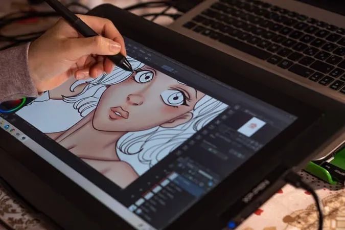
- Select drawing supplies (Traditional Art Path)
- Select equipment and hardware (Digital Art Path)
- Select A Drawing
- Tablet. Decide on art software.
- Study The Foundations of Art. Front view of an anime face.
- Draw an anime body.
- The Drawing Is Colored.
- Complete the illustration.
- Select a Reference Selecting the reference image you want to copy is the first step in learning how to create a digital portrait painting in Photoshop, Procreate, or Illustrator.
- Draw a simple sketch Before you get too far into the drawing, consider how you plan to use your digital art portrait before choosing the size and style of your canvas.
- Change Everything To Black and White Making changes to your work becomes trickier once you start working with color. Therefore, it is best to take care of any edits or changes you want to make immediately. Turn the opacity down and make a new layer to trace over your black-and-white sketch once you’re satisfied with how it looks overall. You might want to create several layers to edit specific portions of the portrait without altering the entire image.
- Include Color To provide guidelines as you color your picture, reduce the opacity to about 40%. To choose colors for the main part of the Image (you don’t want anything clashing), starting with your digital portrait backgrounds is crucial.
- Photoshop is recommended, but any paint program will do. Start with a ramp; avoid using full Saturation at this point. If you want to make the background a little more purple, that’s up to you.
- Begin using a large default brush to paint a “peachy” color at its maximum Saturation and value (sharp edge, pressure-sensitive opacity). Quickly fill in the rough shapes where your cloud would receive light. When painting a scene from nature, it’s especially important to avoid being too predictable, symmetrical, or regular. Reduce the size of the brush and apply some more precise strokes.
- Next, the shadow color—a dull purple that almost looks gray—is added. Then fill in the areas where the peach and shadow meet with the darker orange/red shade. In addition, since clouds typically shine brighter at the top, include them at the bottom.
- Next, the accent hue—a slightly paler peach. Apply the finest brush wherever a cloud edge faces to the left. Be unpredictable and irregular once more.
- You must make all these squiggles’ right-side edges softer while maintaining as much left-side sharpness as possible. You can paint the base color back into the highlight or use a small blurring brush or smear.
- Continue going back and forth, adding more highlight squiggles, softening certain areas, adding shadow color with a finer brush in certain areas, etc.
- Create a new layer and use a sharp-edged brush to paint a value that is a little less saturated and lighter than the lightest sky color. Make the bottom a little bit darker.
- Use the airbrush to paint a full white color while the layer’s transparency is set to “Preserve Transparency.” The brush size should be varied widely. The aim is to achieve this sort of “cauliflower” appearance.
- Next, add another layer and paint the original cloud color, as shown on the right, using a fully opaque, sharp-edged brush.
- Repeat the process, turn on “Preserve Transparency,” and airbrush white paint onto the surface. Continue in this cycle until the entire cloud area is occupied. Remember to aim for slightly closer layer edges at the beginning and wider layer edges at the end (due to the perspective).
- Create a sketch Making a sketch is, of course, the first step. To ensure that the proportions were correct, I used a reference image.
- Base colors The base colors of the eye are then laid down, along with the iris’s color. Keep in mind that skin has a wide range of colors, not just one “skin tone.”
- Hair, light, and shadow Work on the volume and shape of the eye, adding lighter and darker shadow areas. Already, painting the lashes and eyebrows gives it a more realistic appearance.
- Highlighting and detailing Including the finishing touches is so much fun. The upper lashes may reflect on the eyeball because the eyeball is a shiny, reflective surface and will have a bright highlight. When you’re finished painting, continue to add finishing touches. A fun time.
- Sketch silhouettes of fire Paint the fire’s silhouette first. As more vibrant colors will be added later, set the background color to black to make it easier to see. In vermilion, trace the silhouette. To get a better look, you can stretch and paint the end of the fire silhouette using the brush tool’s “fingertips.”
- Draw the luminous regions Draw the fire’s brighter areas. As you move inside, the fire becomes brighter and brighter. A new layer was added. Apply orange paint. To make the paint blend in, use the Brush Blur tool to blur the surrounding area. Put on the striking yellow hue. Use a “blur” to obfuscate the surrounding area after painting.
- Use “Additive Layer” to draw. Make a new layer additive (luminous) over the existing one. Paint it the same shade of yellow as you did for the previous piece.
- Disperse the flames Draw some firebrands around the fire to complete the picture.
- Grab a fairly straightforward landscape image that you like to start. You can use a picture you took while traveling to any stunning landscape.
- Create a new file with your desired dimensions; 1920 x 1080 pixels is a good starting point.
- Open the Image in Photoshop or paste it there, then reduce it to a tiny thumbnail. Whether you do the entire thing on one layer or separate layers for the painting and the photograph doesn’t matter.
- Use a straightforward, hard-round brush; the default settings can be changed by setting the size control to pen pressure. This implies that the brush stroke will be larger the harder you press on my graphics tablet. Press F5 to display the brush options while the brush tool is selected.
- To modify the Size Control, choose Shape Dynamics, then click on Size Jitter to find the Pen Pressure option.
- You’d be surprised to learn how many highly successful digital artists rely primarily on the most basic brushes. Of course, you can experiment with the brush settings, but you believe that using a simple brush with no fancy settings will help you improve more quickly. Keyboard shortcuts that are helpful To quickly access the brush options, press F5. Alt + Click – Use the brush tool while experimenting with colors. – reduce the size of the brush – enlarging the brush The Picture
- Ensure that “Sample: All layers” is selected for the Eyedropper tool. Therefore, all you have to do is paint the canvas with a sample of the colors from the photograph. Start by covering the entire canvas in the color that dominates the sky.
- Try to work from the foreground to the background, starting with the sky. Work quickly, trying to recreate the entire image rather than just a portion of it. At first, you can use large brush strokes to create cleaner lines and shapes.
- Use a smaller brush to add detail after feeling the overall composition has been captured. Don’t worry about the minute details; instead, focus on getting the overall feel of the picture.
- Eventually, you’ll get to the point where you can stop sampling the images’ colors. All the colors you’ll need are already on your canvas. The number of colors in a photo is also diminished when scaled down. How few colors you need may surprise you. Even if you think you made a mistake, see it to the end. With digital painting, especially in the beginning stages of the painting, you can frequently correct many mistakes.
- Sketch the basic outline of the lips. One common error is to draw a hard outer line around the lips’ outline. As this defines the shape of the lips, it is best to concentrate on the line or shadow between them. You can’t tell where the lips begin and end without a lip pencil or dark lipstick.
- Paint a base tone. If the light is coming from above, which is typically the case, then paint the lips with a base tone that makes the upper lip darker than the lower lip.
- Simple shading Add some shadows to define the lips further. Use appropriate references (photos or a mirror) to better understand the subject and lighting.
- Refine lines and add highlights. Start adding highlights, then accentuate the lips’ border.
- Add color variation To add more color variety, use a layer with the Overlay setting. I mostly add oranges and reds, but you can adjust by reducing the layer’s opacity to soften the effect.
- Add brighter highlights. Bright highlights can give the lips a glossy, moist appearance.
- Color blending For a smoother appearance, especially around the lips, you can blend the colors using a soft brush with a low-opacity setting. Pick up colors and glaze them over similar colors until the colors are well-blended. Repeat this process with additional colors.
- Increase the definition. Start defining the details more with a harder brush (I typically use a straightforward round brush with slightly ragged edges).
- Completed details Enjoy adding the finishing touches! I used an Overlay layer to slightly alter the colors and add a hint of pink or red to the lips. Detailing should continue until you are satisfied.
- Create a new file and pasting your line art into it. Lock the layer and reduce the layer’s Opacity to 20.
- Create a New Layer. The warrior’s outline should be drawn using a firm brush (if you’re using my set, ink). Do not omit any steps. 3: Select the area outside the body using the Magic Wand Tool (W). Create a New Layer, invert the selection (Control-Shift-I), and apply the Paint Bucket Tool to it (G). The bottom layer can now be eliminated. woman warrior painting base armor 4: This layer specifies the limits of the character. Anything that crosses these lines is not acceptable. To accomplish this, we must clip a layer to the base. Paint various parts of the armor with vivid, bright colors, using a separate layer for each color. It must be planned to use the fewest number of layers while avoiding overlapping areas of the same color. 5: These components are still present even though we cannot see what is outside the Clipping Mask. Let’s get rid of them. Cut pieces from each clipped layer by first selecting the area outside the mask with the Magic Wand Tool (W). 6: Control-clicking a clipped layer reveals that each of them has some portions that are hidden by other layers. Let’s clean it by picking a section of one layer and gradually removing the selection from each subsequent layer.
- Sketch the location of the trunk and leaves. Drawing the location of the tree and its size in the area where the tree will be drawn is the first step. Draw the locations of the two parts of the tree first since they can be roughly divided into two parts: the leaf and trunk parts.
- Sketch the placement of the leaf parts. The leaves are frequently the part of trees that cause the most confusion when being drawn. As seen in the picture, the leaves are clustered on each tree branch with few leaves. To more easily achieve a three-dimensional effect, consider this group of leaves as a tree component as you draw them. Following the placement of the leaves and trunk, you can roughly depict the locations of each component by using a photograph as a guide. At this point, don’t worry about the shape of the leaves; draw a simple circle to indicate where the parts are.
- Sketch the base. Create a new layer after positioning is finished, then draw the base in a single color. Outline the tree using the color you’ve chosen for the shadow’s deepest shade. The shadows appear bluish, and the sunlit areas appear yellowish. As a result, pick a dark blue hue for the shadows. Don’t worry too much about the color because it can be modified somewhat by using filters after the fact.
- Give the base some color Once the primer has been applied, create a new layer on top of the previous one and select the clipping option. This allows you only to color the area underneath, so let’s roughly lighten and darken the layer beneath. Here is a picture of how the light hit me from the top left corner, making the color transition from yellow-green to blue more vivid as it got darker.
- Painting the leaf’s lightest area. Create a new layer after drawing the base, then clip the base to create the brighter portions of the leaves. Instead of using a pen brush with a distinct outline, I’m using an acrylic brush with variable brush pressure. Paint the area a light yellowish-green color because it will be exposed to the sun. Again, don’t worry too much about the leaf shapes; give them a firmer outline.
- Join the light areas and the base. We’ll use an intermediary color to blend the colors of the light areas and the darker areas underneath, which appear to be floating apart. Under the layer for the light area, please create a new layer and clip the neutral color onto it.
- Cast a gentle light Create a layer on top of the base and blend the light areas and the base to bring out more light.
- Creating a leaf texture painting Since the image appears smooth, add the chunky silhouette of the leaves to each section using a watercolor brush.
- Draw the leaf outline. It’s time to contour the entire picture after you’ve drawn the leaves’ silhouettes on the part. To make the silhouette more realistic, trim the base layer and add leaves.
- Introducing Shadows Create a new layer at the top and clip, then use the airbrush to draw shadows on the leaves and other objects in the back of the image to give them a crisp, three-dimensional look once the shape is in place.
- TIFF file size after scanning.
- At least 300 DPI when scanning.
- While CCD scanners are better for textures, CIS scanners are more affordable.
- Before scanning, apply a fixative to any smudge-prone media.
- When working with larger art pieces, scan them in sections and piece them back together in Photoshop.
- Some Media May Not Be Capable of Being Accurately Scannable by Scanners The most challenging media to scan accurately are those with texture, like globs of paint or stretched canvas. Complete flatness is ideal for scanner performance. But you can keep all that texture with photography.
- Cheap scanners are not very good. Many of the minute details that count may not be captured by a standard (i.e., reasonably priced) scanner. High-resolution cameras, however, can record even the smallest details.
- Some Artworks Are Just Too Large to Scan Working with a very large painting—anything bigger than A2 or A3 size—will put you in a difficult situation. While it is technically possible to scan individual portions of your painting and then use Adobe Photoshop to stitch them all together, doing so would require significant work. You can create vector-based art on the iPad. While many apps will let you do this, Affinity Designer is our personal favorite. Affinity Designer is a behemoth and was one of the first popular vector design apps for the iPad. Thanks to its metal-accelerated, lightning-fast speed, you can zoom in by more than 1,000,000%.
- Only use light to paint.
- Set Color Limits.
- Copy Realistic Colors Exactly.
- Using a Large Brush, paint.
- No Directional Light Source Shade.
- Study First, then Paint.
- Discover the Color Values.
- Open a picture Go to File > Open… in Photoshop and choose a picture from your computer. Choose “turn-photo-into-painting.jpg” if you’re following along with the example asset. Click Open. Choose one that features a landscape or a still life to achieve the best results when using one of your photos. The landscape photo is chosen in Photoshop’s File > Open menu. Layer to smart object conversion Find the Layers panel in the workspace’s lower right corner. Go to Window> Layers to check if you can see it. Convert to Smart Object can be chosen by performing a right-click on the “Background” layer.
- You can change the artistic filter you will use in the following step by converting it to a Smart Object. A “nondestructive edit” keeps the original image intact even after adding effects. To edit the artistic filter and keep the original photo after editing, the layer is changed to Smart Object.
- Access the Gallery of Filters. Click filter> Filter Gallery to begin. The Photoshop window displays a coastal town perched on a hill. Filter Gallery has been chosen.
- Use a Dry Brush filter. To the right of the photo preview, select the Artistic folder and then choose the Dry Brush filter. The filter options are located to the right of the Window. Set the Brush Detail to 9, the Brush Size to 7, and the Texture to 1 for the example photo. Advice: The filter’s preview view options can be found in the Window’s lower-left corner. Select Fit in View from the percentage drop-down menu to view the entire image in preview mode. Click OK when you’re finished. The Artistic folder’s Dry Brush filter is chosen, and the brush options are chosen to give the town a painted appearance.
- Brighten the colors. Find the Adjustments panel above the Layer panel to the right of the workspace. To see it, select Window> Adjustments. In the second row of icons, select the Hue/Saturation adjustment. Use the Saturation slider to increase the saturation to +65 in the resulting Properties panel. This intensifies the colors in the image and emphasizes its painterly appearance. Close the panel by clicking the Properties tab’s title in the upper-left corner. The hue/saturation adjustment layer is added to enhance the coastal town’s vibrant colors.
- Fine-tuning modifications (optional) The edits you have made are nondestructive, as was stated in step 2, so you can go back and make changes to them in the Layers panel. The Hue/Saturation sliders are made available when you double-click the icon to the left of the Hue/Saturation 1 layer in the Layers panel to edit the Saturation adjustment. Double-clicking the Filter Gallery under Layer 0 in the Layers panel opens the Filter Gallery for additional editing when you want to edit the Dry Brush filter.
- Employ the same method that traditional painters utilize. Use a limited colour palette.
- Quickly block in colour using a brush as large as it can be.
- Keep your perspective “zoomed out” as long as possible to understand the value better.
- When printing fine art, ensure the resolution is set to 300 dpi. In most cases, you can print anything up to 13 inches (33 centimetres) by 19 inches (48 centimetres) without adjusting the resolution from the default 72 dots per inch. Raise the resolution to as much as 300 dots per inch for projects that will be displayed or be quite large.
- Make some adjustments to the hue of the print. Changing your print’s resolution can affect the colour and texture of the final product. To restore the colours in your print to their initial state, use the “colour” menu in your editing software.
- When working on a large project, you should use professional software plugins. It is recommended that you use a plugin to change the size of your digital artwork if you plan on printing it on a poster, banner, or another similarly sized project.
- Raise the contrast to see the colours more clearly. Your choice of software will determine how you make adjustments to the contrast of your artwork. Most of the photo editing software out there will provide you with a sliding cursor that you can use to adjust the contrast level. Boost the contrast even further than what appears to be the optimal level on the screen. What appears crisp on the screen might not print out quite as crisply as it appears on the screen.
- In Photoshop, crank up the sharpness to the maximum. Right-click on “Art Layer” in Photoshop’s “Layer” menu, and then select “duplicate layer” from the drop-down menu that appears. After that, choose “Filter,” “other,” and “High Pass” from the drop-down menus. Choose 3 from the “radius” drop-down menu, and then click the “OK” button. Return to the Layer Palette and make your selection from the drop-down menu on the left, picking either “Soft Light” or “Overlay.” The Opacity Slider should be set to 10 and 70 percent.
- You should save your artwork as either a JPEG or a TIF file. After you have made adjustments to your artwork and are ready to print it, the quality of the file that you have saved it as, whether it be a JPEG or a TIF, will be the best. If you click “save as” and then navigate to the drop-down menu labelled “file type,” you can change the file type to either JPEG or TIF.
- Affinity Photo
- Photoshop
- Corel Painter 2026
- Rebelle 5
- Procreate
- Clip Studio Paint Pro
- Artweaver 7
- ArtRage 6
- Krita
- TwistedBrush Pro Studio
- Etsy.
- Amazon.
- FineArtAmerica.
- Saatchi Art.
- UGallery.
- Shopify.
- TurningArt.
- Society6.
- To begin, select a colour from the Swatches panel, and then use the Brush Tool (B) to paint that colour onto the canvas while setting both the opacity and the hardness to 100%. Reduce the hardness and the opacity to 50% once it’s been applied to the canvas.
- Paint a small swatch next to the primary colour while selecting it as the Foreground Color in the palette. Because of the adjustments made to the brush settings, this swatch should now look more opaque and have rounded corners.
- Choose the colour of the opaque stroke you just created using the Eyedropper Tool. Create a new stroke next to the existing one. Repeat this process, taking care to overlap the strokes as you work through the process. Reduce the Intensity of the Color Over Time Eventually, and the colour will become less noticeable and show signs of blending. Consider it the beginning stages of a gradient effect if that helps.
- To “blend” two colours, colour-pick them, so they are next to each other on the colour wheel, then overlap them with increasingly opaque layers. During this process, the Brush Tool becomes the boss, and the Eyedropper Tool becomes his right-hand man. Repeat these steps until all your colours have been incorporated into one another.
- Open Microsoft Paint could also be used. Paint is a drawing program that can be utilized for the creation of drawings as well as the editing of digital photographs. Paint also allows you to save image files using a variety of different file formats for those files. To launch Paint, click the Picture of the Start button on the taskbar, click All Programs, click Accessories, and finally click Paint.
- Create Signature Adjust the dimensions of the image to be close to 350 by 200. Choose the “Pencil” tool, and then adjust the thickness of the line. Create a signature on the paper. If you need to create an image file for the check draft, you have the option of entering the text signature for the check draft.
- Save your file You can save this file in bmp, jpg, gif, or png format, after which you can incorporate it into the ezCheckPrinting, ezPaycheck, ezAccounting, or ezCheckPersonal application.
- Select the Application You Will Use After becoming familiar with several of the functions and benefits of various leading digital illustration programs, the next step will be to select the one that will serve your needs most effectively. Even though Adobe Fresco inspired this step-by-step guide, it should be able to inform your process regardless of the software that you choose to use because the programs share many of the same fundamental functions.
- Become Familiar with the User Interface Spend some time getting familiar with the illustration software of your choice before beginning work on your digital painting project. You will need to tap your way through several different screens, menus, and commands. Create a new document as soon as you feel comfortable with the current one. Pick a page size—the instructor of this course, Peggy Dean, opts for a custom size that measures 16 by 20 inches—and then select a pixel size of 300.
- Experiment with Different Brushes and Colors Now that you have a blank canvas in front of you, it is time to explore all of the options available in this digital illustration program. Using your stylus, you can hone your skills with various paintbrushes and colours. You can delete things as you go along very easily. After gaining experience with the tools at your disposal, you are ready to move on to a project requiring more concentration.
- Draft your outline. After trying out each of the brushes, you are now in a position to select the tool that will allow you to draw with the most success. Make use of that one to create a rough sketch of the foundation for your illustration. Add Color to Your Sketch You are ready to add colour to your sketch.
- There are many ways to add colour to your digital illustration, but those just starting might find it easiest to begin by choosing a broader brush and colouring in their outline the same way they would on paper. You can achieve a variety of textures throughout your illustration by using different brushes to paint on those textures.
- Self-taught (free online courses).
- Art school (with certification)
- Open up your drawing software and add a new layer to the document. This will be for the tears in their own right.
- For the tears, select a colour that is either very light blue or another light colour. Because of this, they will be easier to distinguish against the darker colours of the face and eyelashes.
- Use a brush with a soft edge to draw software, such as Adobe Photoshop or Paint Tool Sai a digital tablet, such as a Wacom Intuos or Huion H610 Pro, a photo of someone crying or an image with tears in it, a photo of someone crying or an image with tears in it a photo of someone crying a digital tablet, such as a Wacom Intuos or Huion H610 Pro a photo of
- Hard round- This round has a circular head and a pointed edge. This brush is far and away the most useful one in Photoshop.
- Soft round – Also circular, this brush lacks the definition of the hard round. It is more analogous to an airbrush or sprays paint in appearance. It works wonderfully for creating seamless transitions and a gloomy atmosphere in paintings.
- Hard flat -is a variant of the Hard round. Its head is oval, flattened, and has a sharp edge. This is more directional but tends to leave nice-looking brush edge marks.
- SculptGL
- Random Art Prompt Generator for Kids
- Mondrimat
- ManadalaGaba
- Bomomo
- GIPHY
- JacksonPollack.org
- KRITA
- Make Beliefs Comix
- Pixilart
- Sketchpad
- Sumo Paint
- Toy Theater
- Vectr
Digital Painting Practice Test Questions
Prepare for the Digital Painting exam with our free practice test modules. Each quiz covers key topics to help you pass on your first try.
Digital Painting Brushes and Textures
Digital Painting Exam Questions covering Digital Painting Brushes and Textures. Master Digital Painting Test concepts for certification prep.
Digital Painting Color Theory
Free Digital Painting Practice Test featuring Digital Painting Color Theory. Improve your Digital Painting Exam score with mock test prep.
Digital Painting Composition and Perspective
Digital Painting Mock Exam on Digital Painting Composition and Perspective. Digital Painting Study Guide questions to pass on your first try.
Digital Painting Light and Shadow
Digital Painting Test Prep for Digital Painting Light and Shadow. Practice Digital Painting Quiz questions and boost your score.
Digital Painting Software and Workflow
Digital Painting Questions and Answers on Digital Painting Software and Workflow. Free Digital Painting practice for exam readiness.
Digital Painting Techniques
Digital Painting Mock Test covering Digital Painting Techniques. Online Digital Painting Test practice with instant feedback.
Digital Painting Basic
Free Digital Painting Quiz on Basic. Digital Painting Exam prep questions with detailed explanations.
Pro Tip: Focus your Digital Painting study time on areas where you score lowest. Most exam questions test application of knowledge, not memorization.

Digital Painting Techniques
Digital Painting: Pros and Cons
- +Digital Painting credential is recognized by employers and industry professionals
- +Higher earning potential compared to non-credentialed peers
- +Expanded career opportunities and professional advancement
- +Structured learning path builds comprehensive knowledge
- +Professional development that stays current with industry standards
- −Preparation requires significant time and study commitment
- −Associated costs for exams, materials, and renewal fees
- −Continuing education needed to maintain credentials
- −Competition for advanced positions can be challenging
- −Requirements and standards may vary by state or region
Digital Painting Questions and Answers
About the Author
Certified Professional Development Expert & Niche Certification Advisor
University of Pennsylvania Graduate School of EducationDr. Alexandra Kim holds a PhD in Professional Studies from the University of Pennsylvania and is a Certified Professional in Learning and Performance (CPLP) and Certified Professional in Talent Development (CPTD). With 17 years of corporate training and professional certification advisory experience, she helps professionals navigate specialized, emerging, and cross-industry certification programs.