How to Make a Bar Graph in Excel: Step-by-Step Guide 2026 June
How to make a bar graph in Excel with stacked, clustered and 100% stacked styles, 💯 formatting tips, dynamic ranges, common errors, and quick keyboard

Bar graphs are the workhorse chart of any Excel workbook. They convert a column of numbers into something a manager, a teacher or a stakeholder can read in two seconds, and they sit at the heart of dashboards, monthly reports and student assignments. Excel ships with several flavors of bar graph — clustered, stacked, 100% stacked, in horizontal or vertical orientation — and the right choice depends on what you are trying to show. The good news is that all of them start from the same three steps: select your data, click Insert, and pick a chart subtype.
This guide walks through every approach you might need. We cover the fastest way to drop a default bar graph onto a worksheet, the keyboard shortcut that creates a chart in a single keystroke, and the steps to build a chart from a deliberately formatted range that updates as you add new rows. We also cover the formatting choices that turn a bland default chart into something presentable: axis titles, data labels, color, gridlines, gap width and chart area sizing.
The principles do not change between Excel versions. Excel 2016, 2019, 2021, Microsoft 365 and Excel for the web all use the same chart engine, with minor differences in where the buttons live on the ribbon. Excel for Mac differs cosmetically but follows the same chart object model. Wherever you see a screenshot in this guide, the equivalent button exists on every modern Excel build, including the free web version at office.com.
By the end of the guide you will be able to make a presentable bar graph in under a minute, choose between bar and column orientation deliberately, add and remove chart elements without hunting through menus, and refresh charts as your data grows. We close with troubleshooting for the half-dozen issues that catch out new users — flipped axes, vanishing labels, overlapping bars and charts that mysteriously refuse to update.

The 30-second bar graph
Select the cell range with your category labels and values, including the header row. Press Alt + F1 to drop a chart on the same sheet, or F11 to put it on a new chart sheet. If Excel picks the wrong chart type, click Change Chart Type on the ribbon and choose Bar or Column. That is it — three keystrokes and a click.
Before you build anything, decide whether you want a bar chart or a column chart. Excel uses the words in a specific way that catches out beginners. A column chart has vertical bars rising from the X axis. A bar chart has horizontal bars extending rightward from the Y axis. Choose horizontal bars when your category names are long, when you have many categories, or when the chart will be read in a narrow space. Choose vertical columns when categories are short and the data is time-based.
The data layout that Excel expects is simple. Put your category labels in the first column or first row, and your values in the next column or row. Include a header. Excel uses the header for the legend if you have more than one data series. If your numbers and labels live on different sheets or in non-adjacent ranges, hold the Control key while clicking each block in turn so Excel selects them as a single range for the chart.
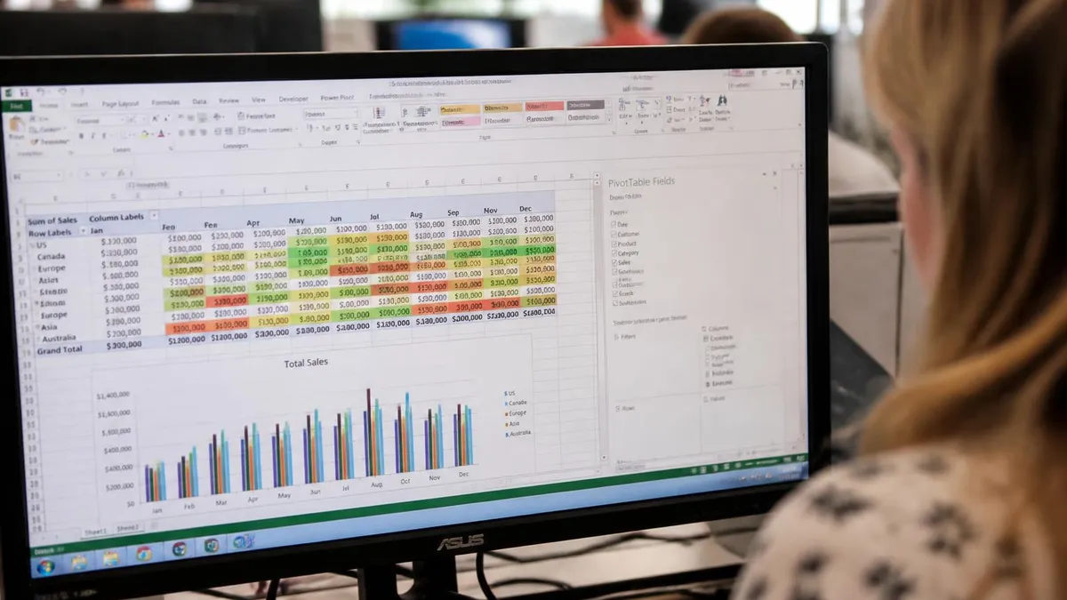
Once your range is selected, the Insert tab on the ribbon shows the chart gallery. Click the small bar-chart icon and Excel previews each subtype as you hover. The first row covers 2-D bars and columns, the second row offers 3-D variants, and there is a separate icon for stacked and 100% stacked styles. For 90% of business charts you want the simple Clustered Column or Clustered Bar at the start of the gallery — anything fancier needs a deliberate reason.
If you prefer the keyboard, the same gallery opens with Alt+N then C, then the chart type letter. The fastest path of all is the F11 shortcut, which creates a default chart on a brand-new sheet, or Alt+F1, which embeds it next to your data. Both shortcuts use the chart type Excel last placed in the workbook, so set the default once and you can build new charts at machine-gun pace.
Bar graph subtypes in Excel
Vertical bars side by side. Use to compare values across categories or across two or three short data series. Excel's safest default.
Horizontal version of clustered column. Use when category labels are long, when comparing rankings, or when you have ten or more categories.
Bars split into colored segments that sum to a total. Use when the parts and the whole both matter — like revenue by product within each region.
Bars normalized to 100%. Use when you only care about the percentage mix and the absolute totals are noise — like budget composition by quarter.
Once a chart is on the sheet, three small buttons appear at the top right corner when the chart is selected. The plus icon opens Chart Elements and lets you toggle axis titles, data labels, the legend, gridlines, the chart title and the trendline. The brush icon opens Chart Styles and Chart Colors. The funnel icon opens Chart Filters where you can hide individual categories or series without changing the underlying data.
Click the chart title and type to overwrite it. Click any axis to format its tick marks, font and number format. Right-click any bar to open Format Data Series, where the Gap Width slider controls how wide the bars are relative to the spaces between them. A narrow gap width fills the chart area with bars, while a wide gap width leaves more whitespace and looks cleaner in printed reports.
Color matters more than most beginners realize. The default Office palette is fine but generic. Pick a single accent color for your most important series and gray everything else, and a noisy chart turns into a clear one. To recolor a single bar without affecting the rest of the series, click the bar twice — the first click selects the series, the second isolates the single point — then right-click and choose Format Data Point.
Data labels are the difference between a chart that needs squinting and one that reads itself. Click the plus icon, tick Data Labels, and Excel adds the value above each bar. For percentage charts, format the labels with a custom number format like 0% so they match the axis. For currency, use $#,##0 to keep them tight. Right-click a data label and Format Data Labels to choose position, font and whether the label shows the category name as well as the value.
Step-by-step: build each chart type
Select A1:B10 with categories in column A and numbers in column B. Click Insert, then the small column-chart icon, then Clustered Column. Click the chart, press the plus icon and tick Data Labels and Axis Titles. Type a meaningful chart title. Right-click a bar, choose Format Data Series, and set Gap Width to 100% for a balanced look.

The chart you build today will most likely need to grow tomorrow. There are two clean ways to make a chart update automatically as you add rows. The simplest is to convert your data range into an Excel Table with Ctrl+T before inserting the chart. A chart built from a Table inherits the Table's dynamic range; new rows are automatically picked up the next time the chart redraws.
The second option is to use named ranges with the OFFSET or INDEX function for the chart's data series. This older approach gives more control — for example, you can have a chart that always shows the last twelve months — but it is fiddlier to set up and harder to maintain. For nine cases out of ten, the Excel Table approach is faster, more readable and just as powerful.
If your data is on a different sheet or in a different workbook, the chart still updates as long as the references remain valid. To repoint a chart at a new range, click the chart and choose Select Data on the ribbon. Edit the data series ranges by hand or click the small range-picker icon and reselect the cells. The legend entries can be reordered here if your stacked chart has segments in the wrong order.
For dashboards, place each chart inside a small Excel Table or named range and use slicers or PivotTables to drive the underlying numbers. A bar chart connected to a PivotTable becomes a PivotChart, which redraws live as users click slicers. PivotCharts are slightly more restrictive than ordinary charts — for example, you cannot move single data points around — but they are the fastest way to build interactive bar charts that other people can drive without breaking your formulas.
Three traps account for most of the support calls. First, using a 3-D bar chart for a serious report — depth distorts the visual comparison and is almost never appropriate for business data. Second, leaving the categories in reverse order on a horizontal bar chart, which makes the largest value sit at the bottom. Third, forgetting to fix the value axis maximum on a chart used as part of a multi-chart dashboard, so different charts use different scales and look comparable when they are not.
Number formatting on the axis is one of the smaller details that separates polished charts from amateur ones. Click the value axis, choose Format Axis, and set the number format the same way you would a cell — $#,##0 for currency, #,##0 for thousands, 0% for percentages, 0.0"K" for thousands with a K suffix. The labels on the bars themselves can use a different format if it makes sense, although consistency usually wins.
Sorting the bars matters too. By default Excel plots categories in the order they appear in the source data. For a comparison chart that should be quickly readable, sort the source data descending by value before inserting the chart. The audience reads from the top down and the largest, most important value gets attention first. For time series — months, quarters, years — preserve the chronological order even if it is not visually optimal.
Resizing the chart object is a separate concern from resizing the chart area inside it. The outer chart frame can be dragged to any size, but the actual plot area inside that frame can be resized independently by clicking the plot and dragging its handles. This is how you give axis titles or long category labels enough room without distorting the bars themselves.
Saving a chart you like as a template is the secret to consistency across a workbook. Right-click any finished chart, choose Save as Template, and Excel stores it in your user template folder. The next time you insert a chart, the template appears under the Templates section of the chart gallery. Use this for organizational color palettes, fonts and axis defaults — it saves a quarter-hour of formatting on every new chart.
Bar graph quality checklist
- ✓Chart title clearly states what the chart shows
- ✓Both axes are labeled with units
- ✓Data labels are on bars or values are obvious from a clean axis
- ✓Colors use one accent color, not the rainbow palette
- ✓Categories sorted descending unless time-based
- ✓Gap width set to 100% or 150% for clean appearance
- ✓Number format on axis matches the underlying data
- ✓No 3-D effects, no shadows, no chart skirt
- ✓Source range is an Excel Table for automatic updates
Power users should learn the chart object model just enough to read VBA samples online. A chart on a sheet is a ChartObject; the Chart inside it has a SeriesCollection, each Series has a Points collection, and so on. Recording a macro while you change a chart's color or gap width gives you the exact code path. Even if you do not write VBA every day, understanding the hierarchy makes it much faster to find a setting buried under several right-click menus.
For Excel 365 users there is also the new chart formatting pane, accessed from Format Chart Area in the right-click menu. The pane is task-organized — Fill, Border, Effects, Size — and persists between charts, so once you set up a workflow you can blast through ten charts in the time it used to take to format two. The classic dialog is still available for users who prefer it.
Excel for the web supports almost the full set of bar chart features, including data labels, axis titles, legend toggles and gap width. It does not yet support chart templates or the full set of 3-D variants. For most purposes this is fine — the templates issue can be worked around by formatting one chart and copying it to other sheets, which carries the formatting along with the data binding.
If your chart looks wrong the first place to check is the data range. Click the chart and Excel highlights the source cells with colored borders. If the highlighted range does not match what you expected, the chart is plotting the wrong cells. Choose Select Data on the ribbon and edit the series and category references directly. This catches almost every mismatch caused by inserted or deleted rows above the data block.
Charts that refuse to update when underlying data changes are usually pointing at a fixed range that does not include the new rows. Convert the range to an Excel Table with Ctrl+T and the issue disappears for future inserts. For an existing chart, the simplest repair is to recreate it from the Table version of the data — five seconds of work that fixes the dynamic-range problem permanently.
Bars that overlap each other rather than sitting side by side mean the Series Overlap setting is not at zero. Right-click any bar, choose Format Data Series, and look for Series Overlap. Negative values create gaps between the series within a category; zero puts them flush against each other; positive values overlap them. The setting is buried but the slider position determines whether your clustered chart looks like a comb or a soup.
For charts that include a secondary axis, double-check that the secondary series is rendered as a different shape from the primary — a line on top of bars, for example. Otherwise readers genuinely cannot tell which bar is on which axis and the chart misleads even though the numbers are right. Excel will not warn you about this; design discipline is your job.
Bar graph quick reference
Choosing the right chart for the data
Use a clustered bar (horizontal) sorted descending. Easiest to scan and works for ten or more categories without crowding the X axis.
Clustered column is the safe choice. Two or three series is the practical limit before colors start to blur and the chart is unreadable at small sizes.
Stacked column or stacked bar is appropriate. Use only if the segments matter to the reader — otherwise a simple total bar chart is clearer.
100% stacked column shows percentage mix changing over months or quarters. Hide the absolute axis since values normalize to 100%.
Bar graphs interact gracefully with other Excel features that beginners often overlook. Conditional formatting in the source cells passes through to data labels if you reference the cells directly with the formula bar. Sparklines fit alongside bar charts on dashboard sheets and give per-row context. Slicers attached to PivotTables drive PivotCharts to filter without retyping criteria. Combine these and a dashboard that looked complicated becomes a fifteen-minute build.
Print and export behavior is its own topic. A chart selected on screen prints as a single page if you choose Print and pick "Print Selected Chart." To export a chart as an image, right-click and choose Save as Picture in Excel 365, or copy the chart and paste it as a picture into any document. PDFs preserve chart vector data when you export the workbook to PDF, so the chart remains crisp at any zoom level.
For PowerPoint slides, paste the chart with the Use Destination Theme option to inherit slide colors, or with the Keep Source Formatting option to preserve your custom palette. Either way the chart stays linked to the workbook by default — change the source numbers in Excel and the slide chart updates next time you open the deck. To break the link and freeze the chart, right-click and choose Edit Links to Files, then break the link.
Microsoft Excel: Pros and Cons
- +excel — growing demand for Microsoft Excel professionals in the job market
- +Diverse career opportunities across multiple industries
- +Competitive compensation packages including benefits
- +Clear advancement path from entry-level to senior positions
- +Transferable skills applicable to related fields
- −Entry-level positions may offer lower starting compensation
- −Field can be competitive — relevant certifications help stand out
- −Work-life balance varies by employer and specialty
- −Keeping skills current requires ongoing professional development
- −Some positions require specific licenses or background checks
EXCEL Questions and Answers
About the Author
Business Consultant & Professional Certification Advisor
Wharton School, University of PennsylvaniaKatherine Lee earned her MBA from the Wharton School at the University of Pennsylvania and holds CPA, PHR, and PMP certifications. With a background spanning corporate finance, human resources, and project management, she has coached professionals preparing for CPA, CMA, PHR/SPHR, PMP, and financial services licensing exams.