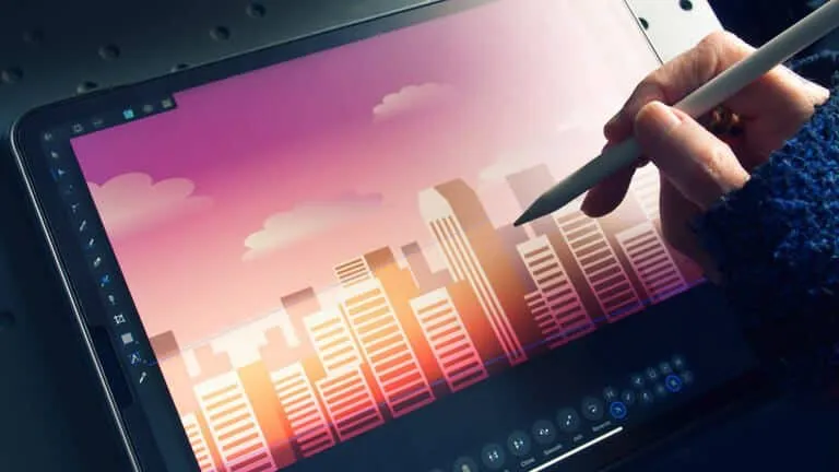
Affinity Designer Tips & Tricks 2025
Affinity Designer is a vector graphics editor. It’s part of the Affinity trio of products. It’s easy to use, versatile, and extremely powerful. To use it properly, you’ll need to learn a few tips and tricks. These tricks will help you to get more from Affinity Designer.
Free Affinity Designer Practice Test Online
Affinity Designer Questions and Answers
To curve text in Affinity Designer, first, select the path along which you want the text to flow, then select the Artistic Text tool and click on the path to add your text.
To install a specific font, open its file in Finder, double-click it, and then select Install Font. Open the Font Book application (included with macOS), click Add fonts on the toolbar, find and select the font files, then click Open to use multiple fonts.
Affinity Designer is a graphic design and UX solution that aids companies in producing illustrations such as concept art, logos, icons, UI designs, print projects, and mock-ups.
Select Export by clicking File in the top left corner of the screen. When you select Export, a menu of different file formats will appear. Affinity Designer is compatible with a large number of file formats. Choose the Preset SVG (for export) by clicking the SVG file format, then click Export.
- Choose the Crop Tool from the Tools panel on the left.
- Choose a crop mode from the Mode pop-up menu on the context toolbar.Â
- Modify the settings for the context toolbar.Â
- To resize the grid to your specifications, drag one of the corner or edge handles. Then, drag anywhere inside the grid to change its position.Â
- Select Apply from the context toolbar.
- Open the Document Setup page.
- In the Color Tab, choose the Transparency option.Â
- Export Your Work
- View Your PictureÂ
- Visit the Pixel Persona pageÂ
- Make Your Layer Raster by unlocking it
- Use the Selection Brush Tool To Make A Selection
- Make Your Choice More Exact
- Get Rid Of The Background
- Export Your Image
PSD, AI, and EPS files can easily be opened and edited in Affinity Designer.
No, you shouldn’t import RetroSupply Photoshop brushes into Affinity.
Using the Pencil Tool, you can draw lines with various widths freehand, just as if you were drawing on paper, to give your work a hand-drawn appearance.
- Launch the Assets Panel. Click View>Studio>Assets in Affinity Designer or Affinity Photo to access the menu. The panel in Affinity Publisher is typically located in the upper left corner of your workspace.
- Select Import Assets under Preferences on the panel.Â
- Navigate to the. afassets file that needs to be installed.Â
- After choosing the file, click Open.
- Launch Affinity Designer.Â
- Select Import Brushes from the Panel Preferences menu in Brushes Studio.Â
- You can locate the. afbrushes file you require using the Files Browser that has appeared. Pick it up immediately.
- The brush category will be automatically imported and displayed. Choose a brush and begin creating.
Open the Preferences menu in Affinity Designer (keyboard shortcut: Control +) and go to the User Interface section to change the background color. Using the “Background Gray Level” slider to adjust the background color if you’re working with a standard document. Using an artboard, use the “Artboard Background Gray Level” slider.
To view the current accessibility settings, select Open System Preferences. The checkbox next to Typeface. The app can then be enabled by clicking the lock icon. It will then be possible for Typeface to change fonts in Affinity Designer.
- First, select the monster image under File > Open. This picture is a PNG.Â
- Take hold of the Crop Tool in the Tools Panel. Use the cropping tool to make the third monster the only thing that is visible in the image.Â
- After cropping the image, choose to Rasterize from the context menu when selecting the layer in the Layers Panel.Â
- After that, take the Pen Tool out of the Tools Panel. Make sure the fill color isn’t active in the Swatches Panel. Next, select the Context Toolbar and change the Width of the stroke setting to 5 pt.
- After tracing the body, give this layer the label “Body” in the Layers Panel.Â
- Next, trace the hair using the Pen Tool. In the Layers Panel, give this layer the label Hair. Grab the Rectangle Tool from the Tools Panel after that. Over the monster’s face, draw a rectangle. Set the Corner to Rounded and the Corner Percentage to 34% in the Context Toolbar. Label this Face in the Layers Panel.Â
- Take out the Pen Tool once more. Set the Width to 8 points in the Context Toolbar. Use the tool to draw a straight line across the monster’s mouth. Click off the line while holding down CTRL. Next, trace the tongue using the Pen Tool. In the Layers Panel, give the Lip line and Tongue a name.Â
- Choose the Lip and Tongue layers in the Layers Panel. For the layers to a group, press CTRL + G. Name the collective Mouth.
- Trace the eyelashes on the monster’s left eye with the Pen Tool while it is still selected. Grab the Ellipse Tool from the Tools Panel at this point. Set the Width to 5 pt in the Context Toolbar. On top of the oval shape, draw an ellipse.
- Next, outline the monster’s eye with an ellipse. Next, add two more ellipses, one above the other, to each white space.Â
- Pick the ellipse of the eye’s central region. Set this fill color to black in the Swatches Panel. Take away the stroke color.
- After that, choose the two ellipses next to the empty spaces. Remove the stroke color and change the fill color to white.Â
- Select all of the components we made for the eye in the Layers Panel. To group them, press CTRL + G, then name the group Left Eye. The group can then be duplicated by pressing CTRL + J. Name the duplicate Right Eye.
- Select Flip Horizontal from the Transform Panel while the Right Eye group is selected. After that, drag the group to the right side and put it over the eye while pressing and holding Shift.
- At this point, select the Donut Tool from the Tools Panel. Using the tool, draw a donut over one of the donuts on the monster. The donut will then be duplicated by pressing CTRL + J. Place the duplicate over one of the other donuts and resize it to fit the one it is placed on. Repeat until all of the donuts have been covered.Â
- Next, choose the two larger donuts. Drag these two donut layers into the Body layer in the Layers Panel. Set the Context Toolbar’s Width of the Stroke property to 3 pt while selecting every donut.
- Choose the monster’s body. Visit the Swatches Panel after that. Set #954FC4 as the body’s fill color. Next, choose to Fill in the Context Toolbar. To switch to Noise, click on the circle next to Opacity. Move the slider to the right to add some noise to the monster’s body.Â
- Then pick the Face. Set the fill to #3CB98D in the Swatches Panel. Then select the Toolbar to Fill in the Context. Add some noise to the face by clicking the circle next to Opacity.
- Next, choose Hair. Give it the fill color #EC7226 as shown. Go to the Context Toolbar after that. Click the circle next to Opacity and Fill. Make the hair noisier.
- Next, choose the oval shape that appears beneath the monster’s eyes. Set the fill color of these shapes to #BF40AA in the Swatches Panel. Then navigate to the Context Toolbar’s Fill section. Click the circle to change the Opacity to Noise and give these shapes noise.Â
- Choose the Mouth group. Set the fill color #246C53 for the Tongue’s stroke and the Lip. Next, change the tongue’s fill color to #DE89B3. The tongue’s fill color should then be given some noise.
- For the donuts, use the fill colors #FFFA20, #4486C1, and #FF20AC. Don’t forget to add some noise to the donut colors as well.Â
- Select all of the components you made for the monster in the Layers Panel. To group the layers, press CTRL + G. Then give the group the name Monster.
- Set up your new document. Open the app and start a new document using the startup panel.Â
- Prepare the pen tool. To limit creation to straight lines, select the Pen tool from the left and click the “Line Mode” button on the top Context toolbar. Set the stroke weight to 9.6pt on the Stroke panel to the right (or type 40px, which will convert for you).
- Begin making lines. Click and drag downward while holding Shift to force the line to be vertical, starting from above to the left of the design area’s center.Â
- Prepare your guides. Some layout guidelines will aid in maintaining order among the expanding number of elements.Â
- Everything ought to fall into place. At 855px, place the right line over the guide; it should snap into place. A diagonal line should be drawn from the top-left of the logo to just above the middle of the logo space using the Pen tool. To duplicate this, select the Move tool (V) once more, hold down the Ctrl key, and drag as we did for the vertical line. Use the “Flip Horizontal” button on the top toolbar to flip it. Set it in the right position.
- Increase strokes By repositioning the end nodes with the Node tool, you can edit these strokes (A). If satisfied, Shift-click both diagonal lines to select them, then select Layer > Expand Stroke from the menu. They become rectangular shapes; as a result, making them simpler to select and align. Utilize the Node tool once more to align the lowest corners on the center line as you zoom in to the ‘M”s point.Â
- Include adornments It’s time to decorate the “M”! Draw a triangle 130px wide by 115px tall by clicking and dragging the Triangle shape on the left toolbar to select it (holding down gives you more options). By using the Color panel, fill it with black, then erase the stroke. Place in the bottom-left corner of the “M,” then repeat for the right. Hit cmd+S and give your file a name if you haven’t already saved your design.
- Combine the forms. Recreate the triangle and adjust its dimensions to 70px wide by 60px high using the Transform panel in the lower right corner. With Shift held down to constrain, rotate the shape 90 degrees using the rotation lollypop. Place one triangle in the first stroke’s left middle, then duplicate it, flip it, and place a second triangle in the same spot on the right stroke. Use “Expand Stroke” on the two vertical lines, “Ctrl+A” to select all of them, and then “Add” to connect the shapes.
- Design the following letter for your logo. The ‘C’ that will fit inside our ‘M’ will now be created. Create a 265x280px ellipse with a 40px stroke and no fill. To make it into a shape, center it in the design area and choose Layer > Expand Stroke. The break in the letter “C” will be formed by placing a rectangle 60px high over the middle of the ellipse. Use the Shift key to select both items, then click the “Subtract” button to separate the rectangle from the ellipse. On the left side of the letter, I’ve also included a tiny triangle.Â
- Curve manipulation We can give the center of our “M” some interest if you’re up for some curve fiddling. Add a tiny circle with a 40px stroke, then apply curves. To create a teardrop-shaped shape that reaches the arms of the ‘M,’ break the curve at the top node and move the loose ends. Curve practice can be found at bezier.method.ac. Using the Corner tool, you can add a tidy 5px rounding inside the upper points of the ‘M’; select both nodes, then click and drag to smooth.Â
- Export as SVG To make it simple for us to use the logo in other projects, we want to save your file and export it as an SVG. Choose “SVG” from the icons at the top of the Export dialog by pressing Cmd+A to select everything, then choose File > Export. From the Export dropdown menu, select “Selection without background,” then click “Export.” Give your logo a name, select a folder (remember where it is!), and press “Save” to finish. Utilize the File menu to close your design.Â
- Page mockup We’re going to create a mockup page centered on your logo throughout the following few steps using the methods you’ve already learned. Create a new design that is the same size as the old one or bigger (ours is 3840 x 7400px), but without the “Transparent background” checkbox selected. Make sure Snapping is turned on once it’s open by selecting the UI preset once more. Next, select your logo SVG by clicking the “Place Image Tool” button, then drag it to the top center of the page. Ours is about 260 pixels square, but it will be beautiful in any size!
- Â Create a layout. Decide whether to start with the rules or the content (and the rules later) to get your layout going. Our guidelines specify a repeating area that consists of a button region, a background rectangle, one large and three small images, and product information. These guides can be moved from the rulers to the page.Â
- Layout techniques Here are some layout hints now! Right-click an object, and select Alignment > Align Centre to quickly center it. You can also use drag and drop to add Alignment (and Distribution) controls to your upper toolbar; to do this, go to View > Customize Toolbar. Use the text-adding tool on the left to add scalable “Art Text” or conventional “Frame Text.” By switching the model drop-down to “RGB Hex” and the sliders menu on the Color panel to “Sliders,” you can use Hex colors.
- Element export When satisfied with your page mockup, choose which components to export. Cmd + click or Shift + click multiple product images in the design panel to select them. Using the button in the top-left, change to the Export persona at this time. Click “Create Slices” in the Layers panel to create slices of any size and position.Â
- Final export Uncheck all but the images you’ve chosen in the Slices panel. Select whether to export at 1x, 2x or 3x size (or all three). Look up the “Export Options” settings. We happily ignore ICC settings while producing JPGs at High Quality using a Lanczos3 resampler (although they are available if you require them!). Now select a folder and click Export after clicking “Export Selected” at the bottom of the Slices panel.
- Select File > Open in Affinity Designer to launch your image.
- After placing your image on the canvas, go to the toolbar left and choose the Shape Tool.
- Choose the desired shape and drag it onto the canvas with your mouse.Â
- Click and drag the layer with the shape over the layer with the background image from the Layer Panel. Thus, the layer with the shape should be on the layer panel first, followed by the layer with the background.
- The background image will now be cut in the shape parameters, and the layer will be highlighted blue in the Layer Panel.
- Open Affinity Designer.
- Press + N to create a new document. In the Color section of the dialog box that appeared, you can select Transparent background if you want to work on a transparent background.
- Choose the Pen Tool (Press P).
- There are four distinct modes. Select Line Mode.Â
- Click where you want the line to start on the document. Then, while holding down SHIFT, drag the mouse horizontally.
- Click and hold the mouse button until the line is finished, then let go. Keep your eye on the Stroke tool on the Context Toolbar, which is currently set to 1 point. You can modify the line’s thickness, type, color, and other attributes here.Â
- This is where our first horizontal line appears.
- Launch Affinity Photo and open the image The image you want to edit can be selected by going to File > Open.Â
- Make a copy of the background layer Select the Background layer, then right-click to bring up the contextual menu. Next, select Duplicate. You could also select Layer -> Duplicate.
- Decide on the Erase Brush Tool. Select the new layer, then from the dropdown menu, select the Erase Brush Tool by selecting the Erase Tool group from the Tools panel (or by pressing E).
- Make the Brush Unique Select a brush from the Brush panel. After that, using the context toolbar, you can adjust the brush’s width, opacity, flow, hardness, and other characteristics. The tool’s power is determined by its opacity: a value of 100% will completely erase the object, while a lower value will add transparency.
- Remove the Item Until the program displays the checked pattern, keep the mouse over the item, you want to delete. The pixels you want to remove, and then click or drag the mouse over them.Â
- Make Modifications By choosing it from the Adjustments list in the Layer panel or the Layer -> New Adjustment Layer menu, you can add a new adjustment layer. Adapt the adjustment parameters to your needs. Drag the adjustment layer inside the layer containing the erased object to reorder the layers.
- Download and unzip your font. We’re using Angèle Kamp’s Hey Girl font in this tutorial. For this project, a feminine font like Hey Girl will work well.Â
- Launch Affinity Designer The primary interface is what you see when you launch Affinity Designer. Click the Settings icon in the toolbar in the top right corner. A tiny cog is used to symbolize it.
- Access the program settings The following screen will appear after you click on preferences. From the left menu, choose Fonts. A list of all the fonts you currently have installed is available here. You will see a trash can and a cloud symbol at the bottom of the list. Toggle the cloud.Â
- From your files, select the font you want to install. Select the cloud with the arrow after navigating to the folder where your font is saved. Once Affinity Designer has been downloaded and installed automatically, click Done in the bottom right corner of the screen. You will then be taken back to the welcome screen.Â
- Launch the text editor. Click on the screen where you want your new text to appear after choosing the text tool (represented by the letter A in a box) from the left menu. There is a drop-down box where you can choose your font toward the middle left of the screen.Â
- Choosing a font You can either type the font’s name in the search box at the top or scroll through your font list until you find it. Usually, a few letters will help you find the one you’re looking for.
- Enter Your Text Enter the text you want using the keyboard.
- Choose Preferences and Import Brushes from the Brushes Panel. Choose Open after locating the. afbrushes file you want to import.
- Navigate to the. afbrushes file you want to import from an Explorer (Windows) or Finder (macOS) window. Drag the file over the window of your Affinity app. Drop the file when the pointer turns into a plus sign, and a dialog box will appear to confirm that the brushes have been imported.
- Create your Artboards Make a new document first. It must be a square since we will tile it. Use the size you want, but consider how the pattern will be used when choosing a size and resolution.
- Construct the symbols Create a square on top of artboard 1 using the rectangle tool (M), making sure it is positioned precisely on top of it and is the same size as the artboard (2000 x 2000 Pixels) (In the transform panel: X: 0, Y: 0, W: 2000 px and H: 2000 px).Â
- Keep the primary template. Use a copy of this document to create your patterns and save it as a master template (shift + command/control + S) if you want to create more patterns.
- Include the design elements Copy the desired design elements by opening them and doing so.Â
- Include the repeat pattern’s corners and edges. You must consider that the x-axis is horizontal and the y-axis is vertical when designing the elements on the edges (in the transform panel). Put elements along the canvas’ edge.Â
- Export the document. Go to file > export once you are satisfied with your pattern.
- Once your business card design is finished, use the keyboard shortcut CTRL + G to group the design’s components. Alternatively, you can choose your entire design, right-click on it, and choose Group. Go to Mockups-Design after that.Â
- Select the Free Stacked business cards by scrolling down.
- At this point, select Download and save the file.
- After that, open the file to the mockup download and extract it.
- After that, choose Open with Affinity Designer by right-clicking on the top business card stack.
- Select the Mockup group when the mockup appears in Affinity Designer.
- Next, select the Main group by clicking. The Project 1 pixel layer should be chosen and removed.Â
- Copy the card’s front in your card design program. The design should then be pasted into the mockup file. A design should always be dragged into the Main group.Â
- After that, arrange the design so that it is correctly stacked on the stack of cards.Â
- Pick the Top Business Cards group after you’ve finished with the Main group. The front of the business card design should be pasted into each of the Top BC pixel layers after selecting each layer. The design must be dragged into the pixel layer, where it must then be placed in the appropriate spot.Â
- Arrange the card now. Since most of this area is cut off, you don’t need to be concerned about the visible design.Â
- Access the card design. The design’s components should be grouped before being copied.Â
- After that, select the Bottom BC layer in the mockup. Publish the design here.
- After pasting your design, move it and place it over one of the blue cards by dragging it inside the Bottom BC layer.Â
- After laying your design over the blue cards, select the Layers Panel and remove the blue Project 3 pieces.Â
- Visit the Layers panel after all of the blue cards have been swapped out.Â
- Next, select the Edge Color 2 layer. Here, you’ll alter the color of the edge of your business card design.
- Open the Swatches panel while selecting the Edge Color 2 layer. To open the Color Chooser, double-click on the chosen color. To add color to your card design, click the Picker and drag it over the image. The edge color can then be modified by clicking the color in the picker.Â
- Finally, choose the Edge Color 1 layer in the Layers panel. Then, go to the Swatches panel and change the color to the shade you used to design your business card.
- Choose Resize Document from the Document menu.Â
- Verify that the Resample option is deactivated.
- Adjust the DPI to determine how many pixels (dots) per inch are printed when your document is printed. Set higher values (such as 300 dpi) for printing done professionally.
- Select Resizing.
A slice can also be made directly from one or more layers or objects in your document. Select one or more layers to create slices from in the Layers Panel of the Export Persona. After making your choice, click Create Slice to produce slices from your chosen layer (s).
- If you bought your software from the Mac App Store, updates will be applied automatically the next time you run it after it becomes available.
- If you bought the software from the Affinity Store, it would automatically check for updates when you launch it and offer any available. Alternatively, you can select Check for Updates from the application’s main menu.
- If you bought something from the Microsoft Store, the operating system will update itself (the next time you start the application).
- If you bought the software from the Affinity Store, it would check for updates each time you launch it and offer any available. There is no need to uninstall an older update because the most recent one will be installed on top of it.
- To begin, we must first open the Affinity Brushes Panel. Simply select View > Studio > Brushes to get started.
- At this point, you can see the default Affinity brushes and various preset categories, including Affinity Designer’s watercolor and acrylic brushes, among others.
- activate the Pen tool. Use the shortcut P or the icon on the left-hand toolbar to activate the Pen tool. Pen tool modes Four different modes exist Smart mode, Polygon mode, Pen mode, and Line mode.
- Changing your course If you use the Pen tool to create a path, you can edit it using the conversion tools in the image above.Â
- Line exercises There are numerous actions available as well. When your path or node is chosen, you have the following options to choose from: Break Curve opens the path at the chosen node; Close Curve closes the path at the chosen node; Smooth Curve smooths or simplifies the path; Reverse Curve reverses the path (toggle to draw from the opposite end of the path).Â
- Affinity Designer’s Snapping In Affinity Designer, snapping can be applied in various contexts.
- Use Fill The Fill feature is the final feature to be aware of. When selected, this will fill the path’s interior with the color of your choice as you draw.
- Apply the Texture to Your Image Selecting File > Open can bring up the desired image in Affinity Designer. Then click Open after finding the image.
- Modify Texture Blend Mode Continue to select the texture layer while choosing Vivid Light for the Blend Mode. Now, the outcome will vary based on the texture and image used. To find a blending mode that works for you, you might need to experiment with the various options.
Affinity Designer is available without a monthly or yearly subscription fee. For either the Mac or Windows version of the software, it only costs $54.99 once; the iPad version is $21.99.
Adobe Illustrator and Affinity Designer each have their strengths and weaknesses. Affinity Designer, for instance, is quicker and simpler to use, while Adobe Illustrator offers more features and customization options.
It is easy for beginners to use as a learning tool but powerful enough for independent graphic designers on a budget.
An effective and dependable piece of software is Affinity Designer. It does have a learning curve, like similar apps, especially for novice or general users. Still, the abundance of readily available tutorials should have you producing beautiful vector art in no time.
Similar features and vector-creation tools are available in Adobe Illustrator and Affinity Designer. The difference is that Adobe Illustrator lets you create freehand paths while Affinity Designer uses node editing.
Affinity Designer is a vector graphics editor developed by UK-based Serif Labs as a substitute for Adobe Illustrator.
Look no further than Affinity Designer if you’re looking for an affordable alternative to Adobe Illustrator that’s just as functional and aesthetically pleasing.
It is already the top choice of thousands of professional illustrators, web designers, game developers, and other creatives who adore its silky-smooth combination of vector and raster design tools. It is best in class for creating concept art, print projects, logos, icons, UI designs, mock-ups, and more.
You can carry out elementary image editing with Affinity Designer and make straightforward designs with Affinity Photo.
The CorelDRAW program, bundled with CorelDRAW Graphics Suite, can open CDR files (Windows and macOS).
30-day free trial in 3 easy steps.
Do one of the following to install fonts: To install a specific font, open its file in Finder, double-click it, and then select Install Font. Open the Font Book application (included with macOS), click Add fonts on the toolbar, find and select the font files, then click Open to use multiple fonts.
Enter “Affinity” into the CoinMarketCap search bar. Near the price chart, press the “Market” button. In this view, you can see a complete list of retailers where you can buy Affinity and the currencies you can use to buy it. The abbreviation for Affinity, AFFINITY, and a second currency can be found under “Pairs.”
- Choosing the TopicÂ
- It’s Time to Color Apply an HSL correction. You can change your photo’s hue, saturation, and luminance using the HSL adjustment.Â
- Background Swapping We must have the background selected to change the color of the background.
To outline text in Affinity Designer, make a duplicate layer of your text object, bury it under the original text layer, and then offset it with the Contour Tool.
Using the Move Tool, select both lines. Choose the two end nodes you want to join using the Node Tool (hold down Shift to select them both). From the Node context toolbar’s Action section, select “Join Curves.”
- Choose Grid and Axis Manager under View.
- Pick the Basic setting.
- Choose the Divisions and Spacing values.Â
- Press Close.
- Create a new document
- Select the icon resembling numerous cubes next to the “Affinity Designer” icon.
- You can see that the toolbar variation has changed.Â
- In the center of the toolbar, select the “pixel tool” icon, which resembles another set of cubes.Â
- Go to the Grid and Axis Manager by selecting View from the top bar. Check the Show grid option on the pop-up window, which you can see.Â
- To add a Pixel layer, click the icon next to the trash can mark in the bottom right corner.
- After that, modify the image’s color.Â
- Resize the drawing.Â
- Everything is now set.
When creating a design, it’s occasionally necessary to manipulate the text to alter the design’s overall shape. To accomplish this, it might be possible to convert the text objects into editable shapes. The letter shapes could then be individually modified using the node editing tools. If you were to do it this way, you would require some guidance to achieve the desired wavy shape. If you do it this way, you are still working with vector design objects.
Print can be accessed via the File menu. Change settings in the dialog box as needed. Select Print.
- Drag your mouse or pencil around a selection rectangle and a copy of the object you wish to split up.Â
- Take the rectangle out.Â
- Continue using the subsequent rectangle and copy layer until you’ve used all of them.
- Use the new image pieces in the order you see fit.
Basic image editing can be done with Affinity Designer, and you can make simple designs with Affinity Photo.
Illustrator can open and edit designs that have been saved as AI files.
Unfortunately, Affinity Designer does not include an image trace feature. Either use an alternative method or manually draw your vector tracings using the Pen Tool.
Simply select > Add Application Palette by clicking on the tiny icon to the right of the swatches tab if you want to create a color palette from scratch within the application. This should produce a brand-new palette with the name “Unamed #” and no colors.
- Â Select New from the File menu.
- Choose the Create artboard option from the dialog.
- Modify the dialog’s settings.Â
- Press Create.
- Choose a pixel layer from the Layers panel.
- Choose the Erase Brush Tool from the Tools panel.
- Pick the brush of your choice from the Brushes panel.Â
- Modify the settings for the context toolbar.Â
- Move the mouse where you want the eraser brush stroke on the page.
The visible layers are flattened and added to the Clipboard. To make all layers flat: Pick Flatten from the Document menu.
Using the -click or -click keyboard shortcuts, select multiple layers in the Layers panel to merge them. Select Merge Selected from the Layer menu.
Affinity Designer Text Width
There are a number of ways to adjust the text width in Affinity Designer. First, you need to select a text style. This is called text mode. When in text mode, you can click and drag the cursor between letters. Next, you can increase or decrease the width of the stroke. This is a much faster method than using the menu.
In addition, you can use the text style tool to change the size of your text. This tool has a range of options, including font style, color, and alignment. It also provides options for insertion of a variety of special characters. The spacing tool is another useful tool. You can also rotate the text in different ways using the rotation tool.
One of the best aspects of Affinity Designer is its modern user interface. It is easy to navigate through all of the options. The toolbar is clearly organized, and keyboard shortcuts make navigation easy. The software has a mild learning curve and can be used quickly.
Affinity Designer Change Canvas Size
If you need to change the canvas size of your project, Affinity Designer has two methods you can use: visually changing the size of the canvas or resizing it with the Document Setup panel. Both methods will let you adjust the size of your project without cropping it. However, you must remember that resizing a vector does not resize proportionally.
The first way is to change the artboard size, and it is very simple to do. First, you need to select the artboard in the Layers panel. Then, use the transform panel to change the size. The second way is to use the guides, which almost all digital design applications come with. Luckily, Affinity Designer also comes with a Guides Manager tool.
To change the canvas size, you need to select the Edit>Resize option and choose Width/Height. If you want to keep the aspect ratio, you can lock the canvas width and height with the padlock icon. Otherwise, resizing will result in the wrong aspect ratio.
Affinity Designer Assets
Affinity Designer is a user-friendly vector design application. To access more premium Affinity Designer assets, visit Envato Elements, a subscription-based marketplace. This marketplace also includes a large library of Adobe suite assets and fonts. You can purchase individual assets or bundles of Affinity Designer assets.
In addition to stock assets, you can purchase unique color palettes, icon packs, and styles. These can be used to create unique logos and resumes. These assets can be exported and imported using Affinity Designer. To view the Assets panel, go to View > Studio. You can also access it when working in a different software application.
Another popular Affinity Designer asset is the Brand Manual template. This template is ideal for defining your brand style guide. This template comes in A3 and US Letter sizes and includes several different designs. Another great asset is paper textures. There’s no shortage of these. This icon pack has more than 180 individual elements and comes in a blue and black color scheme.
Affinity Designer Copy Color
Affinity Designer has a wide array of color selection tools. However, some designers are still unfamiliar with how to use them or copy and paste hexcodes. Luckily, there are a few ways to copy color values and set them in Affinity Designer. Here are the basics:
First, you can name styles. This is useful if you’d like to apply specific attributes to a text selection. In the Paragraph Style menu, you can also choose to change the style. You can also apply Character Styles to underline or bold words. These are all simple ways to alter the appearance of text.
Affinity Designer Animation
The Affinity Designer animation software is a versatile program that allows you to create your own animated pieces. It has many tools and effects, and it can export to Adobe After Effects. After Effects is a very popular program for creating animations, and it has a variety of features that you can use to enhance your animations.
Another great feature of Affinity Designer is its History panel, which is similar to Photoshop. This panel keeps a timeline of all actions performed in the application. Changes in the history are annotated with a Cycle Future (CF), which allows you to easily revert back to an earlier state without reopening the file. Another nice feature is that the History panel is saved when you close the file.
The Affinity Designer program can also export to PSD files, which can be helpful when sharing or updating templates. However, you will need to keep in mind that some features in Adobe Photoshop will not be preserved when you export a PSD or an AI file to Affinity Designer. For example, you may lose some of the effects and pattern overlays from your imported PSD file.
Export Transparent PNG Affinity Designer
In Affinity Designer, exporting transparent PNGs is a simple process. First, you must select the object you want to export and click the Export button. You will be prompted to choose a destination location. Once you have selected a location, you can navigate to it to find the exported transparent PNG.
The export process for transparent backgrounds is slightly different with Affinity designer. In Adobe, you can simply select the Transparent option when saving the File. However, with Affinity designer, you must set the Transparent option before saving. There are several ways to do this. Here are some of the most common ones.
Affinity Designer is a powerful graphic design application that works similarly to Illustrator and Photoshop. Select the Layer tab. Then, click on New Adjustments and select Black and White. This will change all of the colors in the image to their lowest settings.
How to add a page in Affinity Designer
To add a new page, go to the Page Palette on the right-hand side. Click on the crossed red box, which will add a text box with the appropriate text. Click inside the box to make it larger or smaller. Then, set the page live. This is a simple step-by-step tutorial that will help you create a new page in no time.
Once the document is open, you can organize the content in it by using layers. To access the Layers panel, click on View> Studio > Layers. Click on the paper icon to create a new layer, and click the trash can icon to delete it. Each layer is in a separate group, and you can expand it or collapse it with the arrow on the right side.
Affinity Designer Book
Affinity Designer Workbook is an excellent guide for those interested in creating designs. It’s a comprehensive four-hundred page hardcover book that contains full tutorials and practical design tips. It is also very well produced, with high-quality pages and excellent page layout and design. It is a good resource for newcomers and experienced users alike.
This book is written for artists, designers, illustrators, and hobbyists who want to take their art to the next level. It will introduce you to Affinity Designer’s unique toolset and walk you through both pixel and vector workflows. Affinity Designer is a great alternative to Adobe products and this book will show you the features it has to offer.
The Affinity Designer book includes step-by-step tutorials and a user guide. Up and Running with Affinity Designer is a thorough guide for beginners and seasoned professionals looking for an alternative. It also includes real-world exercises and real-world applications to help you get the most out of this new tool.